architecture

About video game space and architecture

In a very old issue of icon, there is an article about the rules of architectures and gamespace by Alex Wiltshire. Some excerpts I found relevant:

Designers consider where the start point, or tee, in a level is. They must think about all the things that the player can see from that point, decide on the view distance and which hazards to show and which to hide. The goal of the level should either be shown or hinted at (...) A basic way of creating a sense of movement is with types of walls: long, linear walls encourage movement along them; tall, thin walls suggest movement up them; concave structures invite players inside; and convex structures encourage them to move around the building. Rhythm can be achieved with the repetition of certain structures, such as bulkheads along the length of a corridor on a space ship, which move or nudge the player forward with confidence and security. Tension can then be introduced with a sudden break in the pattern, like a collapsed strut in the corridor, that makes the pattern unpredictable. The designer can thus direct the player's mood and movement.

A problem with creating richly detailed environments in games is a resulting loss of legibility, which leads to players not noticing elements that are meant to prompt specific behaviour, such as a certain action that must be performed or the direction for progression. (...) Once planned, gamespaces must be given meaning and significance for the player - a sense of place and atmosphere - with a set of aesthetic choices. (...) So in real terms what has the development of more complex and rich game environments done for videogames? Making them less abstract and more intuitively understood and believable, videogames are becoming more and more legible - and attractive - to people who aren't versed in videogame conventions.

I was also interested in this idea of foreshadowing and how it can improve player's self-awareness in space and how it can affect the decision making process:

Philip Campbell feels that foreshadowing, or previewing events in a level, is an important strategy to directing gameplay. (...) He made what lay ahead highly visible and made the upcoming sequence of architecture logical - players can see the exact structure through many levels of the building, allowing them to "feel clever" by being able to make intelligent decisions about the direction they take. He also placed a large window right at the start that semi-reveals the very end of the level and the last enemy

Why do I blog this? in most of the paper about game space, the discussion always stay at the blablabla level (game space is a way to think architecture as a playground and blablabla). In this short article, there are some more interesting content, with more precise description and I am pretty sure lots of game/level designers will disregard it because they have different ideas about it.

Markus Schaefer seminar at EPFL

I attended an interesting seminar today at the EPFL School of Architecture, as part of the Interactive City/Une Cité Interactive Design Studio (led by Professor Jeffrey Huang). The seminar was given by Markus Schaffer from Hosoyaschaefer. I already blogged about stuff they did here. He presented some examples of their work, mostly about visualizations; for example a map representing the evolution of "consumer psychology" or an evolution tree of car typologies (becomes a system of differentiation), maps of ratio between McDonalds burgers prices and salaries. Their work seems to be fell directed towards representing the globalization of the world.

That one was quite evocative (representing how Guangzhou became the center of a system/web):

He then move to the topic of Switzerland with some very interesting map (see their or here): "coming back to SWitzerland was like coming back to a really small world" (Markus previously worked for AMO/Rem Koolhas before heading back to Zürich). My favorite is certainly that one, which shows the importance of emigration in Switzerland (both as population and as founders of the most important companies there):

Coexistence of virtual environment and cities

WORKSPACE UNLIMITED is a set of projects that have a very interesting purpose:

Our projects consist of a series of networked virtual 3D environments which adapt and reconfigure multi player game technology. Each environment is designed to coexist with a city, art centre or public event to which it is both conceptually and thematically connected. The 3D virtual environments are connected together by the internet forming a new kind of enlarged public space for artistic expression and social exchange.

Why do I blog this? exploring the potentialities of both environments is important, especially if we want to go beyond current projects, creating new practices that benefit from both.

A mini-skyscraper controllable with a clickr

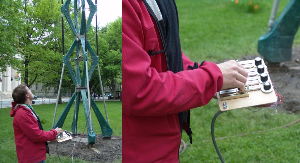
WhoWhatWhenAIR is a blog that follows the development and fabrication of a 40ft interactive/kinetic tower (by Philippe Block, Axel Kilian, Peter Schmitt, John Snavely).

The project was submitted for the mini-Skyscraper competition in the Department of Architecture at MIT. As winning entry we received $7,000 to build it in a month. (...) We wanted to connect the culture of the hack at MIT with a personified miniskyscraper. To bridge interactivity and personality, we created a language. You can speak to the mini skyscraper by operating a bicylce pump and it responds with movement. Coordinated efforts produce unexpected structural choreography.

Pneumatic muscles allow the structure to move in all directions. They pull the structure out of an equilibrium position, creating three-dimensional curvature in the central core. By stacking several units, the mini skyscraper can curve in several directions at once. This core acts as a spine to keep the structure upright when none of the muscles are actuated. The pneumatic movement is graceful and precise.

Also check the movie (.mov, 3.62 Mb).

Architecture Foresight

Archrecord has a good read about building foresight: Imagining the future: How will we make buildings in 2030? by Sara Hart.

magine thirty years from now. Will urban areas in 2030 look like Ridley Scott’s Los Angeles in the sci-fi movie Blade Runner—a prelude to Armageddon where the affluent reside in the tops of 400-story skyscrapers, and the less fortunate scratch out an unsavory existence in the seamy, polluted, and lawless regions on the surface? Or will Americans live the utopian dream in self-sufficient, fossil-fuel free communities. (...) At this moment, however, the future is already taking form. On one hand, materials scientists are locked in laboratories inventing new, smart, and sustainable materials and composites, which are touted elsewhere in this issue as the beginning of a revolution in design and construction. At the same time, building materials that dominated the 20th century still dominate in the new millennium. (...)Still, in an era of engineering virtuosity and genuine collaboration and teamwork, who will own the architecture?

The article describes the material of the future with specific case studies about new developments that concerns concrete, steel and glass. Why do I blog this? the blade-runner like city is still the nightmare of urban planners but it does not seem to be where we are heading; I find this discussion interesting in terms of foresight research and my interest towards urban computing makes me think about these issues too.

A place like a Muscle

I am really enjoying this Muscle NSA project carried out at the Hyperbody Research Group at Delft University. This is a programmable building that can reconfigure itself.

For the exhibition Non-Standard Architecture ONL and HRG realized a working prototype of the Trans-ports project, called the MUSCLE. (...) Programmable buildings change shape by contracting and relaxing industrial muscles. The MUSCLE programmable building is a pressurized soft volume wrapped in a mesh of tensile muscles, which change length, height and width by varying the pressure pumped into the muscle.

What is interesting is the interaction they designed engaging people in a playful activity:

Visitors of the Architectures Non Standard exhibition play a collective game to explore the different states of the MUSCLE.

The public interacts with the MUSCLE by entering the interactivated sensorial space surrounding the prototype. This invisible component of the installation is implemented as a sensor field created by a collection of sensors. The sensors create a set of distinct shapes in space that, although invisible to the human eye, can be monitored and can yield information to the building body. The body senses the activities of the people and interacts with the players in a multimodal way. The public discovers within minutes how the MUSCLE behaves on their actions, and soon after they start finding a goal in the play. The outcome of this interaction however is unpredictable, since the MUSCLE is programmed to have a will of its own. It is pro-active rather then responsive and obedient. The programmable body is played by its users.

There is also a slight connection with the blogject concept:

For the behavioral system this means that the produced sensorial data is analyzed in real-time and acts as the parameters for pre-programmed algorithms and user-driven interferences in the defined scripts. These author-defined behavioral operations are instantly computed, resulting in a diversity of e-motive behaviors that are experienced as changes in the physical shape of the active structure and the generation of an active immersive soundscape. The MUSCLE really is an interactive input-output device, a playstation augmenting itself through time.

Why do I blog this? what I like in this project is that it mixes different aspects of the HCI world: games, games software, architecture, usage of sensors. In the end, the outcome is pretty original and the visitors' experience seem to be intriguing. I also like how it modifies the relationship of the visitors to a dynamic place.

Visualize the invisible (dataflowviz)

Just found this on information aesthetics: Free Network Visible Network, a project by the Mixed Reality Lab.

Free Network Visible Network is a project that combines different tools and processes to visualize, floating in the space, the interchanged information between users of a network. The people are able to experience in a new exciting way about how colorful virtual objects, representing the digital data, are flying around. These virtual objects will change their shape, size and color in relation with the different characteristics of the information that is circulating in the network.

Why do I blog this? this is something very important to me: the possibility to visualize the dataflows, showing the overlay of information in various environments. This would nicely depicts what we were discussing yesterday at the conference: how a certain place now has different meaning: given that in one place you can be there physically and virtually meeting people on IM, MMORPG or something else, the inherent simultaneity of this situation can be visualized through this sort of project.

So let's start a review about this kind of projects:

Related projects:

Any others dataflowviz?

Turning all of Philadelphia's vacant and abandoned lots into urban farms

Via inhabitat:

Farmadeliphication (fahr'muh'deli'fi'kay'shun), n. 1. The process of turning all of Philadelphia's vacant and abandoned lots into urban farms: The 'Farmadeliphication' of once decrepit buildings into farm structures advances fresh ways of seeing old structures as well as allowing for an organic transformation of history that contributes to the present day fabric. 2. What might happen if the Front Studio team's entry to the Urban Voids competition moves beyond the conceptual stage.

Why do I blog this? I find this phenomenon interesting. It's quite a different approach than MVRDV pig city (which consisted in raising pigs in huge skyscrapers) or Tokyo's underground farm.

Wrap-up of the crystalpunk workshop in Utrecht

A more structured summary of what I found interesting at the Crystalpunk workshop for soft architecture in Utrecht last week-end:

  • Pablo Miranda's talk targeted two aspects of architecture: being critical and projective. As for the critique part, a lot of things in architecture comes from the assumption that one can do stuff by drawing (before, people were building directly). The use of computer application has complicated this situation: new tools (3ds max, maya, catia...) gives a very important flavor to what's been designed: so who is going to be the author of a project built using such a tool? the architect or the designers of the tool? Concerning the projects, he presented those of his group which are amazingly interesting, especially those playing with genetic algorithm in architecture.
  • Adam Somlai-Fischer's point was about 'bionic spaces", not smarthomes. Sdam is against smarthomes, makes you dumb and incapable to interact with reality (which I definitely agree with, I hate the crappy intelligent fridge idea that may be refilled when empty). For him, architecture is not the building itself, not the behavior, it's not a dress code BUT the idea that space that surrounds us is a responsibility AND it's a social process. He thinks that now that social software are paving this way (web2.0, flickr...), we have familiar ground to replicate this in architecture. He then presented his incredible projects.
  • Jelle Feringa elaborated on Pablo's critique about interactive architecture. For him, each architect style is bound to the software they used (marcus novak - mathematica /greg lynn - maya kas oosterhuis - virtools / frank gehry - catia). His critique was also that specific software designed for architects are regressive. For example piranesi is very limitative: the software creates romantic-sketchy-cheesy models that make architects bound to old-fashioned model to create architecture. For him, archiCAD is also regressive in the sense that it helps quickly resolve design dilemmas and site-constraints unique tu strict municipal-building codes and client requirements through its interactive abilities. One of the most interesting project he presented was a chair design produced with genetic algorithm. They started by asking a question: "what is the minimum volume defining a chair" which they try to answer using genetic algorithm techniques. For Jelle, this was a new way of designing by addressing a specific question before creating an artifact.
  • Jonas Hielscher (Z-25) presented his project Dat-a: an installation based on RFID technology. The dat-a project allows to track people in an exhibit using rfid (you can see people's name in different rooms). He said: "we are in effect creating and Internet of Things". He and Pablo also mentioned this interesting fact after my presentation about blogject: we will get enormeous piles of data, how would we do deal with that (data mining gets hot as Jonas said).

Thanks Wil for all of this!

stuff

Articulating residents' design priorities

In the last issue of Metropolis Mag, there is an intriguing article entitled "Found in Translation: Laying the foundation for more sensitivity within a community's public spaces". It's mostly about how urban designer can articulate residents' design priorities. What is interesting, is this project they mention: "Hester Sign Collaborative": Those students, interns with a nonprofit design outfit called Hester Street Collaborative, are investigating how Chinatown's jumble of signs, icons, and sidewalk food vendors can reflect a look that residents actually want. With the supervision of Anne Frederick and Alex Gilliam, Hester Street's full-time staff, students create "nonverbal tools" for residents who don't speak English (or design jargon). Last year, intern William Chung designed a board game, Bad Design Darts, to serve as a community survey. Hester Street would post a neighborhood map at a town hall meeting and the block that residents hit most frequently with darts would receive a cleanup or gardening campaign initiated by civic groups.

Jenny Chin, another of the collaborative's interns, developed Step On Your Neighborhood, in which the collaborative lends residents a small handheld paver. People would take the pavers around the their streets and stamp impressions of found objects in concrete. "Here's this way of making things that could be beautiful and are entirely specific to that neighborhood," says Gilliam of Chin's innovation, "This is something many ages can do." (...) The collaborative will soon install a ribbon of symbols to inject more immigrant histories into the flow.

Why do I blog this? I find relevant to study how people think in terms of urban planning/design ideas, especially in diverse neighborhoods. This idea of 'non-verbal tool' is simple and appealing. Besides, I really like this: "the Hester Street intern demonstrates how making casts of found objects can feed a useful English-free design lexicon": (Photos courtesy Hester Street Collaborative)

Old school cyberspace embed its own architecture

Alex Pang is working on the very intriguing topic of "The End of Cyberspace" (there is a short piece about it in Wired today). In one of his blogposts, he's wondering about the names that we given to cyberspace (the ultimate goal is to find a new concept for what is now cyberspace: ubicomp...). Concerning cyberspace names, I looked back at some old role playing games I had both in english and french, dated from end of 80's and 90's. There are names like 'virtual world', "the grid', "the matrix", "cyberspace" and so forth. Sometimes, the names of the artifacts gives the idea of the concept (in "information superhighway" that I really like, it makes me remembering by grandmother who kept asking me "where are those superhighways").

An important thing I guess is the difference or the mix between the idea of a virtual space and its physical representation (as for instance a network of cable or fibers) and the virtual counterpart (information flow).

About this, it's interesting to see that the first representations of virtual reality embed the concept of the cyberspace architecture (in a more perfect way of course). Networked virtual reality is made of wires/cables/fibers (to connect computers) and it's really represented as a grid/matrix. Check those pictures (Space Harriers and Tron):

The ground of this virtual space is - actually - a grid.

Ambient Peacock Explorer

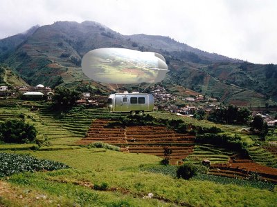
The Ambient peacock explorer is a project by Cati Vaucelle and Philip Vriend which I like. It's actually an interesting mobile unit that can be connected to an headquarter, here is the mobile unit:

mobile units: Independent from the headquarter / One shell per context of exploration / Shell inflated on top of the structure to indicate where the mobile unit is going / Context based shells per unitWater: Jelly Fish Organic Shell Countryside: Wooden structureCity: Inflatable ConcreteAir: Blimp

headquater Is composed of four gathering areas: the air, the countryside, the city and the water area, a studio and an editing room. Each wall receives life feed from the mobile units based on each unit context. Environmental data from sensing mobile units are also projected on the walls as meta information. The headquarter itself retro-project on its roof the life feed of its environment and on the external walls displays the video from mobiles units. The production centre also invites to discuss the documentaries and environmental issues and by that is also a showcase building.