General

Why mobile phone users engage in vivid nonverbal communication that do not benefit their communication partner

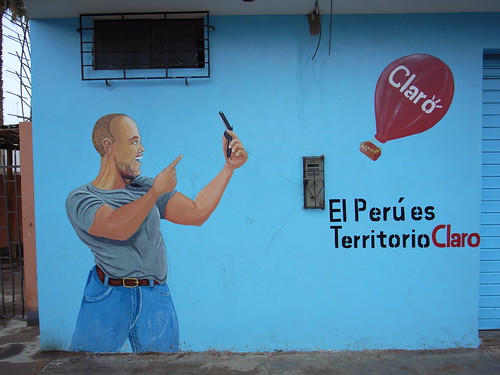
An interesting read for a Friday afternoon: “Not crazy, just talking on the mobile phone: Gestures and mobile phone conversations” by Carolyn Y. Wei from Google research.

The paper addresses why mobile phone users engage in vivid nonverbal communication behaviors that do not benefit their communication partner, e.g., gesturing, smiling, and nodding their heads. The insights presented here are not coming from a user study. Instead, they are derived from a literature review about nonverbal aspects of mobile phone use and on the communicative functions of nonverbal behavior (such as the use of gesture in speaking when the partner is not visually present and how it can influence conversations).

Some excerpts I found interesting:

"Much of the literature about gesture in conversation suggests that it has cognitive benefits for the speaker. (...) The gestures can help speakers think through a complicated task, explain complex relationships, and find substitutes for missing vocabulary. Gesture has a definite purpose in communication and is not performed merely for color. It is easy to see why mobile phone users engage in these nonverbal behaviors to aid themselves as they speak even without an audience in sight – it is instinctual and probably spontaneous. (...) speakers intend gestures to help their listeners better understand communication. They use gesture in concert with words and to convey semantic meaning. Further, they tailor gestures relative to the listeners. Gestures are purposefully designed for the listener – with fewer and different gestures used with people who are not face-to-face. Thus, the gestures employed by mobile phone users are probably more muted than they would normally be in face-to-face conversation. (...) Despite all these studies that suggest speakers gesture to help themselves think and to help their listeners, there seems to be inconclusive evidence about whether the gestures actually help listeners."

And about all of this can influence mobile phone design:

"Mobile phone design can be sensitive to nonverbal communication behaviors. (...) Gesture could be taken advantage of in a similar way to create innovations in mobile phone design, especially to improve the “user experience” for surrounding people. A simple design could be a phone that alerts nearby listeners that the user is speaking on a mobile phone, perhaps by turning on a signal whenever the phone is engaged. One example of this might be a phone that is linked to a wristband, and the wristband visibly glows whenever the phone is in use. (...) Mobile phone design can also respect existing research that suggests gestures are more meaningful to the speaker than the listener, and thus focus on innovations that aid the speaker. An example of this kind of design would be a mobile phone that senses gestures or other nonverbal behaviors and compares them with the words being spoken. If the words being spoken match the amount and nature of gesturing, then the phone might alert the user that she is performing well."

Why do I blog this? because the paper highlights interesting insights about the role of non-verbal communication in cell-phone usage... which is something that has always fascinated me when observing people on the street.
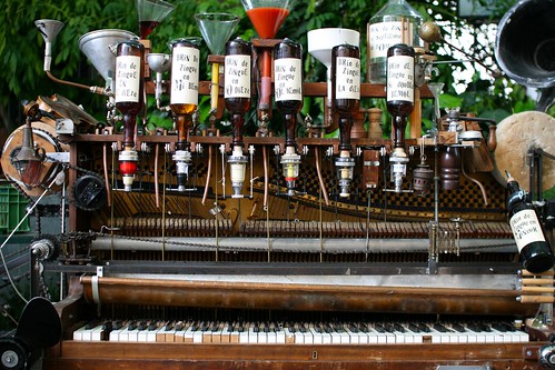
Pianococktail and the convergence of artifacts

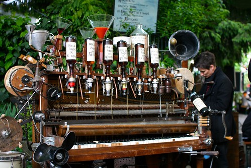
Le pianococktail An intriguing encounter this afternoon with a pianococktail, i.e. a piano that mixes drinks based on the combination of keys played. Being a reader of Boris Vian, running across this crazy object he described in his novel “L’ecume des Jours” ("Froth on the Daydream") is always a pleasure. The one I saw this afternoon has been designed by Géraldine and Nicolas Schenkel in Geneva.

Here's how Vian explains how the device works:

"For each note there’s a corresponding drink – either a wine, spirit, liqueur or fruit juice. The loud pedal puts in egg flip and the soft pedal adds ice. For soda you play a cadenza in F sharp. The quantities depend on how long a note is held – you get the sixteenth of a measure for a hemidemisemiquaver; a whole measure for a black note; and four measures for a semibreve. When you play a slow tune, then tone comes into control to prevent the amounts growing too large and the drink getting too big for a cocktail – but the alcoholic content remains unchanged. And, depending on the length of the tune, you can, if you like, vary the measures used, reducing them, say, to a hundredth in order to get a drink taking advantage of all the harmonics, by means of an adjustment on the side."

Le pianococktail

Why do I blog this? sunday encounter with a curious object that corresponds to the absurd convergence of two very different artifacts. The idea of mixing distinct functions in one object is an interesting innovation process but it's sometimes more poetic and intriguing to do it with very distant class of objects.

As a general exercise to envision alternative near future worlds, it would be good to think about similar convergence between very remote objects. Making two functions converge is a difficult purpose. This example reminds me of a talk by Ben Fullerton at interaction 2010 in which he described a project he worked on at IDEO forBang&Olufsen: a music player that was also a phone, as opposed to a a phone that would also be a music player. This kind of approach is inspring IMHO as it forces to rethink the role of the two objects in very different ways.

Locative media projects that caught my attention

Interesting locative media project that I've found relevant lately:

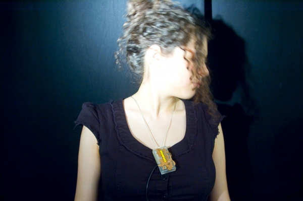
Address necklace by Mouna Andraos and Sonali Sridhar:

"Address is a handmade electronic jewelry piece. When you first acquire the pendant, you select a place that you consider to be your anchor – where you were born, your home, or perhaps the place you long to be. Once the jewelry is initialized, every time you wear the piece it displays how many kilometers you are from that location, using a GPS component built into the pendant. As you take Address around the world with you, it serves as a personal connection to that place, making the world a little smaller or maybe a little bigger."

I like the idea of having a personal connection to a place and not necessarily a human being. This is so different than the raft of buddy-finder applications.

Compass Phone by HaYeon Yoo:

"This project addresses the issue of whether the mobile phone is a surveillance tool or a digital leash and explores designing an alternative means of communication which delivers a more poetic and aesthetic experience.

The Compass Phone does not support any verbal communication side, but has only a GPS function. It measures the distance between two people in real-time and then converts it to the time it takes for them to meet each other by either transport or time unit. A compass is hidden under the digit display. The centre of the compass always indicates the user's position and its needle indicates the other person's direction. "

This one is also interesting at it gives subtle cues about friends' movement in space; I see it as indicating a possibility, and less a factual or objective indication as other buddy-finder try to implement.

Tablet PCs strike back

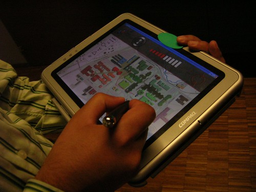
catchbob The return of the Tablet craziness echoed with the perusal of "A bitter pill to swallow: the rise and fall of the tablet computer yesterday during my flight.

The article analyzes Tablet PCs as a "product failure". Given that it was written in 2008, it states that it "no longer represented the future of mobile computing", which is funny as people got to back it recently after rumors of an Apple "bigger ipod touch / e-book reader". Yet another "recurring holy grail" as I discussed last year in my introduction to the Lift 2009 conference.

The entire article is a relevant read as it summarizes some good elements about innovation theories (diffusion, ANT...) and take into account the various technical component of Tablet PCs (pen computing, touchable interfaces, etc.). Some excerpts from the article that I found interesting to highlight:

"So why has the tablet computer not been a successful product? In theory, it had it all (...) Yet many of the factors mentioned in the case study as to why certain individual tablet computers had failed are issues which subsequently have been resolved. Clearly, the technical problems which plagued early products such as slow processor speeds and software reliability have been overcome. The compatibility of software means that applications for such computers are far greater in number and, while still not perfect, issues of functionality such as the reliability and accuracy of handwriting recognition software have been greatly improved. The manufacturers currently involved are not start-up enterprises lacking in financial support or backing; and the products are now part of large ranges of computing equipment from well-known and respected companies, and have received marketing support of a suitably high level. (...) it would appear from the technical factors that have been resolved that the only possible barriers left to the acceptance of tablet computers are social ones. The concept of “interpretive flexibility” proposes that different groups of people have different views on the extent to which a particular technology “works” for them. However “natural” a form of communication writing may appear to be, perhaps, as Jeff Hawkins believes, people don’t want to write on computer screens, and a pen on a large display is not a good user interface for a computer. The feel of pen on paper is a difficult one to surpass. (...) Another factor could involve the complexity of a personal computer, which is clearly accepted if not desired in a desktop PC. This may not be acceptable in such a portable format as the tablet PC. Slow start-up times, large size and weight, and the compromises inevitable in multifunctional products such as a full computer do not cross over well to situations in which the computer is held and carried around by the user, and constantly turned on and off. (...) It is possible that the semantic associations of tablet computers and the body language employed when using them is an issue. "

Why do I blog this? Because I believe that understanding the reasons of product failure is always fruitful and relevant as a starting point in a design process. Although I am not entirely sure about the reasons explained in the article, it's interesting to see that some of the pain points have been fixed and that the return of Tablets can be explained by different factors: confidence renewed by rumors that an industrial actor such as Apple would go into the field (which may or may also lead to the return of big fishes such as Microsoft and HP), the merging of the e-book and tablet PC metaphor (while 5 years ago the two were a bit distinct), etc.

Sharks tagged by scientists

A curious example of an heterogenous network of animals, technologies and people is described in Telegraph:

"More than 70 white pointers have been tagged by scientists is Western Australia in a world first trial that will send beach lifesavers a text message when one of the predators swims close to the Perth shoreline. Wildlife officials and scientists will also receive the text or email warning when any of the tagged sharks move to within 500m of metropolitan beaches. The text messages will be triggered less than two minutes after a shark swims over any one of 18 acoustic seabed receivers. (...) The study is aimed at unlocking the secrets of shark migration patterns and how they relate to attacks on humans."

Why do I blog this? amazement towards the reconfiguration of "nature". What's next? a surfboard with shark-location awareness tools.

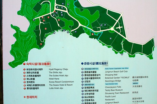
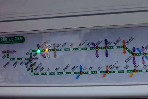
Korean "you are here"

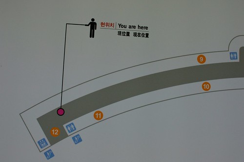
you are here You are here

You are here

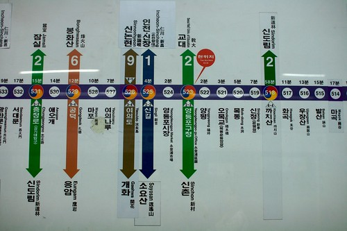
you are here (interactive)

Why do I blog this? the "you are here" sign is a common wayfinding element that is always interesting to observe. Stating where people are can take many forms ranging from ubiquitous red dots (w/o captions) to interactive LED and the context can also influence the signage.

Cognitive sciences deal with this issue and state different criteria to evaluate what they call "YAH" (you are here maps). See for instance You-Are-Here Maps in Emergencies – The Danger of Getting Lost by Klippel, Freksa and Winter which summarize the literature about this:

  • "Local placement: One important aspect of the local placement of YAH maps is the use of asymmetries to facilitate locating the map within the environment. An asymmetrical part of an environment is easily identified on the map as its layout combined with the YAH symbol (see below) shown on the map provides many cues for its location. Therefore, the location of the map in the environment becomes non-ambiguous.
  • Correspondence: YAH maps should allow for easily establishing a correspondence between the represented information and the information that is immediately erceptible. While locating oneself should be guided by a YAH symbol (see below), several aspects contribute to whether or not the orientation within an environment can be accomplished easily:

    • Alignment: The YAH map and the environment should be aligned.
    • Architectural cues: YAH maps should be designed such that architectural cues and natural landmarks are included and that the shape of the route drawn in the YAH map relates to the actual shape of the route the user has to take in the environment, i.e. the behavioural pattern depicted corresponds to the behavioural pattern to be carried out
    • YAH symbol: The YAH symbol fulfils two tasks: First, it locates the user within an environment; second, it should indicate the user's orientation with respect to her immediate surroundings (...) The double function can be achieved by combining a dot with an arrow or by a triangular shaped symbol designs.
  • Alignment of text in the map: The text in a map should be generally readable without requiring to turn one's head.
  • Repetition: Combining the principles mentioned above may allow for easier self-localization, orientation and determination of the route to the destination."

The principles can be employed as a mean to evalate YAH maps as well as a way to design and place then in the environment. As a matter of fact, they can also be interesting if you want to automate a "you are here" system through LBS. The level of mobility (or immobility) would then be an additional factor (in-car GPS versus pedestrian versus bike). There is a whole world to explore here in terms of user/field studies.

SXSW 2010 Proposal about Design Fiction

The future Julian proposed a panel for SXSW about Design Fiction at the following url: http://panelpicker.sxsw.com/ideas/view/5066. Feel free to vote on the platform if you're interested in the topic.

It's called "Design Fiction: Using Props, Prototypes and Speculation In Design" and here's the summary:

"This panel will present and discuss the idea of “design fiction”, a kind of design genre that expresses itself as a kind of science-fiction authoring practice. Design fiction crafts material visions of different kinds of possible worlds.

Design’s various ways of articulating ideas in material can be seen as a kind of practice close to writing fiction, creating social objects (like story props) and experiences (like predicaments or scenarios). In this way, design fiction may be a practice for thinking about and constructing and shaping possible near future contexts in which design-led experiences are created that are different from the canonical better-faster-cheaper visions owned by corporate futures.

This panel will share design fiction projects and discuss the implications for design, strategy and technology innovation. In particular, how can design fiction bolster bolster the communication of new design concepts by emphasizing rich, people-focused storytelling rather than functionality? How can design fiction become part of a process for exploring speculative near futures in the interests of design innovation? What part can be played in imagining alternative histories to explore what “today” may have become as a way to underscore that there are no inevitabilities — and that the future is made from will and imagination, not determined by an “up-and-to-the-right” graph of better-faster-cheaper technologies."

If this all happens Julian will be joined by people such as Sascha Pohflepp (http://www.pohflepp.com/), Jake Dunagan (http://www.iftf.org/user/958). Bruce Sterling (http://www.wired.com/beyond_the_beyond/), Stuart Candy (http://futuryst.blogspot.com/) or myself.

7 qualities of "responsive environments"

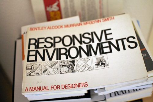
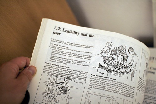
Responsive environments Awesome encounter the other day at the flea market in Geneva: Responsive environments: a manual for designers by Sue McGlynn, Ian Bentley, Graham Smith (1985). I bought it right away and started perusing this interesting compendium of urban design principles. Very practical and straight to the point, exemplified with illustrations and drawings, it shows how to crate environments that do not alienate but offer comprehensible, friendly and controllable places.

The whole book is about this:

"The design of a place affects the choices people can make, at many levels:

  • Permeability: where people can go and where they cannot.
  • Variety: the range of uses available to people
  • Legibility: how easily people can understand what opportunities it offers
  • Robustness: the degree to which people can use a given place for different purposes.
  • Visual appropriateness: the detailed appearance of the place make people aware of the choices available.
  • Richness: people's choice of sensory experiences
  • Personalization: the extent to which people can put their own stamp on a place."

For each of these, there are interesting assignments such as doorstep interviews or probing people at street corner with peculiar photographs: Responsive environments

Why do I blog this? surely some insightful material to chew on, will try to spend more time on it and connect these thoughts with Dan Hill's discussion of hackability and design. So far, I like how the book offer interesting models that can go beyond architecture or urban planning.

Pervasive games book

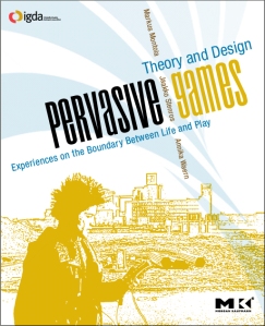
It seems that the book "Pervasive Games: Theory and Design - Experiences on the Boundary between Life and Play " by Markus Montola, Jaakko Stenros and Annika Waer (editors) is finally out, published by Morgan Kauffman: Pervasive Games Book

"Quickly emerging from the fast-paced growth of mobile communications and wireless technologies, pervasive games provide a worldwide network of potential play spaces. Now games can be designed to be played in public spaces like streets, conferences, museums and other non-traditional game venues – and game designers need to understand the world as a medium—both its challenges and its advantages.

This book shows how to change the face of play—who plays, when and where they play and what that play means to all involved. The authors explore aspects of pervasive games that concern game designers: what makes these games compelling, what makes them possible today, how they are made and by whom. For theorists, it provides a solidtheoretical, philosophical and aesthetic grounding of their designs.

Pervasive Games covers everything from theory and design to history and marketing. Designers will find 13 detailed game descriptions, a wealth of design theory, examples from dozens of games and a thorough discussion of past inspirations—directly from the game designers themselves."

Why do I blog this? just saw this on, need to get it and peruse this interesting compendium of case-studies (Killer, Insectopia, Botfighters, Uncle Roy, etc.). People interested can also listen to the podcast by the editors.

Design as part of R&D?

[A perhaps very high level and political post... emerging from recent thoughts about how to frame my work in the R&D public policy in Europe] Can design be perceived as a component of Research & Development? Or is it mostly about "production" and commercialization of products? What are the design phases that can be part of R&D?

All these questions take an increasing importance in my work lately. Working with European companies, I often face them for a very simple reason: in countries such as France, Research and Development benefits from a series of financial incentives (such as tax credit). Since it's not possible for States to directly help companies (although sometimes they try to do so), they have to figure out how to support their national firms in compliance with what the European Commission can accept and stated as regulations. This is why offering financial devices such as tax credits on R&D expenses/investment can be a good way to help. The underlying agenda is that backing companies to fund research project may facilitate the emergence of innovation (I won't comment on this as this is another hot potato in political/economical theories).

Once you've said that you want to facilitate R&D, you have to deal with an important question: what activities can be considered as R&D? The answer generally lies in arid documents that define what constitutes R&D or not. Although different countries have different ways to formulate it, the common definition stems from something called the "Frascati manual":

"Research and experimental development (R&D) comprise creative work undertaken on a systematic basis in order to increase the stock of knowledge, including knowledge of man, culture and society, and the use of this stock of knowledge to devise new applications. The term R&D covers three activities: Basic research is experimental or theoretical work undertaken primarily to acquire new knowledge of the underlying foundation of phenomena and observable facts, without any particular application or use in view. Applied research is also original investigation undertaken in order to acquire new knowledge. It is, however, directed primarily towards a specific practical aim or objective. Experimental development is systematic work, drawing on existing knowledge gained from research and/or practical experience, which is directed to producing new materials, products or devices, to installing new processes, systems and services, or to improving substantially those already produced or installed. (...) The basic criterion for distinguishing R&D from related activities is the presence in R&D of an appreciable element of novelty and the resolution of scientific and/or technological uncertainty, i.e. when the solution to a problem is not readily apparent to someone familiar with the basic stock of common knowledge and techniques for the area concerned."

The definition is quite broad and the document gives lots of examples of what is considered as being part of R&D but my experience in France was that you had to follow certain criteria that are largely based on technology: what is the technological problem? how did you solve it? what prototypes have you put in place to solve it?, have you secured the IP through patents?, etc. In the end, this puts the emphasis on technological research, and it's hard (but possible to stretch it a little bit for creative industries (web, video game for instance). What it means is simply that if you have a bunch of existing techniques (say... open source components and IP) and you try to innovate by tying them together to create something new and original, you will have trouble showing that it is "R&D" as defined by these criteria (so you're sorta forced to create a new technology).

Therefore, it's interesting to look more closely at the document and see what they have to say about "design and R&D". See how it is summarized in this other EC document:

"The Frascati Manual includes some industrial design activities in this definition of R&D. Specifically, the Manual states that prototyping and industrial design required during R&D should be included in R&D for statistical purposes. Design for production processes and the less technical design activities are however not considered as R&D. Forms other than industrial design, such as service design, are also not included. (...) From a designer’s point of view, design includes some research (for example to identify user needs, preferences and behaviours). This means that there are overlaps between the concepts of R&D and design, but that there is no common view as to which is the overarching concept of which the other is part."

Still digesting the implications of this, I am highly interested in the recent announcement Mark reported about the EC public consultation on design as a driver of user-centred innovation. Why do I blog this? all of this means sounds boring and formal but these discussions and definitions have a great importance in innovation in Europe. Based on what is considered (or not) as R&D, some work can be funded (or not). And it has lots of implication about my daily work (when I carry out research studies for european clients OR when I work on a project about how such definition impacts web companies R&D).

Build your own burger

Build your own burger Personalized food composition seems to be pervasive lately, as exemplified by the "build your own burger" encountered in Palo Alto two weeks ago. Still looking forward a more participative steps in which the customer could be even more engaged.

Clive Grinyer at Mobile Monday Zürich

Cargo Quick trip to Zürich yesterday for Mobile Monday where I was invited to participate as a workshop moderator. The keynote speaker was Clive Grinyer who recently moved to Cisco as a customer experience director (after a position at Orange/France Telecom). His presentation was called "I've never used that: adoption and accessibility in mobile technology" and it addressed the disconnect between technology, and what users actually want and need. Here are my quick notes:

"I hear a lot this "i've never used that" and I worry about it, especially after 5 years working at FT

mobility is everywhere, cheap, and cool how can we help clients using it? what i love about mobility is that customer who are driving usages when it works for them: voice, sms text... but people reject it when it's wrong: overselling of WAP as the mobile internet, low (3%) uptake of 3G video calling, slow uptake of mobile music, complex user interfaces, menus and terminology. 90% of users access only 10% of functionalities. Customers differ widely in their use of mobile, from teenagers, old users, etc.

after 5 years of mobile internet, 18% of US and european accessed the internet once a month after 1 month 98% of users did the same! they must have done something good! and now there's lots of internet phones, and normal people buy them (fully screen touch interface 3g and wifi enabled devices specifically designed for the internet) now we even have usable applications that make money, which is a first

iphones, clones change game this is purely because of usability and design

services finally work, since 2003, consumers have rated LBS a their favorite technology feature but usage was zero until nokia, google and apple make it work and a gathering of new tech is about to happen: NFC, new LBS

Grinyer's law: "it takes 5 years before a new mobile tech becomes usable enough that people will actually use it" it can work but it takes more time to be adopted

something's wrong, how to improve?

  • open system makes it easier to make applications but not be integrated and designed around the user; co-creation tells you what people think they want but they not what they don't know they want!; wisdom of crowds is nice but what if great ideas remain inaccessible?
  • we have to design our future: mobile experiences have to be better coordinated; we have to move to leaderships position and not jut experts; we have to make our colleagues aware they designing the experience with EVERY decision
  • creating a vision of how things will be at the beginning (what about writing the user guide at the beginning?)
  • find out what's really going on, what do people do? you know what is going on when you go to the toilet of life!
  • make it simple, co-create with users and prototypes, close user-testing and this should be part of design, not a different unit
  • understand the future: use probes such as whirlpool's washing machine (plants that grows in sort of washing machine) to try things, get feedbacks, have a dialogue with the future
  • make it for everyone, people-centric
  • put in love, even if you have usability. e-books generally have no love in them, they are horrible pieces of technology.
  • hold your vision, management process where people give their opinions can lead to a total mess

Across all industries, usability unlocks adoption and finds great leaders (jonathan ive, bill buxton): we should not stay at usability departments, we need to make others know that it's just a nice to have"

Lessons from Sci-Fi predictions

CIO has a recent article about the lessons learned by science-fiction writer about predicting the future of technology. This journal asked authors such as Larry Niven, Robert Sawyer, Nancy Kress and Charles Stross to discuss technology-related predictions. The whole article is a good read but I point here some of the lessons:

  • "Look for the goals humankind will never give up. Instant travel, instant education, longevity. Then try to guess when it will appear and what it will look like.
  • Pay close attention to parasite control. There is always someone who wants the money for something else.
  • You're obliged to predict not just the automobile but the traffic jam and the stranglehold on gas prices
  • The trap we science and space buffs always fall into is thinking that everybody will want the things that we want, they don't; they have their own agendas, and ultimately, as in everything, it's the economy, stupid. Just because you personally want something doesn't mean there's a market for it. Just because we technically could do something doesn't mean that's how others want to see their tax dollars spent."
  • We can point to extrapolations of current technological and social trends, but we can't extrapolate on the basis of stuff that hasn't been discovered yet. For example: In 1962 it was possible, just about, to see the future of integrated circuitry (and even, if you were very far-sighted, to glimpse Moore's Law and its implications), but the CD player was right out of the picture— solid state lasers lay at least a decade in the future.
  • The standard advice is to be aggressive in your predictions; there's this notion that the future always comes faster than you think it will (...) But, actually, I think a lot of us underestimated social inertia, Most of us predicted a secular 21st century, and it's anything but that. The world is like a person: It doesn't change as it gets older. Rather, it simply becomes more obviously what it always was. People always liked having phones and portable music, but most people never wanted to lug a camera, or an ebook reader, or a PDA around. The future is adding functionality to those things we've already admitted into our lives, not trying to convince people they need new categories of things; the iPhone—the all-in-one device that is, first and foremost, something familiar—is the correct paradigm.
  • Study the cutting edge of the specific field. Create wild cards. And then don't worry about being wrong—it's science fiction."

Why do I blog this? some good tips here and ideas to be mentioned in upcoming work about failed futures and the importance of understanding failures. It echoes a lot with the talk I've given at Design Engaged, I will maybe reshuffle this for my introduction to Lift09.

Head as prototyping device

Prototype A curious prototyping device for hairdresser students... sort of uncommon to see teenagers hanging around with chopped off head in train station.

Prototype

Why do I blog this? fascination towards objects that can be employed as prototyping devices. Certainly to be contrasted with this one.

Dirt and the status of objects in design exhibits

Dirt An intriguing aspect noticed at the Design Biennial the other day concerns the status of objects presented in design exhibit. Most of the objects have warning signs forbidding people to touch/use/employ/walk on/sit on artifacts. However since most of the objects have clear affordances and are quite successful as calling for their own use... people cannot help using them (design success uh?). Which leads to pictures like the one above and below with foot traces here and there on some pieces.

Plus, given the huge quantity of kids there, this sort of audience inevitably wants and needs to touch artifacts.

Dirt

As a matter of fact, I find this extremely interesting as a person intrigued by usage and the passage of time (generally synonymous of dirt, dust and rusted pieces). What do people think at the end of the exhibit? Is the quantity of dirt a measure of success ("ah the affordance of this couch is so great that it's trashed by now").

air interaction

Browsing through weird interfaces, I ran across this air-augmented display.

It's called BYU-BYU-View and it basically adds air to the interaction between a user and a virtual environment, and communication through a network, by integrating the graphics presentation with wind inputs and outputs on a special screen:

"As a telecommunication tool, BYU-BYU-View could enable a system that presents a cutaneous sensation that distant lovers are sharing the same space. As an interface in a virtual environment, it could add the cutaneous sensation of air movement to sight and sound in a novel game. It could become a new input tool for people who have limited abilities with their hands or feet, or a communication method for deaf or blind people that delivers information directly to the skin."

Why do I blog this? wondering about non-standard interfaces and how "blow" can be an intriguing interactions for users, all of this after a long discussion with friends about "blowing" in your nintendo DS in public when playing with nintendogs.

Design approach and capturing the "needs"

In the latest issue of ACM interactions, Steve Portigal's column is a categorization of different "approaches to making stuff" that I found both insightful and ironically intriguing:

"Be a Genius and Get It Right (James Dyson): Be a Genius and Get It Wrong (Dean Kamen) Don't Ask Customers If This Is What They Want Do What Any Customer Asks Understand Needs and Design to Them"

Why do I blog this? an interesting typology of design, perhaps to exhaustive but that certainly tackle relevant issues. For example, one of my favorite is certainly the "Do What Any Customer Asks" as it is often the case with people confusing "user centered design" with "doing what users asked". This is a problem I face very regularly when describing my work: there is this idea that being user-centric is about giving users what they want/asked. Which is of course different than what they need or would desire, since there is a wide gap between what people say to do/want and what they really do/need. It definitely shows the interesting tension in design between relying on users' practice or inventing new futures. As Steve points out, the point is a feature request should be translated in a need request. He takes the example of a customer who want a handle; the important thing here is not that the person wants specifically a handle but simply a way to move the thing from one place to another, and the handle is only a solution instance. So what's a better way to get it? It's all about grasping the needs:

"Needs, as considered in this approach, can be functional, like when a design firm discovered women shoveling snow more than men and redesigned the ergonomics of a snow shovel for this typically smaller user. Needs can also be emotional, such as when Sunbeam studied the backyard-grilling process and realized that the grill itself was associated with family moments and social connectivity rather than a set of meat-cooking features. Sunbeam then worked with Continuum to design the Coleman Grill to connote nostalgic camping cookouts. Needs can deal with shifting mental models of common behaviors, too. Work by B/R/S for Colgate identified that brushing teeth is seen by people as a way to maintain their entire mouth, not just scouring the surface of the teeth. This led to Colgate Total, which promises "Superior Oral Health.""