Design

Affective body memorabilia

Via Frédéric: Affective Diary is a project conducted by SICS and Microsoft Research by Kristina Höök, Martin Svensson, Anna Ståhl, Petra Sundström and Jarmo Laaksolathi, SICS, Marco Combetto, Alex Taylor and Richard Harper, Microsoft Research. This diary is based on a “affective body memorabilia” concept since it captures some of the physical, bodily aspects of experiences and emotions of the owner through body sensors, (and uploaded via mobile phone). Eventually, it forms "an ambiguous, abstract colourful body shape". These shapes can be made available to others and "the diary is designed to invite reflection and to allow the user to piece together their own stories.

The usage scenario is described as follows:

"In Affective Diary users carry bio sensors that capture for example movement, skin temperature, galvanic skin response and pulse. Activities on the mobile phone is also captured, sent and received SMSs, Bluetooth presence, photos taken with the camera and music that you have listened to during the use. The user carries the sensors, for example, during a day, in the evening at home the data is downloaded into a tablet PC and the user’s day is represented in Affective Diary as an animation, where the data is shown. The bio data is visualised as characters with different body postures and colours, representing movement and arousal. The data from the mobile phone is graphically represented and clicking on the different representations makes it possible to read SMS-conversations, view other Bluetooth units and photographs and hear the music again. There is also the possibility to scribble in the diary and the characters representing bio data can be changed, both the body posture and the colour. The Affective Diary aims at letting users relive both the physical parts of their experiences as well as the cognitive parts."

Why do I blog this? what I find intriguing (and new) here is that, compared to existing projects (such as Bio-Mapping by Christian Nold) the "history" feature is taken into account (as shown maybe by the picture above). In a sense, it's interesting to think about how an history of physicological reactions/emotions can be turned into a design object. This is not only interesting in mobile context but also in terms of objects interactions. How would an object register emotional content. Thinking about Ulla-Maaria's project, it would be curious to add this emotional component (especially about object created by oneself)

Workshop about toilet space design

A Public Inconvenience (The 3rd workshop in the in-between-ness series) is a workshop about public toilets in urban environment that I surely want to attend. Organized by Arianna Bassoli, Johanna Brewer, Karen Martin, Valentina Nisi and Martine Posthuma de Boer, the focus will be on the design of this interesting (and often overlooked place):

" Technologies designed for the city often try to abstract away from the inconvenient necessities which our bodies require; or, when they are designed explicitly for public toilets, the focus is on supporting the cultural values of hygiene and privacy. What do we miss by ignoring the fact that public toilets are also the site for a variety of social practices?

'A Public Inconvenience' will explore the experience and affect of public toilets in an urban environment, in this case Amsterdam. Through observation and engagement we will consider how public toilets are shaped by, and themselves shape, cultural practices, values, and attitudes. And further, how this essential part of the urban fabric contributes to the everyday experience we have of our cities."

Toilet for different species (Toilet seen in Saint Jean de Luz France last spring, obviously for aliens)

Why do I blog this? I have to admit that toilet is a spatial artifact that I found interesting, mostly in terms of design and the practice created there. The advent of ubicomp also makes toilets more and more the focus of complex design and there are crux issues at stake here. There are lots of issues: communication between people, statements left by people, possible analysis of body troubles, etc.

And of course, with questions asked by the organizers such as "Why would a toilet want a blog?", I definitely want to be in.

Ambivalence towards automation

A good quote I've read in a french book about foresight ("Fabriquer le futur 2 : L'imaginaire au service de l'innovation" (Pierre Musso, Laurent Ponthou, Éric Seulliet)), translated by myself:

"One can systematically notice a paradox in the public attitude - namely consumers that area comfortable with technological devices. On one hand, one notice the ever-growing needs in terms of comfort, simplification of domestic tasks and distractions. This desire make attractive any propositions that delegate the tedious efforts to machines, that lower the accidents or diseases or that offer improved sensorial performances. On the other hand, consumers always jealously defend a number of principles that corresponds to the traditional representation of how their homeplace should be: autonomy and authority (...) Thus, any automatic device must present some limits in terms of decision autonomy" (Edouard le Maréchal, Tangenciels) "

Why do I blog this? I quite like this ambivalence between a desire for certain delegation and the refusal of automatic systems. That's definitely one of the greatest challenge in design, which emerge from the problems caused by automation. Too often automation is generalized to lots of contexts in which things do not work properly.

Computational tricycle or bicycle?

Paul Saffo's latest column on his web notepad interestingly deal with the "bicycle versus tricycle" design issue:

"Hewlett Packard’s announcement last month of a “Retro” edition of its HP35S calculator highlights another interface that is an even greater lost opportunity -- Reverse Polish Notation. Invented in the 1950s by Australian computer Scientist Charles Hamblin, RPN was adopted by HP as the interface for all of its calculators back when calculators began appearing in the early 1970s. RPN is a vastly more efficient way to enter problems on a calculator than the standard infix method used on virtually every calculator sold then -- and today. For example, if one wished to add 3 to 4, with infix on a conventional calculator, the keystroke sequence is [3], [+], [4], [=], while with RPN on the HP35S, one enters [3], [ENTER], [4], [+]. (...) Borrowing an analogy told to me by Doug Engelbart, RPN is to infix as a 2-wheeler bike is to a tricycle: The tricycle has no learning curve, but it will never go fast. In contrast, the two-wheeler takes some practice, but once one learns, the bike is a high-performance tool. (...) Unfortunately, RPN never caught on widely and even HP lost its nerve and abandoned RPN for most of its calculators. As a consequence calculator users today have no choice but to purchase computational tricycles. But try RPN and you will never go back."

Why do I blog this? I am often intrigued by examples of the "bicycle versus tricycle" issue in design and how different shape of the learning curve can influence the user experience in the long run.

Outdoor ad and shoe polish device

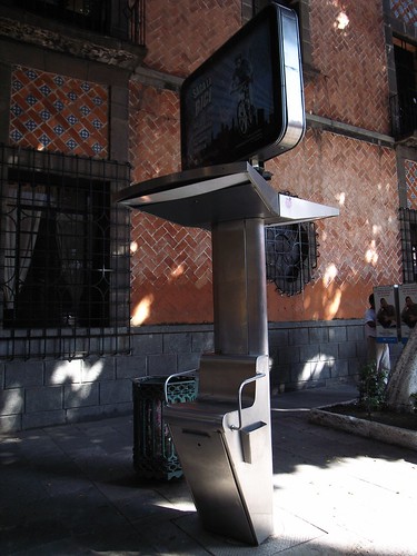
This device is an elevated seat employed by shoe polisher in Puebla, Mexico (Seen last month there). What is strikingly intriguing on this picture is that it has been used as an outdoor advertisement space. Outdoor advertising surface to its best

Why do I blog this? this draws some good reflection about spatial features in cities and cultural differences (nothing like this can be seen down there in Switzerland ;). To what extent an urban artifact begins to have secondary affordances like this? Would it be interesting to use it as a receptacle for other types of information?

Seating in a phone booth

2 booths (Seen in Lyon, France last friday)

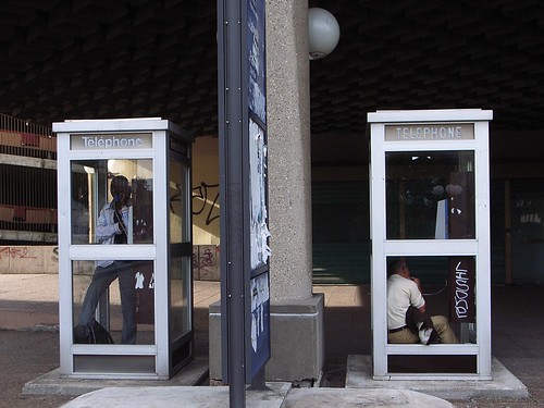
The design of phone booth is often problematic: you have stand while calling. Fortunately, some folks manage to get rid of that problem for others by simply destroying some glassed-wall of the booth... which allows to seat on the edge. And yes, there are still people using phone booths.

Technology personalization

Customization Found in Campeche, Mexico... how specific devices (a loudspeaker in this case) can be personalized for specific contexts (a church)... with a basic add-on in the form of a cross. Surely a small detail but it may be part of the experience for attendants.

Rube Goldberg

I knew about the concept but I was unaware of how it was referred to.US cartoonist Rube Goldberg gave his name to the incredible machines that perform simple tasks in indirect ways. See for instance the "Keep You From Forgetting To Mail Your Wife's Letter"

As described by the Wikipedia:

"The term also applies as a classification for a generally over-complicated apparatus or software. It first appeared in Webster's Third New International Dictionary with the definition "accomplishing by extremely complex roundabout means what actually or seemingly could be done simply." Rube's inventions are a unique commentary on life's complexities. They provide a humorous diversion into the absurd that lampoons the wonders of technology. These send-ups of man's ingenuity resonate in modern life for those seeking simplicity in the midst of a technology revolution. Goldberg machines can also be seen as a physical representation of the 'pataphysical—carrying a simple idea to a nonsensical, ornamented extreme."

Why do I blog this? rube goldberg, as chindogu, are intriguing phenomenon and surely of interest in terms of design issues/opportunities. And I think it goes beyond simply making fun of some human tendency to make things more complicated than they are. I will surely check more what has been written on that topic

Good reads on Ubiquitous Computing

A reader of this blog recently asked me if I had tips about relevant paper to read concerning Ubiquitous Computing that has been released in the last 2 years...I made a quick list of the ones I found really interesting lately and that I rely on when doing presentations about critical overviews of that topic. One might wonder why they all have similar authors... it's definitely that there is some coherent thoughts in Paul Dourish's writings that echoes with my feelings. And of course, it's only 4-5 papers among a ocean of thoughts concerning ubicomp but those are the ones that I liked lately. No exhaustivity hre

Greenfield, A: (2006). Everyware: The dawning age of ubiquitous computing. Adam's book is a good overview of issues regarding the user experience of ubicomp, plus it gives a good primer that can leads to lots of papers on the topic. Have a look at the bibliography.

Bell, G. & Dourish, P. (2007). Yesterday’s tomorrows: notes on ubiquitous computing’s dominant vision, Personal and Ubiquitous Computing 11:133-143. This one gives a good critical vision of how "ubicomp of the future" is yet to be seen (because of issues such as difficulty to have seamless infrastructures) and a "ubicomp of the present" vision should be promoted (for example by looking at Korean broadband infrastructures/practices or highway system in Singapore).

Dourish, P. & Bell, G. (2007). The Infrastructure of Experience and the Experience of Infrastructure: Meaning and Structure in Everyday Encounters with Space. Environment and Planning B, Great food for thoughts about how infrastructures are important in ubicomp and how things are not simple when we think about space and ubicomp.

Williams, A., Kabisch, E., and Dourish, P. (2005). From Interaction to Participation: Configuring Space through Embodied Interaction. In proceedings of the International Conference on Ubiquitous Computing (Ubicomp 2005) (Tokyo, Japan, September 11-14), 287-304. What I liked in this paper is that the authors showed how space is not as smooth as expected by engineers and designers ("space is not a container"), showing how history and culture can shape our environment. Projects and applications are indeed relying on a narrow vision of city, mobility or spatial issues that take space as a generic concept.

Dourish, P., Anderson, K., & Nafus, D. (2007) Cultural Mobilities: Diversity and Agency in Urban Computing, Proc. IFIP Conf. Human-Computer Interaction INTERACT 2007 (Rio De Janiero, Brazil). Here the authors argues for investigating people’s practices, which can help understanding the complexity of how space is experienced, how mobility takes many forms or how movement in space is not only going from A to B or how mobility can take many forms.

Chalmers, M. and Galani, A. (2004): Seamful interweaving: heterogeneity in the theory and design of interactive systems, Proceedings of the 2004 Conference on Designing Interactive Systems (DIS 2004), Cambridge, USA, pp. 243-252. A paper about seamful design, i.e. how the environmental and technical seams can be used as designed opportunities and reflected to the users.

"Google novel aura"

Interesting interview of William Gibson on Amazon. An excerpt that I found pertinent:

"Amazon.com: How do you research? If you want to write about, say, GPS, like you do in your new book, do you actively research it and seek out experts, or do you just perceive what's out there and make it your own?

Gibson: Well, I google it and get it wrong [laughter]. Or if I'm lucky, Cory Doctorow tells me I'm wrong but gives me a good fix for it. One of the things I discovered while I was writing Pattern Recognition is that I now think that any contemporary novel today has a kind of Google novel aura around it, where somebody's going to google everything in the text. So people--and this happened to me with Pattern Recognition--would find my footprints so to speak: well, he got this from here, and this information is on this site."

Why do I blog this? writings has always been a matter of structuring and restructuring ideas, phrasing and content but it seems that with tools such as google there is a way to find "footprints" (traces of people in a "textual space" here). IT reminds me of some french sci-fi authors who started his book by quoting his "sources" such as scientific papers, anthropological and philosophical books. What was fun was to read the book from that perspective and see how these ideas were melted into the book, a sort of elaborated collage.

Variable_environment booklet

The report of the "Variable_environment" project, a joint project between EPFL and ECALhas just been released. Although it's in french, this 19 Mb. document is full of great content, material and insights (some parts are in english).

With principal textual contributions by Patrick Keller, Philippe Rahm, Ben Hooker, Rachel Wingfield, Christophe Guignard, Christian Babski, etc., it addresses the notion of the "variable environment/" or the "mobility" problematic:

"From industry, planes, cars and motorways to services, mobile media, mobile (micro)-spaces, interactions, jet-lag, ...From Architecture's "high-tech" & mobility utopias to a "mish-mash" (hybridization) of (technological) objects, micro-architectures, situations, networks and interfaces. Those two comparative images (yesterday/today, see below) serve us since the start of the project as a kind of general background for our transversal ra&d project (transversalities between architecture, design, sciences). They resume some of our main concerns:

They both speak about "mobility". Two kind of "mobilities": 1__ mobile environment in term of distance. It moves and its context of use is changing (img 1: a walking city & a "mobile personal environment") or 2__ mobile environment in term of time. Its configuration, shape or function varies along time, but its location is fixed (img 2: an instant city and a flock of blimps). We can therefore speak about "Variable environments" in these two cases (variable in distance/context and/or in configuration/size over time)."

Why do I blog this? great material to be read, 2 possible of reading the document: (1) simply focusing on the content, (2) observing the underlying signs of collaboration between different actors (engineers, researchers, designers) and trying to understand the ideas at stake, what happens when art/design and research work together. Surely a relevant achievement for that matter.

Fixed keyboard mapping

Fixed keyboard mapping What happens when keyboards have different mappings... and need to be fixed right away. (Observed at a lab meeting this morning).

I am not really into research about topics such as "repair" but I find it very intriguing, in terms of User Experience, as well as the history of interaction people have with their artifacts. See the work Jan did about this for example concerning "informal repair culture/innovation". As you may know if you're a reader of Pasta and V., I am always amazed by people who trash stuff in occidental cities. Although most of the informal repair culture is seen in Asian or African countries, I am wondering about this very same phenomenon in european cities, like the places where I live. Judging from the explosion of consumer electronics material I encounter in flea market, I am pretty sure the informal repair culture there would be interesting to study.

Back to the picture above, this simply exemplifies as well my fascination to very low-key tweaks/modifications people think about a-la Michel De Certeau (see here as a starting point for example).

About design inheritance

In a paper called "Trying Not to Build the Same Old Spacecraft: Structural and Political Issues in Design Inheritance" (the pdf article is damaged so see the slides from the talk), Charlotte Linde explores the concept of "design inheritance", i.e. "how people and institutions attempt to plan for inheritance or to avoid being locked into the consequences of previous design decisions". In a sense, as she describes it's "No one wants to be responsible for the next Y2K problem" or "More thoughtful designers don’t want to be responsible for the next QWERTY keyboard". Working at the NASA, she takes the "spacecraft" as the example in her discussion. The interesting thing about spacecraft is that is both "iconic of the future" that it requires a strong inheritance of past design (because it's expensive/complex/risky and also because of the low number of prior examples). Using this example, she then shows how the social and economic factors forcing design inheritance.

"Factors Retarding Change

  • “They got it right the first time”
  • Installed technology base
  • Amount of risk acceptable: Old technologies with known failure parameters can be preferred to possible improvements with unknown failure parameters + Are there social mechanisms for learning from failures?
  • Length of mission (as compared to rate of change of technology)
  • Rate of change within spacecraft design subsystems"

Why do I blog this? because it's an important topic, as I am regularly pissed by how the wheel is being reinvented all over again. The talk seems to scratch the surface about how to "plan to plan" through spiral development or modularity ("Attempts to leave room for the insertion of not yet developed technologies").

The designer's stance

Paul Dourish about the designer's stance (embodied combuting), described in Where the Action is:

"while system designers have control largely over just the representations encoded in the software, the meaning of the system extends beyond simply the software to the whole environment in which the software is used. (...) The "designer" formally designated, still has the primary responsibility for the artifact. However, the second responsibility ascribed to the design - responsibility for the way the artifact is used - is open to considerably more debate. Obviously, artifacts must be designed with at least some expectations of their probable use. (...) Instead of designing ways for the artifacts to be used, the designer needs to focus on ways for the user to understand the tool and understand how to apply to each situation. The designer's stance is revised as the designer is less directly "present" in the interaction between the user and the artifact."

Why do I blog this? going through the book this morning (again), this quote echoed with some thoughts that I had lately about multiple affordances. Was thinking lately about how artifact interactions (like an "intelligent home, whatever that means) are fragmented in ubiquitous computing and how, at the same time, artifacts can have multiple affordances.

Designing for deterioration and the affordance of aging

Via Experientia, this very interesting blogpost about "designed deterioration by Khoi Vinh. Taking the example of a cast iran skillet that had developed a coating from oil and food (called "seasoning" by manufacturers), Khoi Vinh shows how it's a beautiful piece of design and "how its very deterioration has been incorporated into the design of the object, at how it’s gotten more attractive — less ignorant — the more I use it". He then wonders about the fact that designing an object is "based on an assumption that it would remain perfect forever, which is obviously impossible:

"the concept of what we might call designed deterioration is fairly anathema to digital hardware. The objects we purchase from purveyors of digital technology are conceived only up to the point of sale; the inevitable nicks, scratches, weathering, and fading they will encounter is not factored in at all. The result is that as they see more use, their ignorance may recede, but they wear it poorly. They don’t age gracefully."

Why do I blog this? Deterioration, failures, breaking, rip-offs are very intriguing phenomenon to me. And of course, it raises pertinent questions about design. What are the functions of aging? To what extent the traces of time are important?

Alexandra described how this is important for building a positive history of interaction with an object (see my notes from what she described at the NordiChi workshop) but what else is conveyed by aging? ownership? uniqueness...

Besides, this applies differently to digital objects like webpage or video games, since the aging often corresponds to the disappearing of the designed object. Although some projects try to add a "time dimension" on webpage, see for example the Lucent’s Live Web Stationery which add a digital patina on a webpage.

blue3

(Picture taken in Toulouse, an aged wall that have seen loads of concerts posters in the area, conspicuously removed by folks over time)

Game industry foresight by E. Adams

Some interesting quotes from Ernest Adam's foresight about the future of gaming:

"Games that depend on that depend on location or travel? Useful in theme parks, Laser Tag, etc. Not ever going to be a major segment. Compare # of video gamers to # of paintball players.Compare # of video gamers to # of paintball players. (...) In the long run...... Mobile phones will not drive out other devices. Other devices will absorb mobile phone capability. Just as everything now contains a digital clock, someday everything will contain a mobile phone. (...) In 30 years, In 30 years, how how we play has not changed - Handheld/mobile on the bus to school - Console in the living room - PC in the home office or kid ’s bedrooms bedroom

Convergence will be partial, not total. - A computer monitor is better than a TV. - Handhelds cannot cannot contain the best hardware. - A PC is a poor machine for group play. (...) The all-over VR body suit: Only as a very high--end option for fanatics"

Why do I blog this? some interesting thoughts here, need to use that material later on, quite like the very pragmatic approach.

Striated space

R0011875 Why do I blog this? I quite like wall textures like this one, as it reminds us how the space that we inhabit is not so smooth. There is a sense of roughness that is exemplified by this picture. At the micro-level, this image represents how a space is not always a repetition of the same small bits. How to design with this in mind?

Experience-design trappings

A good read for my daily commute today was this "On the ground running: Lessons from experience design by Adam Greenfield in which he describes the pitfalls and challenges of the "new ecosystem" that underly "experience design" and how to overcome them. Products, such as the iPod, are "no longer an isolated entity, but a way of gaining access to content which might ultimately live elsewhere", which leads designers in a situation where getting this product right "means accounting for your interactions with it across multiple channels over time". Quoting Eliel Saarinen, Adam highlights the importance of having things always "designed with reference to their next larger context".

The article goes through different examples such as the Nike+ system (biotelemetric transponder, compatible Nike sneakers, an iPod nano, and an online environment), a complex Acela train experience and the Puma Trainaway (shoes and clothes, a series of cardkey-sized, plasticized maps to running routes in major cities worldwide, MP3 audio guides, and alliances with Hotel chains). What I found very interesting here is the limitations:

"physical components that are fragile, unreliable, or not delivered to specification to begin with; difficulties integrating those components with online environments, with desktop or mobile applications, and with human participants; and finally, the inherent unpredictability of any attempt to maintain consistent feel across technosocial systems of heterogeneous type and nature."

A potential solution according to Adam concerns the logic of “small pieces, loosely joined,” coming from the Web culture. Favoring this bottom-up (streetwiser) opinion, the point is that

"the network is open-ended, effortlessly extensible, and robustly resilient to the failure of individual system components (...) Isn't it better, then, to open these systems up—to provide the APIs and other hooks that would allow people to configure them to their own liking? (...) the person formerly known to experience design as the “user,” “customer,” or “consumer”; needs to be understood as a human being before designers can do their work properly. Any other approach, he reasons, risks treating this person as an instrumental component, not as someone capable of fully participatory co-creation."

(On a different note, things can go beyond API as described in this article in The Economist about the sharing of data)

Why do I blog this? the issues and problems presented by Adam parallels some thoughts I had recently about complexity, how creating something is now tight to so many different aspects (user, context, regulations, etc.) that lots of flaws might emerge in the end.