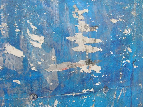
Via Experientia, this very interesting blogpost about "designed deterioration by Khoi Vinh. Taking the example of a cast iran skillet that had developed a coating from oil and food (called "seasoning" by manufacturers), Khoi Vinh shows how it's a beautiful piece of design and "how its very deterioration has been incorporated into the design of the object, at how it’s gotten more attractive — less ignorant — the more I use it". He then wonders about the fact that designing an object is "based on an assumption that it would remain perfect forever, which is obviously impossible:
"the concept of what we might call designed deterioration is fairly anathema to digital hardware. The objects we purchase from purveyors of digital technology are conceived only up to the point of sale; the inevitable nicks, scratches, weathering, and fading they will encounter is not factored in at all. The result is that as they see more use, their ignorance may recede, but they wear it poorly. They don’t age gracefully."
Why do I blog this? Deterioration, failures, breaking, rip-offs are very intriguing phenomenon to me. And of course, it raises pertinent questions about design. What are the functions of aging? To what extent the traces of time are important?
Alexandra described how this is important for building a positive history of interaction with an object (see my notes from what she described at the NordiChi workshop) but what else is conveyed by aging? ownership? uniqueness...
Besides, this applies differently to digital objects like webpage or video games, since the aging often corresponds to the disappearing of the designed object. Although some projects try to add a "time dimension" on webpage, see for example the Lucent’s Live Web Stationery which add a digital patina on a webpage.
(Picture taken in Toulouse, an aged wall that have seen loads of concerts posters in the area, conspicuously removed by folks over time)
