Design

Karl Gerstner on design models

Karl Gerstner Note to self: take more time reading this curious book by Karl Gerstner, a swiss typographer. It's a document about his design process in the early days of the computer era. Definitely not about recipes and direct solutions, it's rather a sort of reflection on possible design models.

Karl Gerstner

Perhaps it's a tad too oriented towards graphic-design but there seems to be some interesting elements in there that go beyond this domain.

Karl Gerstner

Karl Gerstner

Why do I blog this? gathering notes for an introductory course next week about design processes in various contexts.

Meme circulation: Parking Wars

The "Parking Wars" application on Facebook was certainly one my favorite game two years ago. I gave it a shot for 3-4 months and then let it go (although one my friend is a "$28,699,245 (Parker Emeritus)". Besides it may have been the only application that attracted me to log in on Facebook back in 2006.

The game, designed by Area/Code was actually a facebook app that was meant to promote a television show:

" In Parking Wars, players earn money by parking -- legally or illegally -- on their friend's streets. Players also collect fines by ticketing illegally parked cars on their own street."

What was fantastic at the time was the fact that this simple games app took advantage of the FB social graphs in curious ways:

  • The underlying logic is simple: you need to have friends to park your cars on their street. The point is therefore to maximize the number of friends who play Parking War... which leads player to participate in the network effect through invitations (on top of word-of-mouth).
  • The game is asynchronous and turn-based so it's good to find friends on different time-shift so that you could place/remove your car when they sleep (a moment during which you don't risk to get any fine).
  • When giving a fine you can send messages to other players, the dynamic here is highly interesting as people repurposed it into some weird communication channel that is public but that address a different audience than the Facebook wall
  • Competition is stimulated with a peculiar kind of score board: you only see scores from other players within your network (who added the game). This is thus a sort of micro-community where each participants' score is made explicit.
  • The "level design" is also interesting with a "neighbor" feature that enable you to park on adjacent streets, which can be owned by people outside your network.
  • The cheating tricks are also social: you can less-active FB users to add the game so that you're pretty sure they won't check that you're illegally parked, you can create a fake FB account or benefit from streets created by people who stopped playing.
  • ... and I am sure there is more to it from the social POV

Interestingly, my curiosity towards Parking Wars came back up to the surface when chatting with my neighbor Basile Zimmermann who works as research scientist at the University of Geneva. In a recent project, he addressed how Chinese Social Networking Sites re-interpreted design concepts already used by existing platforms such as FB and turned them into something different.

Which is how he showed me a curious application he saw on a Chinese SNS called "开心网 / Kaixin001" ("Happy Network") that is a Parking Wars-inspired copy also called "争车位" ("Parking Wars") which appeared in July 2008:

The layout is similar to the one created by Area/code, some cars are more fancy than others but the main difference lies in the presence of advertisement (as shown by the "LG" brand). As a matter of fact, the ad part was not included in the first few months of this Parking Wars version on the Happy Network and it appeared approximately around March 2009 according to Basile. From what I'm told, the game is evolving too with a system of maps that operates differently from the FB version.

More explanation in his upcoming paper about this topic: Zimmermann, B. (forthcoming). "Analyzing Social Networking Web Sites: The Design of Happy Network in China" in Global Design History, Adamson, Teasley and Riello eds, Routledge.

Why do I blog this? dual interest here: 1) my fascination towards Parking Wars and its underlying game design mechanism based on social dimensions, 2) the transfer of this meme in another culture.

Extreme car dashboard

Super-tuned car dashboard Extreme car tuning of a dashboard, encountered in Paris yesterday afternoon. The owner interestingly added a cockpit GUI, some potentiometers and removed the steering wheel. Given the whole appearance of the car, I am not very sure whether it's still used.

Why do I blog this? curiosity towards this sort of tinkering as it allows to ask questions. Although the car is obviously not unusable any longer, it's interesting to wonder about what is can be like to drive with this kind of interface. Out of its original context, it makes no sense but should there be some interesting transfer that car-dashboard designers never thought about?

About non-users of technologies

Most of the research about people in HCI and interaction design focuses on technology usage. This is all good and there are lot of things to get from such studies. However, it's also important to take this issue the other way around: non-usage of technologies is relevant as well. Researchers in STS (Science Technology Society) and HCI tackle this issue as shown in the book by Pinch and Oudshoorn which introductory chapter is entitled "how users and non-users matter". Earlier work in computer sciences and HCI have also considered non-usage to understand limits and acceptance problem, to a point where anxious engineers and tech researchers looked at "non-users" in terms of "potential users" A recent article by Christine Satchell and Paul Dourish also deal with this topic (at the upcoming OZChi conference in November). More specifically, they are interested in "aspects of not using computers, what not using them might mean", and what researchers/designers might learn by examining non-use as seriously as they examine use.

The article sets off to go beyond the narrow and reductionist vision of the "user". It clearly acknowledge the notion of "user" as "a discursive formation rather than a natural fact" and "examine use and non-use as aspects of a single broader continuum". Which approach is somewhat different from earlier work. The main point of the authors consists in highlighting that "interaction reaches beyond 'use'". What this means is simply that the experience of technology per se may be shaped and influenced by elements that are outside or beyond specific circumstances of 'use'". This is an highly interesting point that is very difficult to address, especially with certain peeps who think that the UX is solely shaped by the technology itself (not to mention the good folk who told me once that what "users" are looking for is "simple enough algorithm").

The meat of this paper also lies in the description of six forms of non-use:

  1. Lagging adoption: non-users are often defined "with respect to some expected pattern of technology adoption and diffusion" [the 4 Pasta and Vinegar readers may have recognized here the notion of s-curves]. The problem is that this view tells nothing about "who do not use technology, but rather about people who do not use technology yet.". As if technological usage was inevitable and "non-use" a temporary condition.
  2. Active resistance: "not simply a failure to adopt – i.e., an absence of action – but rather, a positive effort to resist a technology". This can take various forms such as infrastructure resistance (home-schooling, people who live "off the grid").
  3. Disenchantment: "this often manifests itself as a focus on the inherently inauthentic nature of technology and technologically-mediated interaction, with a nostalgic invocation of the way things were", which may be an appeal to a "way we never were",
  4. Disenfranchisement: "may take many different forms. Interest in universal accessibility has largely focused on physical and cognitive impairments as sources of technological disenfranchisement, but it may also have its origins in economic, social, infrastructural, geographical, and other sources."
  5. Displacement: some kind of repurposed usage of the artifact that make it difficult to understand who is really the user.
  6. Disinterest: "when the topics that we want to investigate are those that turn out not to be of significant relevance to a broader population"

And the conclusion gives insightful arguments about how this may influence design:

"From the perspective of system developers, a utilitarian morality governs technology use. The good user is one who adopts the systems we design and uses them as we envisioned (Redmiles et al., 2005). Similarly, the bad or problematic user is the one who does not embrace the system or device. (...) what we have tried to show here is that non-use is not an absence or a gap; it is not negative space. Non-use is, often, active, meaningful, motivated, considered, structured, specific, nuanced, directed, and productive."

Why do I blog this? Non-usage of technologies is a topic that has always attracted me, and it's perhaps related to my interest in product failures. The typology proposed here as well as the discussion of "non-users" is of great important IMO to understand technologies.

Is the future about jetpacks or curious-but-ordinary things?

(Albert Robida's vision of the future in 1890)

Last june, I participated in a panel at the i-realize conference in Torino with Bruce Sterling and Geoff Manaugh. The starting point of the discussion was a short presentation I gave which resulted from a workshop I organized the day before about how people move and interact in Torino and how this may evolve over time. As one can see on the video of the panel (apart from the fact that I am a bit stressed out because my VGA adapter is screwed), Bruce picked up on the results to describe his personal interests. He mentioned how as science-fiction writer, he was into "big futuristic things". But he also stated how as a tech journalist he fancies small details/improvements/additions/modifications in our daily life (exemplified by the booklet i did with Fabien).

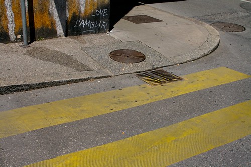
He used the street example (see picture below) to describe how innovation can be very basic... like this curved sidewalk that allows people to roll up instead of having a big step.

Sidewalk innovation

Interestingly, reading Warren Ellis august column at Wired UK, I also find an echo to this discussion:

"The future bubbles up under the floorboards.

We spend a lot of time looking for our spaceships and jet-packs, but – and consider this bit, it gets bigger and weirder the more you think about it – in a matter of days we can genetically sequence a mutant virus that’s jumped the species gap. People try to make an ordinary thing of that. There’s a strong tendency to cast the present day, whenever that may be, as essentially banal and not what was promised. Stop looking for the loud giant stuff. The small marvels surround us."

Why do I blog this? referencing material about the balance between big futuristic things and ordinary change, interesting quotes to be re-used in my upcoming course about how to observe the world for design purposes. This discussion about small marvels directly connects with George Perec's notion of "Infra-ordinary".

Dieter Rams' interview

Interesting interview by german designer Dieter Rams read the other day at the train station in Zürich.

What struck as fascinating was that Rams was, at first, hired to design stuff but with a different mission that led him to nail down design process:

"One of my first jobs in the design department was to harmonise the relationship between the designers and the technicians and so build up trust. There was certainly no form to the design process; for example, as yet there were no briefings. Later on we created teams consisting of designers, marketing people and technicians who, from the start, all worked together on a product. Such a framework does have a huge effect on the design process. The design projects then followed the tasks set by each of the individual areas – whether it be hi-fi, body care, health care etc. There was a business director who was at the same level as the technical director and the design director."

He also tackles relevant aspects in terms of marketing issues:

"[reacting to the marketing take-over at Braun]This always had to do with the ever-increasing quantities that had to be produced. And with the fact that more complex production technology also necessitated huge investments in toolmaking and production facilities. Marketing gained in importance at the end of the seventies as it was responsible for ensuring competitiveness and a return on investment. (...) the reason for the actual problem may be that no one wants to admit that at some point they have reached the end of the line. Yet you can't always be making a new shaver or a new coffee machine unless you come up with a real innovation – and here I'm not talking about tinkering with the shape or the colour. And then people think that this will increase sales a bit more. They're dreaming! Yet for all this it seems as if most managers still believe that just having a sheer mass of products on the market achieves something. Right now, that is the problem with the car industry. They have been shoving more and more cars onto the market yet it is obvious that the markets have long been saturated. And yet these are precisely the development programme targets being set by the design divisions of larger companies. But I still maintain that the way is to produce less, but better. "

Why do I blog this? curiosity towards Ram's approach and thinking.

Outdoor television

Protection for outdoor TV Watching television outdoor often requires some sort of bricolage... such as this TV encountered in Omalos, Crete. The cardboard piece is an easy-but-convenient way to manage to see the images when the sun if glowing a bit too much.

3 pieces about ethnography and design

notes about blogjects Some pieces I ran across recently about the role of ethnographically-inspired approaches in design:

Fewer Engineers, More Anthropologists (by Navi Radjou) highlights a so-called new R&D model based on interdisciplinarity. The authors describes to what extent "anthropologists" (or people who have skills related to anthropology) can help companies to "tailor their business models and offerings to match users' socio-economic and cultural context". What is weird here, as described by near future laboratory fellow Julian Bleecker is that this is definitely not really new ("2.0"). For example, Julian points to earlier work by Lucy Suchman at PARC (described in here book). What I find surprising here is that the notion that users should be taken care of in the design/R&D process is not new as well. Of course it was not called "design-based ethnography" in the past and "co-design" wasn't employed either. Perhaps the HBR has lowered his standards or forgot to ask an historian of science and technologies.

How to Turn Research into Innovation Gold (by Jessie Scanlon, Business Week) is a bit more mature as it do not highlight the originality of such approach. With such title, the assumption is clear: data from the field can be turned into gold. It basically points out with a problem field researchers have with the huge quantity of material they collect: what to do out of it? how to turn it into something that is fruitful for other stakeholders (such as designers, strategy people or engineers). What the article describes as "how to tease useful insights out of all of this disparate data". The author takes the example of a Steelcase case (I always like to make weird phrase like this, using two times the same word):

"With all of the research materials gathered in a room, the group convened for what they call a "big share"—a two-day event that included marketers, engineers, industrial designers, and other stakeholders. The field team began by telling stories and sharing observations. (Researchers record the latter in formal documents that include the observation, its origin, its significance, and other details.)

With their thinking primed by the stories, the group went through all of the research photos, organizing them into related themes—a patient's need for privacy, for instance—and taping those clusters on the wall. As they began to see common problems or workarounds, they added observations written on Post-It notes to the wall. "The goal is to take the knowledge gained from the research and make it explicit," says Bromberg."

They then apply a 100 to 50 to 12 insights "that could guide the design and development phases to come" in a sort of reduction process. The article also gives some ideas about the process itself (take time to look back at the data, look for patterns) which seems like the outline of a thick manual of ethnography.

In the last issue of Ambidextrous, there is an interview of a designer and an anthropologist who addresses the general issues raised by the role of field research in design. They discuss the existence of such approach for sometimes (it goes beyond the HBR piece for that matter) and focuses on the added value: the uncovering of "unmet needs or 'opportunity spaces'", "get business people a little closer to real people, to customers". Doing so is achieved through high-level goals: "understand people in their own terms", "through simplified models, a set of key stories or quotes", "eliciting the cultural constructs people have while keeping your mind on two places at once, both the native model [of the user] and your own analytical model [as an ethnographer]".

Some general comments about these pieces:

  1. The first aspect that strikes me is the vocabulary. The general use of terms such as "ethnography" and "anthropology" sounds like they reference to established and well-respected academic disciplines and practices. It's a sort of indicator of their validity, relevance or maybe seriousness. However, what is generally meant is "field research" with a strong focus on "data" and data collection techniques. The absence of theories and theoretical constructs is quite astonishing. Of course, there are different schools of thoughts in anthropology, and some of them employ less theories than others, but still they argue about the reasons for that. That being said, I tend to prefer using the term "field research" (or scouting) since it's more humble and less anchored in a specific discipline (don't want rain on anyone's parade).
  2. The focus on a utilitarian model is also important in these pieces. The point of using ethnography is to find "unmnet needs" with their obvious counterparts: business opportunities (or in engineering circle: opportunities to turn a technology into something that can be employed by peeps). Surprisingly, there's never a discussion about what is a "need" (isn't it a theoretical construct?) and the fact that this term is used with a very broad meaning do not account for the complexity of what it encompasses. Recently I was in a round-table with engineers and they were eager to find a "need" that could justify their developments. I find it intriguing but my interest vanished when I realized they stayed at an highly general level: a need for a mobile service could be "sharing content" or "communicating with one's tribe". It was really hard for me to make them understand that these needs are only broad categories and that it's important to go to finer-grained levels. Like... what is important for [a certain category of] people when they do X and Y, at certain moments in time/their life, etc.
  3. The quantitative rhetoric grounded in temporal perspectives is also fascinating in these articles. See for example: "To effectively carry out their global R&D 2.0 strategy, CEOs of multinationals must give themselves a target of staffing at least 40% of their R&D labs in emerging markets with sociologists and micro-economists by 2015" in the HBR piece. Or: "the group had generated close to 100 insights (...) they "collapsed" these to 50 and then further." in the BW document". Maybe, it's a side-effect of the corporate world that desperately need indicators and quant stuff but the emphasis on such parameters is curious from an external viewpoint.

Why do I blog this? preparing material for my "Field research for designers" course for next semester, I try to find an alternative model to what already exist. I am particularly interested in the use of ethnographical techniques in a context where one do not try to jump on the "uncover needs" bandwagon. My assumption is that there are still some possibilities to employ methodologies and theories coming from ethnography in a meaningful and subtle ways to inform/constraint/inspire/question/help design and the different stakeholders of design-based projects.

Urban animal (an interesting encounter from last week-end, a giraffe-shaped game in a public parc in Geneva, which nurtured some interesting reflections about public space and "how do people do what they do" discussions).

This topis is well present in the discussion I have with Julian, about how to go beyond the instrumental and explore fringes (the places where the unevenly distributed glimpses form the future may be located) for crafting weird near future explorations.

ATM interface complexity

Interstitial practice These four pictures depict different ATM interfaces from Lyon, Santa Monica, Lisbon and Paris. As usual, there is a lot to draw here: keyboard minimalism versus "a button for each bill needs", presence or absence of jack-entry for headphone, paper annotation, ATM receipts dumped in the cracks, etc.

out of doe

ATM interface

Touch interaction

Why do I blog this? An always-interesting approach to object and design analysis consist in taking pictures of similar items in various places, and to adopt an analytical perspective (drawing comparisons, observing exceptions or recurring phenomena, trends and patterns, etc.). I wish I had more time to spend on this sort of analysis.

EPFL IC research day

At the Information and Communication faculty research day at EPFL which is about "Invisible Computing: Novel Interfaces to Digital Environments". Two bits from the presentations caught my eyes. In her presentation entitled "The myth of touch", Chia Shen from Harvard University dealt with 3 wrong ideas about touch-based interfaces. She started by reminding us how people want touch because they have the impression that it's better for engaging users (and that it helps to "remember" and collaborate). She then moved to the description of 3 myths in this context:

  • "Myth #1: touch is natural: The reality is not that simple. Actually, touch is natural up to 3 UI-less gestures: zoom in/out, pan/scroll, tap. For some applications, the mouse may be better and there is an entire user culture built around this vocabulary
  • Myth #2: multi-touch = multi-user. As stated by Bill Buxton: "now not only can my eye see the pixels, but the pixels can see my finger", there is for example a problem with 2 fingers... whose fingers? if you don't know whose finger are there? how to zoom, select? pan?
  • Myth #3: touch is intuitive: it's really the data that is intuitive, if it's not, you become an interpreter for the interface (...) a large proportion of our cognitive system is devoted to interpreting sensory information from body parts with the most sensory receptors such as our fingertips (...) visual sensory input overwhelms audio and tactile in the human brain."

It's always interesting when technology researcher bring out and explore their own myth, what is taken for granted and why they're wrong. I wish the speaker had spent longer time in this issue to dig more into details. The "natural" bit is interesting at it echoes with some elements I discuss: it connects to the fact that what is natural is socially constructed and shifts over time.

The third presenter, Richard Harper (from Microsoft Research) used the example of "smart home" design to describe his perspective on innovation and design process. Some hints about he started with echoed with what I discuss in my courses:

" it doesn't matter where you start but it matters to make assumptions... you need to start with the right assumptions

users do not know what is the future HOWEVER, the future is visible in your behaviors, the future lays here in the present, in weird behavior, the things we do that are actually special evocative and rich. We have aspirations and hope to make our life a success, we can learn from that for innovation, to bring out new ideas"

He then used his exploration of the complexity of home experience to demonstrate this process, finishing with different technological projects to support his claims. Some of the point he made about people's experience at home were quite interesting:

"People want to make distinctions, when they make a home, they make it different form work, they make their home different from everyone else. But it isn't easy, it's full of contradictions: people want to close the door on the world outside but they still want contact with that world (call their friend...). Furthermore, when they make their homes special, they cannot be so special that visitors don't feel at home.

when someone gets home, sits down and switches on the TV they are switching themselves off, but they have to work at doing nothing (housework, kids asking things, give love to partner). There is so much to do and so little time to do nothing.

And the occupants themselves make for contradictions: some tidy home up, some make a mess, some set up homes, other leave home...

do designers have to be smart to understand a smart home? yes, but it's not the technology that requires them to be smart. Don't assume that there is an integrated model of the user (one that fits all) but it doesn't mean that there can't be innovation"

Why do I blog this? some highly intriguing elements there, I find quite interesting to see how this can push a little bit the envelope at EPFL where it's uncommon to have this sort of approach (unfortunately technologies are often the starting point).

Ceiling signage

You can write under the bridge! In general, ceilings are not so common place to put signage on. Which is why I found interesting to encounter this sign "L'Europe" (the name of this plazza in Lausanne) placed on the surface that is under the bridge where people walk to the subway station.

About digital and paper maps

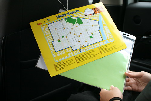
Taxi map Mapping is a favorite topic of mine, not only because I worked on locative media, but also because I find they are fascinating objects. Maps are really interesting these days as they exemplify one of the design trend I spotted recently: the transformation of non-digital objects by design techniques coming from the digital world. To some extent, lots of artifacts from the material world can be re-designed by applying insights learned when creating weird interfaces and new sorts of interactions.

This is what happens currently with paper-maps which design is reshuffled by people who grew up with video-games and on-line mapping tools, or by designers who consciously want to apply techniques coming from the digital. What is highly captivating in this context is that it also reshapes the user experience of the object at hands. Maps are a good example of such phenomena.

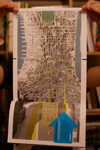
One of the most advanced project along these lines is certainly Jack Shulze's Here and There. Although I don't have the poster version, the Wired UK version will do to exemplify what it is:

Here and There

Here is the idea:

"Imagine a person standing at a street corner. The projection begins with a three-dimensional representation of the immediate environment. Close buildings are represented normally, and the viewer himself is shown in the third person, exactly where she stands. As the model bends from sideways to top-down in a smooth join, more distant parts of the city are revealed in plan view. The projection connects the viewer's local environment to remote destinations normally out of sight."

There is more on S&W's on-line web log where Schulze describes how he wanted to "exploits and expands upon the higher levels of visual literacy born of television, games, comics and print". More specifically, he wanted to tap into the satellite representation as a symbol of omniscience and the reason why a platform such as Google Earth is so compelling. The point was to have "a speculative projections of dense cities (...) intended to be seen at those same places, putting the viewer simultaneously above the city and in it where she stands, both looking down and looking forward".

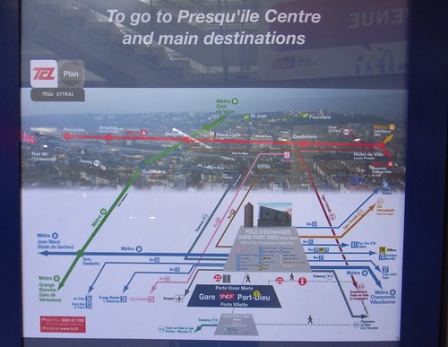
Reading this in the train yesterday made sense when few minutes after, arrived at my final destination in the city of Lyon (France), I encountered this curious map:

Horizontal Map

The map depicts the city of Lyon from the train station at the bottom (in this white area) and the city itself in the upper part of the picture. There is a lot to discuss here and I won't comment about what is not represented (can the white part be absent because it may have been perceived as not interesting for tourists?). What I find relevant there is:

  • The sort of bird eye's view, as if we were in a video game, where the landscape is represented in plan over distance
  • The color overlay that shows the subway, tram and bus lines is also curious. It basically maps the public transport infrastructure on the perspective
  • The map is fixed and located in the train station, it's only drawn for this specific viewpoint (the station) and definitely match the context of use.

Why do I blog this? trying to make some connection between online musing and urban scouting... and the map topic is highly intriguing for that matter. I am convinced there is a lot to work on to modify non-digital objects with this sort of design techniques.

See-through toilet

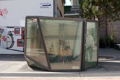
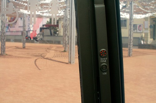
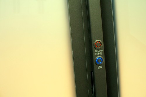
See-through toilet (3) Another item I found curious while spending time in Lausanne the the other day: a see-through toilet. Based on a steel-and-glass architecture, the toilet is based on a transparent system: when pressing the "voir" button (which means "see"), the glass gets transparent and it turns opaque when someone is inside and presses the button again. A motion sensor also turn the glass transparent if there's no motion during a certain amount of time (to prevent people from staying there for too long or in case of a problem) OR if there is TOO MUCH ACTIVITY (no party is allowed in there).

See-through toilet (1)

See-through toilet (2)

It's questioning as well to see that the button has been called "VOIR" ("see"), as most of the people who enter the toilet do not want to "see" but instead to "not be seen". My guess is that it's on purpose, to disrupt people's behavior (who would want to press a button anyway to see how to make the glass opaque).

From what I've read, the point is to find an answer the recurring problems of toilet trashing. By looking at the inside, people can have a direct overview of the toilet state. Designed by Oloom in 2008, the whole point of this is explained on their website:

"Eleven glass sides for this toilet whose walls are partly made of liquid cristal glass. Under electric tension, the glass is transparent and the toilet shows its clean and functional inside/interior: the user feels safe and sound. Out of tension, they become opaque: the place is now occupied and the users intimacy guaranteed. An innovative concept to deal with insecurity problems whilst playing with transparency."

An important feature in this design is the presence of a pine tree next to the transparent toilet. This tree has been especially chosen to be planted there because it's aimed at bringing more pleasant smell. A sort of high-tech/low tech combination.

Why do I blog this? An intriguing piece of furniture with curious combinations (the pine tree, the syringe trash can). Is this the Everyware-like city toilet of the future? I don't know but it's certainly interesting to understand more the way the glass gets transparent or opaque. The rules embedded in the system, that I described at the beginning of this post, tells us captivating insights about what is considered as normal or not in society.

Kinder eggs

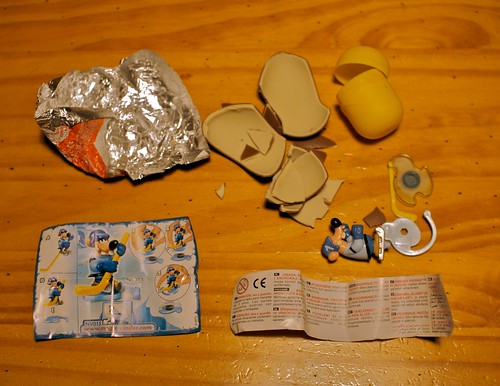
Kinder eggs Kinder eggs

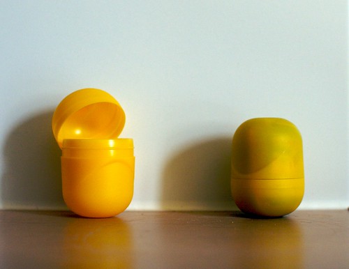
Interesting piece of packaging here with these Kinder eggs, in a sort of matryoshka twist: like a set of dolls of decreasing sizes placed one inside the other. The yolk-like yellow container, in which a little toy is compacted, is inserted in a chocolate egg.

Kinder egg gear

This piece of artifact is one of these highly intriguing carefully-designed object for several reasons:

  • The way the designers manage to create small toys than can fit into this yellow box is imaginative and fascinating. There is even a rolled piece of paper to explain how to build the toys out of the separated pieces: the smaller manual on Earth perhaps. It's also curious to see that this tiny space also have enough room for a small paper-based disclaimer in almost 10 languages.
  • The yellow container is a curious objects that can be repurposed for lots of ways (for instance as a container for small items, like coins, or for kids to tinker out weird stuff)
  • The toy series, constantly transformed and new, is also an on-going surprise (see for example people who collect them).

Does it tell us something about the future? I don't know but it certainly reveals an interesting example of design with a size constraint here, surely a curious exercise to do "more with less" (and pack it into a yolk-shaped box).

Digital close to physical

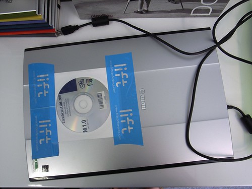
Digital+physical Seen at the office today.

When the digital (in the form of a DVD that contains drivers and software) needs to be put close to the physical (this scanner) through the magical use of duct tape. DVD like this often gets lost although they're generally needed, a quick trick to avoid losing it is to keep it close to the physical items it is related to.

The role of theory in ethnographically-informed design research

resources for phd dissertation The use of ethnographical methods in design research here and there out of academic circles brings back the question of the role of "theory", and its articulation with research methodologies and techniques. This is a recurring topic with clients, research colleagues and I've seen it popping on mailing lists such as anthrodesign.

Before jumping to the differentiation between theory and methodologies, it's important to acknowledge that there is no just "one" ethnography. The use of this term, especially in business circles, is not fair. It's as if it is was a general container to provide engineers/strategists/designers with a one-way solution for their problem at hand. An article such as "fieldwork and ethnography: a perspective from CSCW" by Harper et al. (to be found in the EPIC 2005 proceedings) gives an introduction to some of them.

"Part of the trouble has to do with the fact that the word ethnography can be used somewhat capriciously for a whole range of purposes; as a label used by some for practices to be jealously defended; a label used to give renewed vigor, even fashionability for an old trade, fieldwork; and at other times a label used to defend pointless hanging around. What ethnography is, though it clearly has some kind of character, is not at all clear"

The paper basically shows that there are different distinction based on disciplinary assumptions about methods, theories and sensibilities. The authors picked up 4 texts (Cognitive Work Analysis by Vicente, Contextual Inquiry by Beyer and Holzblatt, Designing Collaborative Systems by Crabtree, and Marcus' Ethnography through Thick and Thin) and show how they represent different viewpoints: a ‘cognitive science’ viewpoint; a ‘practical’ approach; an ethnomethodological perspective, and a postmodern alternative. They show how that each of them reflects different orientations and sensibilities and not only refer to which methods to choose and how to look at "data". The paper also suggests to use the term "field work" instead than "ethnography" since the former is better suited to the activity carried out in design research.

Who are the protagonists at stake here? Let's say that we can distinguish 3 components:

  • Theories of science analyze the condition of production of knowledge from a philosophical viewpoint. Example: positivist view (authentic knowledge is that based on actual sense experience), more critical approach
  • . Then, there are finer-scaled theories that act as subset of the general theories of science: Chomsky's Generative Grammar, Sperber's relevance theory of human communication, Suchman's Situated Action theory, Media theory about framing, etc.

  • Methodologies describe the general ways about how to carry out research. Based on considerations emerging from theories, methodologies propose a set of methods. Example: qualitative analysis, quantitative analysis
  • Methods that are general ways to study a class of phenomena, based on theoretical tools (how about how articulate data and theories) and techniques (recipes to acquire, transform, analyze data).

In the context of design research, the situation is a bit more specific given that it corresponds to (1) a qualitative and, generally, (2) an inductive model of research. It's qualitative as it tries to uncover cases that can be selected according to whether they typify (or not), specific characteristics or contextual locations. It's also generally inductive because general principles (yes, theories) can be developed from specific observations (as opposed to other forms of research which are based on hypothesis-testing). I tried to list the link between empirical research and theories in this context:

  • Certain theories can frame the research and give an idea of what one is trying to achieve and look for. Or, as formulated by Harper et al.:"disciplinary ‘sensibilities’ may allow us to produce a set of broad, ‘sensitising’ or ‘illuminating’ concepts, starting points that can serve as reminders that some kinds of thing are often to be found whilst not diverting us from our equally powerful interest in what is uniquely ‘situated’ about what we are studying. In short, provide us with a ‘way of looking’". What it means is that it allows to efficiently synthesize, interpret and sort out insights. In sum, it orients the research.
  • The goal of this research is to generate a theory, Beyond describing and exploring the context at hand, it's also to articulate principles or more general notions or rules, and understand a culture based on certain aspects. To some extent, building a theory can be a research goal.

Of course, this is a quick summary and there is more to it. This is all and good but people interested by design research may want to know more about what theories or theoretical spin they might want to employ. Ranging from Ethnomethodology to Interactionism or Grounded Theory and Activity Theory, there is plenty of possibilities here and I won't enter into much details in this blogpost.

What is interesting is perhaps the discussion about which sort of theoretical twist are employed in "design research". In HCI and CSCW, which have a strong ethnographically-informed design approach, it seems that ethnomethodology is very common and french ergonomics is all about Activity Theory (and modified versions). Other approach this without any reference to theories, such as Jan Chipchase's work at Nokia Design which is fairly descriptive and exploratory. Again, as I stated above, there is no "one way" here, the important thing is to find the method the researcher is comfortable with in conjunction with he/she and the design team think is relevant for the time being. On my side, I do think that an approach such as "Grounded Theory" by Strauss and Corbin is pertinent and flexible enough for design research.

Tools to analyze weak signals

Spent last friday in Zürich presenting the Lift screening process and trend analysis with Holm Friebe's class at the Design Hochschule. The morning was about the Lift Conference, more specifically about our process to scout for speakers and ideas, to set a theme and work it out. The message was that the wide range of signals (ideas, memes, "trends", technologies, social phenomena, scientific discoveries, etc.) and inscriptions (books, magazine, blogposts, articles, academic papers) is scanned and filtered through different criteria: preference towards social implications than technologies for the sake of technologies, avoidance of technological determinism (as much as we can), stepping a bit from terms that are too *hip* (such as "web2.0"), etc. In the afternoon, we took some time to discuss different tools to filter the signals and forms of change. The tools are actually quite common and stem from the mix of methods we encountered in our work/readings/studies and meetings with lots of people. Most of the conversation addressed the use of s-curve, coming from diffusion theories of innovation. It shows how adoption is slow at first (depicted by a flat curve at the beginning of the time period) till a tipping point (the steep curve mid-way) and a plateau. This last phase corresponds to the adoption of the technology by adopters (which does not correspond to everyone on earth). To put it shortly, the s-curve is a way to represent the number of people who adopt a technology over a particular time period. As C. Christensen puts it, "it states that in a technology’s early stages, the rate of progress in performance is relatively slow. As the technology becomes better understood, controlled, and diffused, the rate of technological improvement increases . But the theory posits that in its mature stages, the technology will asymptotically approach a natural or physical limit, which requires that ever greater periods of time or inputs of engineering effort be expended to achieve increments of performance improvement"
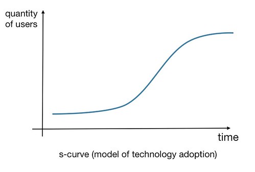
Tool for discussion

Of course, we should distinguish the different ways to use s-curves. You have the sociological use where you draw the s-curve with real-data of technology adoption (as described in here). But you also have a more metaphorical use of the curve, which is the one we discussed in the course. Using a s-curve in this context is relevant to structure the discussion about where an innovation (technology, social change, etc.) stands at a certain moment in time, where it came from and where it might be in the future.

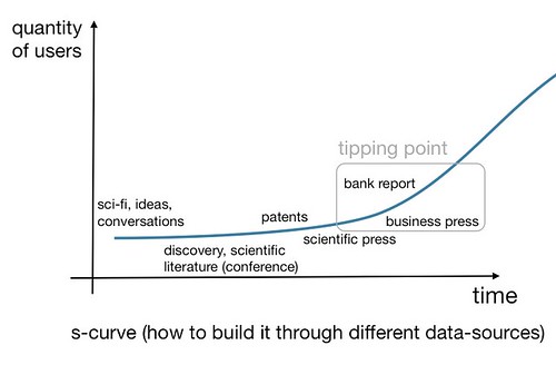
A good way to start drawing an s-curve, in the context of such discussion, is to look at different information sources: you can for example map data points depending on the information source represented on the following figure:
Tool for discussion

Tool for discussion

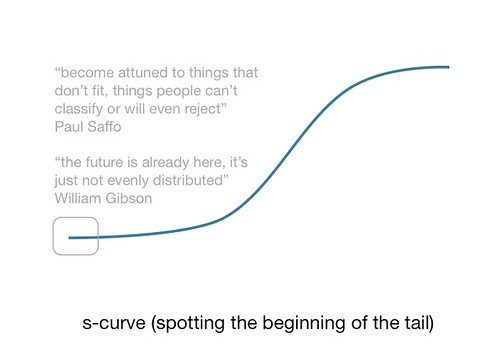
As one can see on the two figure above, there are two important points in s-curves:

  • The beginning: that I exemplify through these 2 quotes by Paul Saffo and William Gibson. They simply show that s-curves' beginning are already here and the point is to spot them through different data sources (be they readings, field studies or always-on attitude.
  • The tipping point: the moment in time when the rate of adoption increases, which depends both on technological improvements and, above all, on "contextual" issues such as " the active participation of all those who have decided to develop it" (see Bruno Latour's work about the "model of interessement"). On a methodological note here, I would say that the use of s-curve in conjunction with Latour's work may be a bit flawed. Will need to think this through later on.

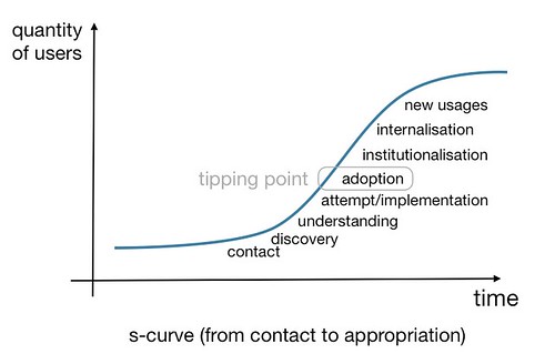
Another way to see an s-curve and to discuss how to apply it to a certain innovation is to adopt a people/user/market viewpoint:
Tool for discussion

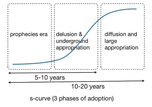
This standpoint can also be summarized by these three phases of idea/meme/technology adoption (based on Scardigli's work):

  1. Phase 1: The “time of prophecy and fantasy” (enthusiastic or terrifying) where revolutions are predicted and technique is “inserted socially” (right after invention and R&D). It correlates with a discourse around the hopes and fears linked to these issues which are recurring in history. What happen is that fantasy, scientific knowledge and actions are intertwined and even the weakest signal is turned into an excessive hope or fear. Prophecies become necessities and then self-justificated. Some example: "3D web platforms like Second Life will change the Web forever", "Mobile social software will be a revolution", etc.
  2. Phase 2: The “delusion phase” that suggest how the expected technological revolution does not lead to a social revolution. Or, when we realize that there is a gap between forecasts and realizations/effects. At the same time, some people start appropriating, adapting, using the idea/meme/technology differently. This is generally less publicized as the press thinks that the "innovation is a fad" and it's not worth talking about it.
  3. Phase 3: “the side-effect phase”: 20 or 40 years after, the real diffusion of the technique is effective and some social and more long term consequences appear but often different from the one expected at first. This is what happened with the video-phone, it never really worked as a independent box at home but people are now using it on their laptop through Skype; and it allows interesting new social dynamics and usages.
Tool for discussion

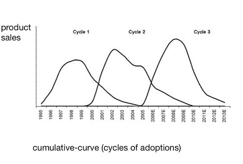
Of course, back to the evolution of technologies, you can also take a "sales" viewpoint: if you look at the rates of acquisition/sales instead of the adoption. For each product, you then this sort of succession of curves that represents cycles of adoption (video game consoles in this case):
Tool for discussion

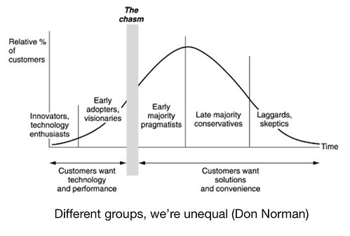
Finally, we also discussed the importance to consider the large diversity of human behavior, which was depicted by this well-known Bell curve that I've taken from a book by Don Norman (who actually took it from G. Moore's book "Crossing the chasm").
Tool for discussion

What we can draw from this curve is that:

  • There is diversity, not juste "one normal human"
  • People who are at the beginning of s-curves are the early adopters.
  • You can be an early adopter for a certain topic (iphones) and a conservative person for others.
  • Besides, this curve also relates to the previous representations in the sense that the s-curve can be seen as being made up a series of 'bell curves' of different sections of a population adopting different versions of a certain product

Why do I blog this? trying to formalize a bit the tools we used the other day is interesting as it forces to describe why and how they're relevant. It's important to point out, though, that these tools are definitely not a perfect algorithm/process to give you the answer about “how a signal would evolve into a fad or a success". Instead, they should be seen as a a way to structure the discussion of signals and topics we collect. Which is why I smiled when, few streets ahead in Zürich, I stumbled across the name of this company:
systematic absolute return

Thanks Holm for the opportunity!

Johanna Brewer about ethnography and design

Johanna Brewer at LDM/EPFL Back to EPFL today for a lecture by Johanna Brewer about "What can ethnography do for technology?". She basically presented how ethnography, as a methodological strategy, is relevant for design in the context of her PhD projects. Johanna did her PhD with Paul Dourish at UCI Irvine and she recently launched a new start-up called frestyl (in the mobile/web music business).

After a brief introduction of *what is ethnography*, she showed how Human-Computer Interaction, initially based in Computer Science, evolved to include cognitive psycho concepts with a quantitative understanding of how humans interact with technology. Researchers recognized that this approach, though fruitful for certain purposes, could be complemented by others, such as ethnography. Which is *Ethnography met HCI*: as technology has become ubiquitous, multi-purpose, embedded, social, there was trend to move beyond lab-based studies of individuals and instead understand social use of technology. The point was then to leverage ethnographic techniques to seek inspiration for new designs. This quick summary was interesting but I think it partly ignores the use of ethnographically-inspired method in the broader context of design (that happened in parallel).

Johanna then summarized what *ethnography can do for HCI*:

  1. broadening the notions of requirements gathering
  2. understanding social context of service increases chances of adoption (rather than just the use of technology)
  3. creating new engaging experiences (things that move beyond practices people are already doing, push the envelope, push the boundaries)
  4. inspired by real-world social interaction

In human-computer interaction, the way ethnography is employed is different than its earlier roots in anthropology: field study is shorter (week-long rather than year-long but the rationale is that one day is better than no days at all!), there is a deep/narrow focus on particular setting (what's like to ride the public transport in lausanne?), study of target users, with an eye towards technology design, not just understanding culture for the sake of it. Which led her to delineate two scopes: "open-ended, exploratory, revolutionary" versus "target, tailored, techno-centric" (look at a particular setting, or at particular features to be changed).

A big part of the presentation was then a description of the different techniques, which she categorized in two clusters:

  • Traditional methods: participant observation (and the importance of taking personal field notes), photography, video, interviews
  • Innovative methods: defamiliarization (looking at your culture with fresh eyes), people shadowing (following a person (often with consent), documenting their actions, in-situ discussions, ask "stupid" things: Why did you push that button here?), object shadowing (following things instead of people, like newspaper dropped on the tube in London), disrupting and intervention (shaking up a social situation and observing the result), cultural and technological probes (low-fi/hi-fi design interventions: exploring people's reactions, probe a situation, once you have designed something)

After a brief description of the analysis part (documentation is analyzed through coding: looking for common themes in data), she presented the existence of various outcomes: a plan for follow-up ethnographic study (as it allowed to ask more questions), general guidelines for futures technologies, concept design, implementation of prototype, fully realized product. And all of this can take a large range of format: written document, video, photographic essay, design response/prototype to demonstrate ethnographic work.

She then showed various examples taken from her work. I enjoyed the part about how she chose the sample group for her interviews.

(undersound is one of the project that emerged from Johanna and her colleagues' ethnographic research)

She used what she called "theoretical sampling": chose a theoretically interesting sample of people (rather than statistically representative) who are interested by the experience of the context she was exploring (the tube). I was also intrigued by how she looked for inspiration for design, not guidelines, something that I was not surprised of given that this was the reason why I invited her PhD advisor to Lift last year. Her point was that ethnography can give an impetus that what you design is culturally relevant as it roots your design in cultural underpinnings "when you go to a place and talk to people, you design sth that is relevant for them (and it also makes them appreciate what you do)".

Why do I blog this an interesting overview that is certainly useful as I am preparing a course about these issues for next year's class at the design school in Geneva.

Original design thinking approach for researching RFID

Designing with RFID by Einar Sneve Martinussen and Timo Arnall (presented at Tangible & Embedded Interaction 2009) is an highly interesting read if you're into alternative visions to the internet of things. Based on what the authors call "a practice-driven design approach", through sketching, making and form-explorations, they explore the possibilities for richer design of RFID products in everyday contexts.

However, I was even more interested by the design methodologies proposed in the paper. The way the articulate different techniques, such as sketching, modeling, form exploration or evaluation, is original and curious. What is relevant to me is the clear definition of a purpose ("to gain a rich working knowledge of the kinds of design qualities that RFID objects may embody") and the way they proposed different investigation phases:

"product review (...) To understand the ways that RFID tags have been designed into consumer products, we conducted an extensive product review that documents many RFID products from around the world. This has been a process of reflection on existing industrial and consumer products. (...) design experiment that focuses on form and expression rather than specific applications or technical infrastructures. (...) Through a sketching process we developed an understanding of the relationships between physical forms and tags. Form-explorations were then used to visualise findings, to generate further models and to examine surface qualities. (...) The experiments were carried out and evaluated by a group of designers with diverse design skills: including model making, software programming, electronics hardware and digital 3D design. Subsequent iterations were informed by design evaluation and through teaching (...) Sketching is used as an analytic tool, to evaluate, not just for idea generation. (...) digital 3D modeling (...) act as a way of lifting the findings out of rough sketching and experimenting stage and towards a generalisation of the research. They effectively communicate the physical aspects of the design findings and help us to evaluate and refine a vocabulary of forms. (...) In industrial design the approaches to physical objects has included aesthetic taxonomies of form18 that codify various elements and properties of primitives such as geometry, orientation, symmetry, spatial matrices, forces and relationships between forms as well as intention and expression. Through introducing RFID as an element into this approach, we begin to design an inspirational or generative set of forms for RFID- enabled objects. (...) [it] helped to understand the fundamental properties that determine how RFID object could be used and designed."

Why do I blog this? It's been a long time that this pdf sits on my desktop. Knowing Timo and Einar's work I was intrigued by both the topic AND the methodological approach. The two aspects of it are important but it was even more important to see how they exemplify an interesting approach to design research. Besides, such a description is rarely seen.

Surely some good material for my courses, and an opportunity to rethink about how to articulate user research can be included in such a process.

Testing the Nintendo DSi

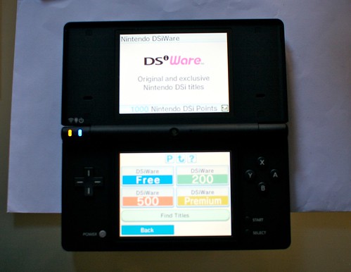
Nintendo DSi Recently acquired a Nintendo DSi. Although I have a DS for sometime, I wanted to see how the user experience could be reshuffled through the new features provided by Nintendo.

The first interesting change is that you can download games from DSi ware virtual shop. Simply put, there's no game sold with the console! You plug in the interwebs, see what you can buy with 1000 points and download it onto the internal drive of the DSi. It takes a short amount of time that you spend watching a bunch of Nintendo characters who race to fill box with blue liquid (which means that the game download is complete). Fortunately, this time, the web browser (Opera) is free. What this means is that part of the software is dematerialized (no cartridges).

Nintendo DSi

Another important addition consists in the two cameras that allow you to take photos with eleven different lenses and exchange photos with other Nintendo DSi systems. The basic piece of software enables the user to manipulate content in very basic ways (stretch a photo, add moustaches...) and create new game mechanics (as in the Wario Ware game you can buy with your 5000 points). Of course the quality is so-so but I am more intrigued by how basic games could be implemented on top of that, than using the DSi to replace my camera.

Perhaps the most striking change lies in the small improvements and variety of usage allowed by the new features: web integration/access is very interesting and it turns the console into a platform to do other things than gaming. I actually used it last week in our Lift weekly meeting to access Google docs. The whole user experience is improved through very simple UI transformations. It's interesting to observe how dealing with memory issues on the DSi has changed: you have virtual "slots" where you can download applications from DSi ware and the addition of an SD card slot is also a good move to enable the use of external content.

On the minus side though, the loss of the GBA cartridge slot (then no weird add-on!) and the "yet another new power adapter" is again an issue. Moreover, it's not possible (so far) to read MP3 because they wanted to support the AAC music format; I know it allows you to alter the pitch and speed but I don't have anything in this format (yet).

Why do I blog this? as a user experience research intrigued by mobile technologies, the DSi is an highly curious piece with good things ahead. For two reasons:

  1. it's not longer a device uniquely devoted to gameplay: users can be engaged in web-based interactions, play with pictures and sounds and I am pretty sure there will be improvements and tools to build sth around them.
  2. it also disrupts the mobile gaming experience: playing with cameras or material from SD cards is perhaps more common after seeing games on cell-phones but it's still a good step for the video game console designers. For instance, Wario Ware micro-games with the camera are very curious (although a tad difficul depending on the light conditions). Furthermore, It seems to me that the social component will also be a hot topic using different contextes (colocated versus distant play).