Design

Wave your hand sign

This icon is used in danish trains to tell people that they can wave their hand in front of a sensor so that doors could be opened:

Interestingly, in other countries like Switzerland there are no signs, people just learn how this work and eventually wave their hand.

Social software about things

Not really concerned by the web2.0 frenziness, I still have a look at all these social software that pops up everyday. Recently, two of them caught my interest: Mythings and Wakoopa (what a name!). Let' start with the former:

"MyThings is, an online service that helps keep track of belongings—when and where they were bought, for how much, the services provided with them, and their value. We offer useful services and deals, such as valuations, accessories, warranties, lost and found, and product updates and information. Why catalog your things online? For many reasons! Perhaps you want one safe place to house all those details—you know, the random receipts and warranties you’ve stuffed in a shoebox or in that famous junk drawer. Or maybe you want to better manage your things—like when you need to upgrade or replace certain items, see what’s missing in your favorite collection, or time which wines to drink within the year. Or perhaps you want to know how much your cache of valuables is really worth. It can be any of these things but the point is with MyThings, you can have peace of mind because it is safe and secure and can be accessed anytime, from anywhere.

So what’s in it for us? We think that as consumers we’re bombarded with product and services information. But we also know manufacturers, retailers, and other sellers want to offer a better way to provide their services to you. With MyThings we provide that option based on your preferences. We can all appreciate when the right offer or information comes to us at the right time—such as rebate information when you trade in your old MP3 player for the latest model.Or how about when an auction house has an interesting sale coming up of 1960s comic books? Even when someone is ready to sell their porcelain pug dog collection. You get the idea.

MyThings is an infomediary, a trusted third-party between buyers and sellers."

As a side note, this is very close to the "my space of things" we discussed last year at the 2nd blogject workshop (and in my talk with Julian at Reboot 2006).

The latter has a similar purpose, except that it focuses on "digital artifacts", i.e. software.

"Wakoopa tracks what kind of software or games you use, and lets you create your own software profile. Ready for you to share with the world. Why? Because what you use on your desktop is who you are.

With Wakoopa you know what software you've been using, and how long you've been using it. But you also get updated when a new version comes out, or somebody writes a review about your software. Wakoopa allows you to share your software usage and your opinions about software. Just invite your friends to view your profile, or put a widget on your own site. If you still don't know what anti-virus program to use, or what games to play, then just look in our database. We know what the cool kids use! Browse by tag or category, it's all there."

Why do I blog this? an interesting link here between social software that focuses on things, digital or physical. don't know whether this will take off but that's an intriguing attempt.

(Tap) Interface of the day

Encountered this morning in France, at the train station in Lyon: Tap ergonomics

It' been a while that the tap was not delivering water. Instead of putting a warning sign about this, some folks preferred to add a piece of steel to cover the sink... What a great affordance.

Food artifacts form the 21st century

Curious objects from today (tomorrow?) that I ran across lately: Candyfab (via, which is a home-built 3D sugar fabricator. It basically allows to 3D print objects out of pure sugar.

Gastrobots (robots with a stomach) like Chew Chew (a food-powered robot in the form of a little train). The idea here is to power a robot through the digestion of food making it eventually self-sufficient when operating in a self-sufficient natural outdoor environment.

Definitely not relationships between them (apart from the fact that the common thread here is food)

Marginal practices and design

Finally got some time to read what inspired the Glowbot project blogged about recently: Ljungblad, S. and Holmquist, L.E. (2007). Transfer Scenarios: Grounded Innovation with Marginal Practices. In Proceedings of CHI 2007, ACM Conference on Human Factors in Computing Systems, 28 April - 3 May, 2007, San Jose, California, USA.

In this paper, the authors interestingly describes a method they called "Transfer scenarios" that aims at "helping designers to come up with inventive ideas, and at the same time provide grounding in real human needs". The point is to look at "marginal practice" (in their examples having unusual pets, such as snakes and spiders) not to regard the persons involved as "end users" but instead as a way to understand underlying human interests and qualities of interaction, relevant for the design outcome.

Some excerpts I found relevant:

"We define a marginal practice as individuals sharing a specific activity that they consider meaningful. The marginal practice should consist of people that do not reflect the majority of end-users and may even be a group of people that are unlikely to be end-users of our proposed systems. The point is that such a practice can provide a new perspective on the use of the technology, raising design ideas that are based on alternative viewpoints and ways of doing things. A practice that is considered meaningful for a minor group, can still involve underlying needs that a more general group can benefit from."

The authors then proposes a 5-steps process:

"1. Learn about the technolog.y This step involves exploring and learning about the general properties of the technology. (...) The goal is to get an overview of the possibilities and limitations of the technology, rather than to get a deep technical knowledge.

2. Match the technology with a marginal practice. Another important step is to investigate potential marginal practices and decide for one.

3. Investigate needs and interactions. The third step involves investigating the human activities in the chosen marginal practice.

4. Analyze and Transfer Data to Initial Design. This step is about analyzing data, such as transcribed interviews or videos, to transfer the findings into design.

5. Detailed Design and Technology development (...) actual design of the technology, involving intended users."

Why do I blog this? because I have often felt that marginal practices are of interest because they involve passionate users about certain domains and areas. It makes me think of a book I've read recently called "Choosing Death: The Improbable History of Death Metal and Grindcore" (Albert Mudrian, John Peel), which should definitely worth to have a look for people in the music industry. I think the book is a good exemplification of a marginal practice (early 80s, people wanted to play music as speed as possible with extreme vocals) and the underlying motivations that enable it. Back to interaction design, I also like process as the one they presented.
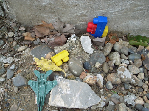
Stoned toys

Why the picture here? absolutely not part of their article but it's definitely my own marginal practice: taking pictures weird things such as plastic artifacts and toys in awkward contexts.

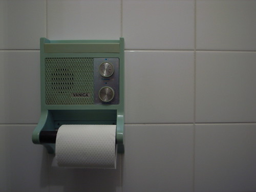
Vanica toilet radio

device from the past One of the mysterious encounter of this week in Amsterdam was this truly nice radio mounted on a toilet paper-roll, designed by Vanica.

Why toilet+radio? According to Zyra:

"Advantages: You are entertained when using the toilet. You learn a lot of snippets of knowledge at random. Learning is automatic and without commitment in an environment usually devoid of intellectual sound. You can always tell if someone else is using the toilet even if they do not lock the door and do not whistle, as you can hear the radio. After the installation of the toilet radio, everyone remembers to shut the toilet lid after use (because no-one is so careless that they'll wastefully leave the radio on!) As you use the toilet at night sometimes, you get to hear unexpected items on nighttime radio. Makes good humour in relation to something considered taboo. Visitors make comment on the ingenuity and comedy value of the toilet radio arrangement.

Disandvantages: (none)"

Why do I blog this? certainly an intriguing combination of artifacts, nice to observe and worth a try. This encouragement to stay in this 4th place (i.e. toilet) was however contradicted by an automatic shut-off light system that obliged to wave my hands above my head (where the motion detector was located). What an experience only to keep listening to radio programs.

Mediamatic slides

Here are my slides from the serie of talk I made at Hybrid World Lab workshop (Mediamatic, Amsterdam), careful, big PDFs over there: An Overview of Hybridized digital-physical worlds: a global picture of the existing or speculative projects regarding the hybridization of the virtual and the physical CatchBob! What we learnt from building a pervasive game , that describes some lessons we learnt from the CatchBob! project carried out with Fabien Girardin and Pierre Dillenbourg (my phd dissertation actually). What about the tools? An overview of locative systems, which a sort of primer on locative technologies and their design issues. The User Experience of Location-Awareness , a talk that I've already done at Geoware last month, that I though would be good for the Mediamatic audience: the problem of mobile social software as well as opportunities for the future. 7+/-2 ideas for developing hybridized worlds user scenarios, that describes what I - as a user experience researcher - expect from a scenario about product/services.

R0011667

Notes about the workshop later. Also, Timo's slides are very worthwile.

Some quotes from the Mediamatic workshop

Impossible to give a complete picture of the Hybrid World Lab workshop (let's wait to digest stuff and come up with a more articulate summary afterwards). Some bits and pieces, in the form of quotes:

"GPS removed me from my surroundings" Timo Arnall

"from our perspective, I think it's impossible to study how people use the city using technologies like BT, it's a flawed question, how can you know how they use the city? you just follow where they are" Giles Lane

"graffiti, stickers as user generated content in the city" Timo Arnall

"we have to be careful when we design. The user, who is this mythical person?" Giles Lane

"picking up information through visual tags on a cell phone feels like picking up rubbish from the streets" Timo Arnall

"we are ill equipped to deal with urban screens and analyze them" Avah Fatah gen. Schiek

(picture taken by myself of a the nice material we have here)

Asynchronous gaming based on purchases?

(via), World of Warcraft Rewards VISA:

"Earn gametime with card purchase: Accrue World of Warcraft gametime at the rate of 1% of every dollar in qualifying purchases. The World of Warcraft Rewards Visa is the only card that pays you to play.

Why do I blog this? it's a very intriguing connection between activity in the physical space. I won't comment on the socio-cultural implications but it's a clear example of asynchronous activities that are integrated in the game (purchase crap during the day, observe some output/effects back home when you play on the computer.

What's the next step? turn your VISA records into a game? a sort of passive gaming.

Peripheral awareness of gossips

Exploring Passive Social Wearables with Gossip is a paper written by Eric Gilbert, Matthew Yapchaian and Karrie Karahalios for the CHI2007 workshop "Shared Encounters". The application they describe is a wearable speech interface that take advantage of gossips and display them as a "social awareness":

"People gossip constantly: at the office, over the fence, within families and at happy hour. Consequently, gossip is the spoken script for most face-to-face encounters. (...) Our system, known as Gossip, reacts to users’ everyday talk by displaying a word from the conversation on the wearer’s clothing. We present our system concept and a specific case study involving low-fidelity prototyping sessions. "

They did a wizard-of-oz study to see, some of the verbalizations from the users:

"“I thought they would be distracting, but they weren't. It was funny seeing words that had come up in our conversation.” (...) “It gave me an idea of what I was talking about! Even when I wasn't going to focus on a special subject those words reminded me to get back to that subject.”"

Why do I blog this? reminds me of a project carried out by researchers at the lab I worked previously: Reflect is a noise-sensitive table that displays turn-taking patterns when students work collaboratively (a peripheral perception of the group verbal interaction or on individual contributions represented as lights). Both projects aims at augmenting interactions: the former with semantics, the latter with occurrences of talk.

Smart houses that are not so smart and then should be smart in another way

Reconfigurable House is a stimulating project by Adam Somlai-Fischer, Usman Haque et al.:

"The Reconfigurable House is an environment constructed from thousands of low tech components that can be "rewired" by visitors. The project is a critique of ubiquitous computing "smart homes", which are based on the idea that technology should be invisible to prevent DIY. Smart homes actually aren't very smart simply because they are pre-wired according to algorithms and decisions made by designers of the systems, rather than the people who occupy the houses.

In contrast to such homes, which are not able to adapt structurally over time, the many sensors and actuators of Reconfigurable House can be reconnected endlessly as people change their minds so that the House can take on completely new behaviours. (...) And if the House is left alone for too long, it gets bored, daydreams and reconfigures itself.... "

Why do I blog this? because I like both the project and the underlying ideas that support it. The concept of intelligent "smart environments" often gave me the creeps for various reasons, maybe because of my background in psychology.

Lots of material on the website + videos.

interactive cities

Anomos and Hyx recently edited an interesting book called "interactive cities" about the ways in which the digital domain impacts the contemporary cities.

"In the field of urban planning, there has been much debate about the information and intelligence society and its flourishing potential. Discussion is gradually veering away from the idea of modeling all the components involved in a given project, as a means of managing the complexity of sustainable development. Instead, current initiatives call on continuous, distributed and dynamic methods to ensure consistency among the environmental, economic and social dimensions.

Interactive Cities contributes to this debate with over a dozen articles by various recognized authors. Researchers, urban planners and historians present their approaches to understanding interactive cities, endowed with invisible digital infrastructures and thriving at accelerated metabolic rates. Dominique Rouillard, Denise Pumain, Laurent Perrin, Carlo Ratti and Daniel Berry, David Gerber, Gerhard Schmitt, Jeffrey Huang and Muriel Waldvogel, Ted Ngai and Philippe Morel"

Why do I blog this? curiosity towards a book I've to find.

Different levels of interactivity in user-generated content

Working on a presentation about user-generated content and video-games, I found interesting how Jef's talk addressed the different levels of granularity when thinking about "open design". Depending on the interactivity given to the end-user, this white paper from Think Studio discriminates:

"- Passive consumption: The user is getting products or services with no real interaction and no real choice. He or she has to take whatever is available. - Self Service: The user is given the ability to choose between various products or services. - DIY: Do It Yourself: The user starts getting involved in the value chain. - Co-design: The user starts adding value by customizing the product and therefore defining his or her needs himself (as opposed to buying a product defined by the product management team). - Co-creation: The user is involved in the design of the product or service itself."

Why do I blog this? Player-generated content is an interesting issue for the video-game industry. Although I could not make it to the GDC, Amy Jo Kim's slides are quite revealing for that matter.

What the categories above show is that there is a different granularity of participation that could be turned into game mechanics. It would be good to discriminate them in a more comprehensive or applicable way.

On a different note, I am quite skeptical of the "content" term in "user generated content" because it implies that what is created by people is strictly content, which is wrong. Imagine that people can also produce rules, algorithms, problems. For example, designing a Counterstrike level is not just a matter of producing content, it's also creating a problem that people will be engaged in, with specific constraints (okay my example is maybe wrong because in this case the problem created is a by-product of the level designed).

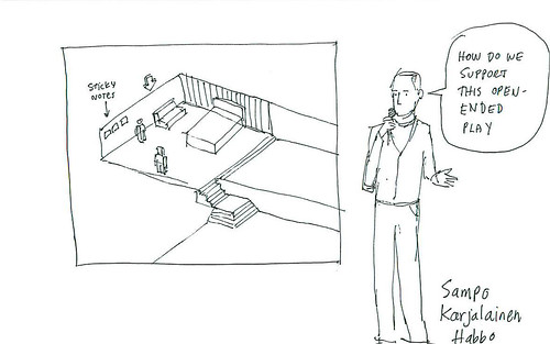
The picture is taken from Dave Gray's drawings made at LIFT07, it shows Sampo Karjalainen from Sulake (Habbo Hotel) who was talking about this topic.

Googie architecture

Googie architecture, according to the Wikipedia:

"Googie, also known as populuxe or doo-wop, is a subdivision of expressionist, or futurist architecture influenced by car culture and the Space Age and Atomic Age, originating from southern California in the late 1940s and continuing approximately into the mid-1960s. With upswept roofs and, often, curvaceous, geometric shapes, and bold use of glass, steel and neon, it decorated many a motel, coffee house and bowling alley in the 1950s and 1960s. It epitomizes the spirit a generation demanded, looking excitedly towards a bright, technological and futuristic age. (...) Cantilevered structures, acute angles, illuminated plastic panelling, freeform boomerang and artist's palette shapes and cutouts, and tailfins on buildings marked Googie architecture (...) Roofs sloping at an upward angle - This is the one particular element in which architects were really showing off, and also creating a unique structure. Starbursts - Starbursts are an ornament that goes hand in hand with the Googie style, showing its Space Age and whimsical influences "

(Images taken from spaceage city) Why do I blog this? curiosity

Ironies of automation

Some excerpts I like from Ironies of Automation by Lisanne Bainbridge:

"The classic aim of automation is to replace human manual control, planning and problem solving by automatic devices and computers. However, as Bibby and colleagues (1975) point out : "even highly automated systems. such as electric power networks, need human beings for supervision, adjustment, maintenance, expansion and improvement. Therefore one can draw the paradoxical conclusion that automated systems still are man-machine systems, for which both technical and human factors are important." This paper suggests that the increased interest in human factors among engineers reflects the irony that the more advanced a control system is, so the more crucial may be the contribution of the human operator. (...) We know from many 'vigilance' studies (Mackworth. 1950) that it is impossible for even a highly motivated human being to maintain effective visual attention towards a source of information on which very little happens, for more than about half an hour. This means that it is humanly impossible to carry out the basic function of monitoring for unlikely abnormalities, which therefore has to be done by an automatic alarm system connected to sound signals. (...) This raises the question of who notices when the alarm system is not working properly. "

Why do I blog this? there is a lot more to draw from this paper but I was interested in these two parts because it raises intriguing problems. Automating something (i.e. delegating a function to an artifact, the rationale of design) is not simple and can foster incredible situations.

The intricate nature of city components

An excerpt from Jane Jacobs' "The Death and Life of Great American Cities":

"Intricate mingling of different uses in cities are not a form of chaos. On the contrary, they represent a complex and highly developed form of order. (...) Let us first consider that diversity looks ugly. (...) But this belief implies something else. It implies that city diversity of uses is inherently messy in appearance; and it also implies that places stamped with homogeneity of uses looks better. (...) If the sameness of use is shown candidly for what it is - sameness - it looks monotonous. Superficially, this monotony might be thought as a sort of order, however dull. But esthetically, it unfortunately also carries with it a deep disorder: the disorder of conveying no direction."

colored material

The picture above has been taken in a familiar area of Geneva. While it does not really depict a "mixture of use" as described by Jane Jacobs, I found it was a good candidate to represent heterogeneity in a city. The two building it shows are different and the junction between them is not seamless.

Why do I blog this? this is space in itself, a sort of heterogeneous continuum with seams (I also mentioned holes a while ago). The quote from Jacobs is interesting because it explains the advantage of diversity: it creates an identity that eventually enable people to find their way in cities (and memorize places).

What does that mean in terms of design and ubiquitous computing? Well, first of all, this situation ought to be taken into account in the design itself: certain systems or artifacts may work differently depending on the space people are located. Second, seams, flaws, holes and stuff can be taken into account, this is called "seamful design". People interested in this might have a look at Chalmers, M. & Galani, A. (2004): Seamful Interweaving: heterogeneity in the theory and design of interactive systems. In: Proceedings of ACM conference on designing interactive systems DIS 2004. ACM, New York, pp 243–252.

Seamlessness and duct tape

Read in "Everyware: The Dawning Age of Ubiquitous Computing" (Adam Greenfield):

"The infrastructure supporting the user's experience is deeply heterogeneous, and, at least in contemporary, real-world systems, frequently enough held together by the digital equivalent of duct tape and chewing gum. (...) any attempt to provide the user with a continuous experience must somehow paper over these circumstances"

Fixed stuff with tape (2)

This discussion of flaws about seamlessness in technological development is of considerable importance. Beyond Gilles Deleuze notion of "espace strié" (striated space), the assumption in ubicomp that infrastructure are and will be seamless often leave aside failing infrastructures, the accumulation of different norms, the tweaking people do on tech and stuff like that. The picture has been taken in Nice, France and shows how a traffic light has been fixed with duct tape so that the wiring does not fall apart (and eventually not get wet by possible rain or trashed by some wandering moron).

Modalities of access

Accesses An extraordinary layering of different modalities to access that building, either using humans (pressing a button, asking a human individual to open up the door) or non-humans (inserting a key, swiping a card vertically or inserting a card horizontally). But why? are there different level of access? different institutions behind that door? Out-of-order systems?

User experience of sound and earlids

Interaction designers, researchers and architects interested in sound and the user experience of sound in space should really have a look at Karrie Jacobs' latest column in Metropolis magazine about that topic. Analyzing how noise-cancelling headphones works out, She is making the point that although sound is a very important in her perception of the environment, it is sometimes convenient and intriguing to re-discover that very same setting with sound attenuation through a technology she describes (what a long sentence I wrote here). Some snippets:

"many people deal with the acutely intrusive nature of our sonic environment by wearing audio armor. The iPod and similar devices provide them with a controllable acoustic circumstance, one that keeps them reasonably well insulated from everyone and everything else. However, I’m an extremely late adopter— possibly the last person on earth who does not own an iPod. This is a philosophical decision: I like to be where I am. And part of being in a place is hearing it. All well and good, except the world is filling up with sonic spam: endless security announcements, cell-phone ring tones from hell, people talking about their grocery lists at a volume more suited to Il Duce from the balcony. (...) I met with two members of the Bose “noise-reduction technology group” (...) Eventually I tested the Quiet Comfort 2 headphones, somewhat bulkier than the newer model, with big cups that enclose the ear, and I marveled at how the sound of the room’s vent fans disappeared when I turned the switch on (...) I visited the Met to see an exhibition of fifteenth- century Italian art. I found myself bombarded by loud conversation, so I remembered the earplugs, still in my purse. I put them in, and not only did they cut the volume on the voices, but the colors in the paintings suddenly seemed brighter."

Why do I blog this? There is a lot to draw here, especially when you think about designing applications in an urban environment. The discussion about silence is of great interest too (the fact that it does not exist in nature on Earth, the role of religions...).

At a higher level, I find that there is a direct translation from this silence problem to activities. In a sense, designing a new type of urban computing activity puts people in a sort of parallel world, as creating silence with earlids.

Creative design and human-computer interaction

Dispelling Design as the ‘Black Art’ of CHI , Wolf TV, Rode JA, Sussman J, Kellogg WA, Proceedings of CHI 2006. The paper interestingly tackle the issue of "creative design" and differentiate it from the notion of "design" as propelled by HCI researchers. The authors' main claim is that the typical usage of design in HCI is "at best limiting and at worst flawed". The first part of the paper describes what design is not: it's not a formal model, there is a different use of prototyping ("not about punctuating the design process with the rigor of evaluation but rather about presenting the design with opportunities to analyze her work. Analysis here refers to not to user studies or formal evaluation, but to the collaborative and introspective processes of designers"). All the statements and claim of the authors are based on existing literature as well as a case study they present.

What was interesting to me is the excerpts that follows about how creative design build knowledge that is different from the one that emerged from scientific practice:

"Creative design constitutes a ‘praxis’ (i.e., rational action and reflection on decisions within the context of design activity) in pursuit of what we have called design rigor. (...) Design praxis is comprised of the following professional qualities, which overlap with each other and are necessarily entwined, contributing to an overall design culture: 1) a non-linear process of intent and discovery, 2) design judgment, which is informed by a combination of knowledge, reflection, practice and action, 3) of artifacts, and 4) the design critique (‘crit’)."

The article goes further by giving some hints about to move forward:

"To create a thriving professional practice of design within the CHI community, we need to address a number of factors. First, when discussing design, we must account for the strong relationship between intention, activity as inquiry, and judgment.

Second, ensuring design rigor requires organizational support. Projects must be set up with design as a core competency with trained designers on hand to fulfill that role

Third, we need to develop more innovative practices to facilitate shared understanding among members of multidisciplinary teams."

Why do I blog this? I am often intrigued by this discussion about the word "design" tat seems to refer to lots of things (almost as much as the word "research"). Misunderstandings are one thing but how to define design is also important IMO, especially given the context of my work. It would also be interesting to have this discussion with the different "design fields" I have discussion with (game designers, industrial designers, architects).

Coming from a cognitive sciences and HCI background, this is of tremendous importance not to reiterate the mistakes of the past about how research can fuel design.

Finally, this notion of design as a "black art" is of curious and seems also to be opaque even for designers, look at this for example.