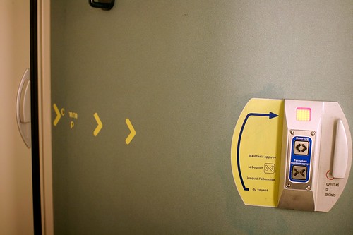
This toilet door encountered in a french train yesterday struck me as fascinating. On both side of the door (in and out the toilet), you have a remnant of the past (a door handle that has its highly efficient affordance) and a set of button (open/close). As you can imagine, most the passers-by start by turning the door handle, which fails to open the door, they then froze and realize they can press a button. The next step is that they come in and realize that a similar masquerade happens inside. What is intriguing is that when outside of the toilet, the button set is close to the door handle, which is not the case inside (hence the presence of weird yellow arrow-shaped stickers).
What happened here? The combination of two interaction styles (buttons + door handle) is stunning and detrimental to this basic interaction (opening and closing a door uh!). What's the design rational here? maybe that it's less physically demanding to press a button and wait that the door automatically closes/opens. However, and you may expect, people IN the toilet are generally anxious about how to close this god damn door. Some even try to grasp and push the handle, which does not allow to lock the door.
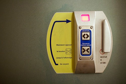
Let's have a look closer:
Besides, the button set is perhaps not the best way to interact but the presence of both is even more confusing. Weird arrows, red circles for emergency opening, what a mess!
Why do I blog this? observing how everyday basic interactions can be transformed into complex encounters with objects. And yes, I always bring my camera when I go to ANY toilets, it's an interesting place to analyze weird technological innovations.


