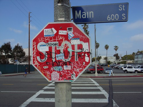
 Stickers and graffitis are now common on lots of urban surfaces. On this example found in Venice, Los Angeles, some surfaces are, interestingly, more attractive than others. Although the height of each sign is almost similar, the "stop" sign clearly receives more inscription than the street name plate. Is it because the red sign corresponds to an authoritative order (that should be regarded with mockery)? Or simply that the size of the sign is a better affordance?
Some surfaces are more attractive than others
in Urban