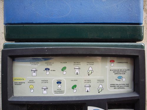
 A very simple list of touch interactions seen on the streets of Paris, France. As parking meters get more and more complex, the types of activities you can have with these devices is much more diverse. It therefore requires colors, shapes, cancel buttons and stuff. What I find intriguing here is that all the possibilities have been sketched down. A contextual manual if you will.
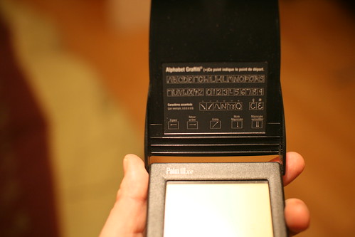
Reminds of my old Palm with its handwriting alphabet printed on the device:
The complexity of interactions with our electronic devices nevertheless leads to the issue of how to make visible (or reveal) the whole set of possibilities. Especially when it comes to gestural and touch interfaces: how to make them more self-revealing? would it be possible to design clear affordances? or, in a button-less world, how to make apparent the diversity of interactions?
