Design

William Gibson on "unanticipated impacts" of technology

Interesting insight from William Gibson in this interview:

"The strongest impacts of an emergent technology are always unanticipated. You can’t know what people are going to do until they get their hands on it and start using it on a daily basis, using it to make a buck and u­sing it for criminal purposes and all the different things that people do. The people who invented pagers, for instance, never imagined that they would change the shape of urban drug dealing all over the world. But pagers so completely changed drug dealing that they ultimately resulted in pay phones being removed from cities as part of a strategy to prevent them from becoming illicit drug markets. We’re increasingly aware that our society is driven by these unpredictable uses we find for the products of our imagination."

Why do I blog this? This is a common lesson in sociology or in history of science and technology but it's always intriguing to see it formulated by a fiction writer. What I find interesting here is the final sentence, in which Gibson argues about how our society is increasingly driven by these unanticipated uses.

Video series about Social computing by Tom Erickson

Preparing my Interaction Design course at HEAD Geneva about social computing, I received a timely email from Mads Soegaard about an highly relevant series of video about this very topic. It's actually written by Tom Erickson an interaction designer and researcher in the Social Computing Group at IBM's Watson Labs in NY.

The video is going to be public pretty soon and it's good to see a preview of this material. It basically consists in a good overview of the design and social issues at stake in social computing; a domaine that can be defined as following:

"when we speak of social computing we are concerned with how digital systems go about supporting the social interaction that is fundamental to how we live, work and play. They do this by providing communication mechanisms through which we can interact by talking and sharing information with one another, and by capturing, processing and displaying traces of our online actions and interactions that then serve as grist for further interaction."

Interestingly, videos are commented by various researchers from this field such as Elizabeth Churchill, David W. McDonald and Andrea Forte. A comment from Churchill's caught my attention as it exemplifies what I show to students and clients: the role insights coming from field research and their use in design:

"The idea of conducting field investigations that open our eyes to differences in ways of thinking and different norms for social action is not new, but it is easy to forget to look out for how our technologies are being adopted, adapted and indeed appropriated. Tom reminds us to move beyond simple characterizations of other perspectives and to field our technologies with a view to being surprised. Indeed, he suggests if we are notsurprised, perhaps we are not designing well enough. The humility of this approach is very appealing to me."

Why do I blog this? I have only watched half of the videos but they present a rich overview of Social Computing. From Slashdot to Chatroulette, from CSCW to social media, it's good to see this sort of panorama that show the evolution of this field. Especially given that it considers early projects and posit that platforms such as FB or Twitter embed traces (and design issues) already at stake 10 or 20 years go in other computing domains.

Thanks Mads for letting Pasta and Vinegar readers to access this material before the public release.

Pre-Internet of Things Objects ID

One of the current obsession consists in observing the meta-data given to things in the physical world. They're generally used to give an ID to a certain artifact (in order to performance maintenance acts) or its status. Some examples recently encountered: Power plugs at London Heathrow:

Extension chord at the local design school:

Switch at Lift Conference offices:

Why do I blog this? I use this as an example in talks/courses about innovation to show that so-called "breakthrough" (such as the Internet of Things) should be pondered... and the evolution of technology is a: - A slow movement: the idea of giving an ID to objects is not coming out from the blue, it existed before the IoT, - Technology is not the only underlying factor here: the "social" (here: a decision between a group of people to name artifacts to keep track of their status) and the "technological" (here: the thing itself as well as meta-data systems/reading devices) are closely intertwined.

Randomly juxtaposing diagrams of two everyday objects

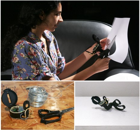
The Creatomatic by Nova Jiang:

"The Creatomatic is a piece of software designed to accelerate the imagination and prompt new inventions. It works by randomly juxtaposing diagrams of two everyday objects from a selection of hundreds. Through free association, the two objects can prompt the invention of an entirely new object, which can be practical or nonsensical. Inspired by the accidental nature of creativity, the Creatomatic uses the technique of surprise to overcome habitual ways of thinking and short circuit rational control."

Why do I blog this? I find interesting the way a piece of software can integrate such a design tactic (creating chimera).

"Practicing Theory or: Did Practice Kill Theory?" symposium

An interesting follow-up to the Swiss Design Network Julian an I attended last year is organized in Geneva on November 25 at the Geneva University of Art and Design (HEAD). It's called "Practicing Theory or: Did Practice Kill Theory?":

"The Swiss Design Network 2011 Symposium Practicing Theory aims at understanding what are the real theoretical contexts of designers practicing design research, how these theoretical backgrounds are formed, explored and broaden, and what use is made of them in the everyday practice of a research project in design. Not only will we seek to understand where from designers think, but also in what directions their research could possibly push the activity of thinking. At the end of each Paper presentation session, a round table will mix design researchers and theoreticians from various related disciplines, in order to discuss more deeply the interconnections of design research and theory."

Why do I blog this? The presentations will address the relationship between theory and practice in design research. Writing research projects related to this topic, I'm curious to see what can come up out of this.

Meerkat and Tuba: serendipitous presentation of digital content

Having a large quantity of pictures on my Flickr account, I enjoy using Photojojo time capsule, a system that send me twice a month photos from a year ago. I like this kind of almost random selection of my past appearing in my (boring) Mail app. Which is why I was intrigued by this design prototypes described in "Meerkat and Tuba: Design Alternatives for Randomness, Surprise and Serendipity in Reminiscing by John Helmes, Kenton O’Hara, Nicolas Vilar and Alex Taylor:

"People are accumulating large amounts of personal digital content that play a role in reminiscing practices. But as these collections become larger, and older content is less frequently accessed, much of this content is simply forgotten. In response to this we explore the notions of randomness and serendipity in the presentation of content from people’s digital collections. To do this we designed and deployed two devices - Meerkat and Tuba - that enable the serendipitous presentation of digital content from people’s personal media collections. Each device emphasises different characteristics of serendipity that with a view to understanding whether people interpret and value these in different ways while reminiscing."

Meerkat is aimed at exploring the notion of getting the user's attention to push content to him/her:

Unlike the previous one, Tuba requires the user to deliberately pull content of the device:

Why do I blog this? I find it interesting to see how time and asynchronous interactions can be embedded into tangible artifacts such as these two examples.

Video games with less video

Discussion with colleagues here at the design school about "screenless interaction design" led me to present some projects that I find interesting in the field. It seems that there's starting to be a cluster of projects that aim at creating playful and digital interactions with less emphasis on the visual senses. Some examples I find interesting:

SAP (for Situated Audio Platform) a "Barely Game prototype" by Russell Davies:

"The Situated Audio Platform, a browser for geotagged audio files. The idea is that it only has one button, the whole screen, which you use to switch it on, and then you never have to look at it. You can leave it in your pocket, monitoring the world for tagged files, quitely pinging, while you listen to your music. Then if it detects something, you hold it at your side and sweep the area until you home in on whatever it's found. You could browse AudioBoo with it, or get it to read geotagged wikipedia files to you. That's the useful bit.

But if you wanted to do some pretending, and some stupidness, it could turn into a social fighting game. Where the files you explore are mines and traps laid by other people and you sweep and destroy them to stay alive. All while never looking at your device."

Oterp by Antonin Fourneau (development by Kevin Lesur):

"Oterp is a mobile phone game project using a GPS sensor to manipulate music in real time, depending on the player's position on Earth. It generates new melodies when travelling. The objective of Oterp is to mix the reality of our everyday environment with a video game. This is a new way to imagine our movements in a society increasingly on the move and dependent on mobile interfaces."

Papa Sangre:

"Papa Sangre is a video game with no video. It’s a first-person thriller, done entirely in audio by an award-winning team of game designers, musicians, sound designers and developers. We’ve created an entire world using the first ever real-time 3D audio engine implemented on a handheld device. Which was BLOODY HARD."

It seems that there's a continuum based on the degree to which the user need to look at his or her own device: from no need to do this to a quick glance once in a while. Interestingly, this connects to another interest of mine: asynchronous interactions between the user and digital realms... which led me to this kind of design space (teku teku angel is a Nintendo DS game in which you have to walk with a pedometer to raise so tamagotchi-like creature):

Why do I blog this? This is just a quick note for myself about the possibilities of non-video pervasive games (what an ugly term). Food for thoughts for the laboratory!

Crosswords - QR - Game of Life

Lighweight QR code (as suggested by Paul Baron)? Game of Life (as suggested by Matt Jones)? or simply a red hand-drawn crosswords structure... as this kind of artifact fascinates me recently. I wonder if some people already thought about crosswords generated by game of life algorithms (beyond this.

Why do I blog this? I'm just mesmerized by the visual proximity between crosswords, QR codes and Game of Life rendering.

"the job of the studio is to bring our own ideas to life..."

The interview about SVK by Berg London is insightful but I was fascinated by this quote:

"I think the job of the studio is to bring our own ideas to life – that it’s something inventive, hopefully something that has some cultural importance – but mainly to have fun, make stuff y’know? When you can make that kind of thing achievable, when it gets some kind of independence from the client work so you can do it yourself, that’s really interesting."

Why do I blog this? this is exactly the sort of direction we are trying to aim at.

"Mobile 3D" projects

Currently working on a project about the user experience of 3D on mobile displays, I am fascinated by these two projects that came up in a discussion with Etienne yesterday:

Hasbro MY3D Viewer:

"Designed specifically for iPhone and iPod touch, the MY3D Viewer lets you experience 3D games and 360-degree entertainment in a brand new way. Simply insert your device into the viewer to enjoy a variety of 3D and 360-degree-enhanced apps, many of which are free from the App Store. The MY3D Viewer includes four adapter trays sized to fit iPhone and iPod touch devices. Your device quickly snaps in and out--no wires or batteries are required."

Sensor Girl, an old stereoscope customized for iPhones by Dominique Cunin. This project has been shown at Mode:Demo (Lift Experience 2010):

"SensorGirl is an artistic experimental application that aims to question the new interactive relationship a user can have with represented objects on nowadays mobile screens. Embedded sensors like accelerometers and gyroscope are opening new modalities of interaction with images : the user’s hand changes the screen physical orientation which can be used to interact with the represented object without any third party device. The screen itself and its relative state can then be directly connected to an object image, linking both in a new way that common controllers like mouse or joysticks don’t permit on usual, non-mobile screens."

Why do I blog this? I'm accumulating examples of curious experiments like this for a project and wonder about people's reactions, the design possibilities and the value of 3D in mobile context.

Funfaircomp: game interfaces

Some examples of game interfaces encountered at a fun fair in Nantes last week:

Why do I blog this? Fun fair and amusement park offer peculiar kinds of constraints for interaction design: noisy environment, presence of a crowd, cash-oriented money, balancing success and failure with regards to the reward at stake (toys, etc.) The crafting of sound user experience in this context is intriguing and lead to solutions as shown above.

It would be good to spend some time and observe more people's reactions when using these huge buttons and joysticks. That being said, fun fair interfaces and amusement parks experiences seems to be a forgotten realm in human-computer interaction. Apart from research about amusement rides, I haven't seen may occurrences of such endeavor. That can be an interesting lead for future projects.

The graphing calculator plateau

This piece in The Atlantic by Alexis Madrigal deals with an interesting case in technological evolution: the stabilization of a technical objects, which in this case in the so-called graphing calculator.

The column wonders about the reasons why graphing calculators such as TI-83 did not change that much, unlike teenager gadgets. Some explanations the article surface:

"First, for high school level math classes, the TI-83 Plus and TI-84 Plus are essentially perfect. After all, the *material* hasn't changed (much), so if the calculators were good enough for us 10 or 15 years ago, they are still good enough to solve the math problems.

Second, standardized test companies only allow a certain range of calculators to be used. If they got too powerful or complex looking (seriously, the aesthetic is part of it), they could be banned, hurting their sales. Horizontally oriented calculators have been banned by the SAT, even if they have near identical functionality to vertically oriented models. 

Third, and this is probably most important, teachers tend to recommend a particular calculator or set of calculators, and the more of their students using the same tool, the easier it is to teach them. That puts a drag on the change in tools because the technological system in which they are deployed militates against rapid change"

Which leads the author to the following conclusion:

" Some technologies don't change all that quickly because we don't need them to. Much as we like to tell the story of The World Changing So Fast, most of it doesn't. Look at cars or power plants or watches or power strips or paper clips. The changes are in the details, and they come slowly. But that's ok. More change isn't necessarily better."

Why do I blog this? An interesting example of a technical object that seemed to reach a certain plateau. An example to keep up my sleeve for my course about interaction design and technological evolution.

The promise of locative media seems to remain just that: a promise

Read in the "Rise and Fall of New Media" by Lauren Cornell and Kazys Varnelis:
Locative media remained the stuff of demos and art-technology festivals until 2008 when Apple released the GPS-enabled iPhone 3G. Paradoxically, the mass realization of locative media seems to have taken the wind out of its sails as an art form. Although courses on writing apps proliferate in art and architecture programmes, the promise of locative media seems to remain just that: a promise, its transformational ambitions forever enshrined in William Gibson’s Spook Country (2007), a novel which, tellingly, was set not in the future but in the recent past.

Why do I blog this? The quote echoes with my feeling and it's the second time this week that I encounter such comment about locative media. I actually don't know what it means about the use of this technology but I guess we'll see pretty soon how users repurpose such devices and services to their own context and interests.

Design as cultural invention

An interesting quote found in a NYT piece about Berg London:

“Historically, design has associated itself with utility and problem-solving, but we prefer the landscape of cultural invention, play and excitement,” Mr. Schulze said. “When technology is infinitely complex, and our attention increasingly finite, producing something you can act on and observe at a human and cultural level is hard.”

What are 5 things all designers should know (by Leila Takayama)

Interesting perspective by Leila Takayama on Kicker studio's weblog:

"What are 5 things all designers should know?

1. People respond to many interactive technologies in ways that they respond to people, even when they won’t admit it or can’t recognize it. (See: The Media Equation) 2. There is often a gap between how people reflectively talk about an interactive product and what they actually do in the moment of interacting with that product. Know which of those matters to you. 3. What is perceived can be more important what is objectively true when it comes to how people embrace and engage with interactive objects. 4. It really does not take much for an interactive product to seem like it has its own agency and apparent intentions. (See: Heider & Simmel demonstrations) 5. Under promise and over deliver on user expectations."

Why do I blog this? Simply because it's an informal summary of various points that echo with my perspective.

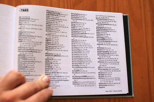
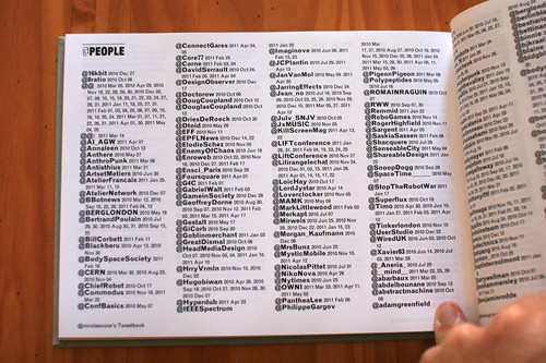
Tweetbook: express auto-biography print-on-demand

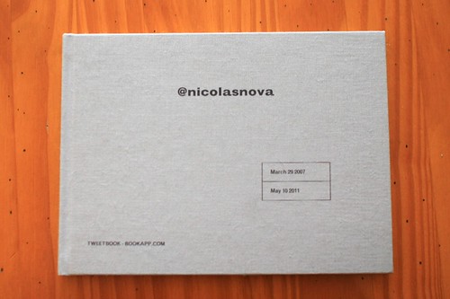
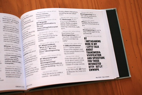
Laurent Bolli gave me my "tweetbook" copy. It's basically a book with the content I've put on Twitter for few months. Tweetbook is a print-on-demand platform made by bookap that allows to archive your Twitter feed into a beautifully printed and bound book. The project was presented at a nice exhibit called "Objet(s) numériques" at Le Lieu du Design in Paris.

As described on bookapp's webite:

"The booklet gather biographic material and give a documentary dimension to the flow of micro-messages. In order to create one's tweetbook, the author enter his or her Twitter ID on an vending machine and the book is automatically produce. The corresponding opus can also be sent by email (PDF) or printed on demand, as a sort of "express autobiography""

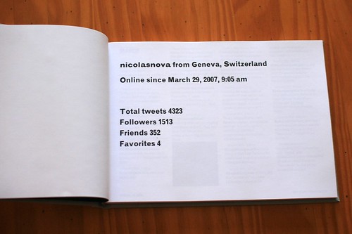
Why do I blog this? An interesting experiment to turn digital material into a physical instantiation. Interestingly, there's more than the tweets: tag and people indexes, basic stats and visualizations also reveal some information about your content production:

"Animal-Computer: a manifesto"

Anne Galloway's recent blogposts about epizoic media and the Internet of cows made me think about this PDF that I recently dropped on my computer desktop. It's called "Animal-Computer: a manifesto (see also this technical report) and it's written by Clara Mancini from The Open University in the UK.

The article is about sophisticated computerized environments affording complex interactivity to pets and animals. Agricultural engineering, primate cognition studies, pet-tracking systems and telemetric sensor devices worn by leopards, birds or elephants are standard examples of such animal-computer interactions. The author highlight that although these examples are fairly common, this line of research has never really entered mainstream HCI/Computer science, leaving the "animal perspective" left aside in such body of work: "For some reason, animal-computer interaction (ACI) is, quite literally, the elephant in the room of user- computer interaction research".

Which is why the author delineates the contour of animal-computer interaction research:

"ACI aims to understand the inter- action between animals and com- puting technology within the con- texts in which animals habitually live, are active, and socialize with members of the same or other spe- cies, including humans. Contexts, activities, and relationships will differ considerably between spe- cies, and between wild, domestic, working, farm, or laboratory ani- mals. In each particular case, the interplay between animal, technol- ogy, and contextual elements is of interest to the ACI researcher."

Of course, this draws fascinating questions both abstract and operational:

"How do we involve them in the design process? How do we evalu- ate the technology we develop for them? How do we investigate the interplay between nonhuman par- ticipants, technology, and contex- tual factors? In other words, how are we going to develop a user-cen- tered design process for animals?"

Why do I blog this? Certainly because Julian and myself dealt with animal-computer interaction few years ago, working on a project we called "new interaction partners (it aimed at exploring the animal-computer interaction in entertainment). I've recently been drawn to this ACI field again as one of my student at the design school in Geneva worked on project that also involved pets and cell-phones. Perhaps, this could be a new line of research to explore next year.

The design of fearsome interactions

Theme parks and horror houses are not necessarily the kind of stuff you think about when someone tells you about interaction design... but these artifacts must be carefully thought. And this paper called The Gas Mask: A Probe for Exploring Fearsome Interactions is intriguing for that matter because it describes an interesting design research approach that explore what the authors calls "fearsome interactions".

The papers presents a mask-based interface that is made of breath sensors, WiFi (to wirelessly transmit "breathing data") and a wireless microphone. Two combinations of these are tested as probes in an interactive ride. The field study is quite revealing and the authors highlight "six key dimensions of designing fearsome interactions": cultural, visceral, social, control, performance and engineering. More specifically, I was intrigued by the one they refer to as "control":

"An important aspect of fearsome experiences such as thrill rides or perhaps even watching a horror film is that of giving up control; committing to a scary and unknown experience and not being able to back out, either physically or socially. Our gas mask interface amplifies this because the user cannot disengage from it; the sensor is strapped to their face, emphasising the message that the machine will sense and respond to their every breathing action. (...) Contrary to conventional HCI wisdom which argues that users should be able to gracefully manage their engagement and disengagement with sensing systems, the wider challenge here is to create interfaces that require them to surrender or at least fight for control."

Why do I blog this? First because of my interest towards weird research foci. Second because of the general implications. Although this kind of research looks curious at first, the results discussion is quite important for interaction design/human-computer interaction research. The discussion about control is of particular interest.