Design

NYT piece on the Talk to Me Exhibit at MoMA

An interesting overview of the "Talk to Me" exhibit at MoMA in the NYT written by Alice Rawthorn. Some excepts I found interesting:

"“We went through so many changes in the definition of design in the 20th century with all the clichés about form following function, and the addition of meaning in the 1960s with post-structuralism, but what is really important right now is communication,” Paola Antonelli, senior curator of architecture and design at MoMA, said by telephone. (...) “Because of that designers can’t just think in terms of form, function and meaning when they develop new objects, they have to learn a bit of script writing too.” (...) Though the same same microchips that enable things as small as smart phones to fulfill hundreds of different functions also make them more opaque. In the industrial era when form generally followed function, you could guess how to use an electronic product from its appearance. You can’t do that with a tiny digital device, which is why designers face the new challenge that Ms. Antonelli calls “script writing,” in other words, ensuring that the object can tell us how to use it. (...) “There is still an imbalance between the aesthetic value of some projects and their functional value, and designers need to make much more effort to explain what they are doing,” Ms. Antonelli said. “This field is moving so fast, but we are still dealing with the old clichés and still adding new ones.”"

Why do I blog this? It's interesting to see how the curator puts things into perspective (wrt to interaction design). From an STS standpoint, the notion of "script writing" can be understood in two sense: (1) the code writing aspect that underpins interaction design of course, (2) the very idea that designers/engineers embed a vision of users in the technical objects they create... what Actor-Network Theory describes as script-building (among which certain clichés about users' attitudes, expectations and needs). It's therefore intriguing that Antonelli uses this "script" term.

Design research project about extreme conditions (Moon)

Stumbled across this curious project this morning: the Moon Life Foundation, an interdisciplinary platform organisation for research and innovation in art and culture to a future life by people on the moon. Their aim is to create a community of practitioners and public about this sound topic.

What I found intriguing about their work is this:

"The extraterrestrial context with its extreme conditions, restrictions and opportunities forces us to abandon familiar points of departure in the design process. The fact that this can lead to innovative and functional tools for our earthly existence has already been proved by the aerospace industry (Velcro, microwave, Internet, laptop, MP3 player and airbag). With the interdisciplinary character of the project (science, technology, art and design) in a futuristic context, Moon Life aims to initiate a new development in design culture. Is it possible to create a future-oriented, innovative impulse for instance in the same way that Constant’s New Babylon did in his time?"

Why do I blog this? Documenting curious design research project as a way to show what kind of material can emerge out of it.

Good reference about timelines

Working on the game controller book lately, I became fascinated by visual representations of time: evolutionary trees, time-series, timelines, etc. A great resource about this is certainly "Cartographies of Time: a history of the timeline" by Daniel Rosenberg and Anthony Grafton.

The book is a comprehensive history of graphic representations of time in Europe and the United States from 1450 to the present:

" From medieval manuscripts to websites, Cartographies of Time features a wide variety of timelines that in their own unique ways--curving, crossing, branching--defy conventional thinking about the form. A fifty-four-foot-long timeline from 1753 is mounted on a scroll and encased in a protective box. Another timeline uses the different parts of the human body to show the genealogies of Jesus Christ and the rulers of Saxony. Ladders created by missionaries in eighteenth-century Oregon illustrate Bible stories in a vertical format to convert Native Americans. Also included is the April 1912 Marconi North Atlantic Communication chart, which tracked ships, including the Titanic, at points in time rather than by their geographic location, alongside little-known works by famous figures, including a historical chronology by the mapmaker Gerardus Mercator and a chronological board game patented by Mark Twain."

There's also this gem at the end of the book, a sort of "Fog of war" representation:

Why do I blog this? Beyond the use of these as models to try different representations of game controller evolutionary trees, I am fascinated by the ways these timelines also add interesting spatial components on top of time-related visualizations.

Exploring gestural interfaces usage to design sensor-based game prototypes

It's been a while I haven't posted about past and current research projects conducted with partners. Last week, I went to DPPI 2011 (Designing Pleasurable Products and Interfaces) in Milano, a conference that focused on "How Can Design Research serve Industry?". I'll get back to the conference itself later and only focus here on the paper I presented. Written with Timothée Jobert, a Grenoble-based researcher (CEA-LITUS), our paper was about how user-centered design approaches can be employed in the video-game industry. Our point was to show how users can be taken into account at the beginning of the design process, and not just when a prototype is ready to be thrown in the usability laboratory. The short paper is based on a case study of how players use gestural interfaces such as the Nintendo Wii and the Bodypad. Conducted 2 years ago, the starting point of this field study was the development of a new accelerometer sensors by a company called Movea. We conducted a field study in order to explore user appropriation of such interfaces, define a design space and it led to the development of various game prototypes (by eXperience Team and Widescreen Games).

The paper can be found at the following URL.

Slides from the presentation are available on Slideshare:

[slideshare id=8421676&doc=dppi2011slides-110625085011-phpapp02]

Hauntology

In the fifteen years since Derrida first used this term, hauntology, and the related term, hauntological, have been adopted by the British music critic Simon Reynolds to describe a recurring influence in electronic music created primarily by artists in the United Kingdom who use and manipulate samples culled from the past (mostly old wax-cylinder recordings, classical records, library music, or postwar popular music) to invoke either a euphoric or unsettling view of an imagined future. The music has an anachronistic quality hinting at an unrecognizable familiarity that is often dreamlike, blurry, and melancholic—what Reynolds describes as “an uneasy mixture of the ancient and the modern.

Why do I blog this? I ran across several occurrences of this term recently, both in academic paper and music columns. There seems to be something intriguing here that can perhaps be connected to current discussion and work about the circulation of cultural elements (Basile's work), atemporality and the relationship between the past and the future.

Domestic complexity: home(s)

Reading Divining a Digital Future: Mess and Mythology in Ubiquitous Computing by Paul Dourish and Genevieve Bell last week-end, I was interested by several things. Among others, as I was about to prepare a speech about robot interactions, the part concerning home and ubiquitous computing was of particular interest. Some excerpts I found important:

"That there are so many words, metaphors, and imaginings for home should serve to remind us that homes exist within a wide range of physical, infrastructure, and legislative contexts and that they are also embedded within highly varied systems of meaning. (...) Materially, homes are hugely varied and the challenges of designing for and into these many homes are immense. First, there are the practical considerations: size, density, scale, and history. (...) Second, homes are the sites of a range of social and cultural practices, dysfunctions, and aspirations, even within a single city. There are a myriad of patterns of occupation, floor plans, household size, and composition. (...) Third, few homes operate in a vacuum or complete isolation; they are part of a larger social, cultural, and sometimes physical institutions. (...) Lastly, and complicating the picture still further, the different kinds of metaphors and symbols of and for home mean that things we wrap around design or that we imagine design might implicate - ideas about security, trust, the future, and even the relationship between public and private - are all flexible. (...) this complexity seems at odds with the current, deceptively simple visions of the digital home. Not only is the home in these visions always singular, but it is nearly always unrealistically large, frequently freestanding, connected to the rest of the world only for the provisioning of services, and newly constructed - without legacy hardware, infrastructure or quirks. It is almost always occupied by a heterosexual nuclear family, which is remarkably accident-and-trouble-free and perfectly happy to perform daily tasks and rituals in series or parallel, entirely without incident. (...) these has been visions of domestic life that celebrated technology and its transformative power at the expense of home as a lived and living practice"

Why do I blog this? Some good material here about the problems of "smart homes" and the complexity of context.

Potential user experience of pico-projectors

There's a currently a lot of interest directed towards screens and ubiquitous displays in interaction design. Interestingly, I've always been ambivalent about this topic and scarcely addressed it in my own research/consulting gigs. However, given that more and more client projects (as well as students/media requests) are related to multi-screen design, I started to collect material about it. The approach, as usual at the lab, is to investigate what one could refer to as the "Long tail of insights", that is to say, research results, informed opinions, expert views or little field observations that go beyond the general discourse about the topic at hand. Concerning multi-screen design, one of the sub-theme that I rarely see addressed consist in the body of work done on pico-projectors. The potential use of built-in projectors in mobile phone seems to be a curious prospect and researchers, designers and engineers of course wonder about what can be done once the camera in phones are not just an input and allow users to create so-called "mobile projections". As a matter of fact, the mobile character of this capability looks intriguing and the next question to be answered here concerns the "real potential uses of projections in the wild".

The uneventful train trip to Paris this morning provided a good opportunity to read a paper about it. Called "Pico-ing into the Future of Mobile Projection and Contexts" and authored by Max L. Wilson and his colleagues from Future Interaction Technology Lab at Swansea University in the UK, it reports the results from a study about how people will want to use such technology, how they will feel when using it, and what social effects we can expect to see.

On the methodology side, the paper adopt an interesting approach:

"Our first-phase study used the Experience Sampling Method (ESM) to elicit the reactions of participants to a range of media regardless of whether they would consider projecting them during undirected usage. In the second phase, we performed a diary study of potential mobile projection scenarios. Although consumer-level mobile projector phones were not available for use or study at the time, we believe that using prototype systems allowed participants to concentrate on the potential use of such devices, rather than the qualities of a finished product. The reactions in the first-phase study also helped to finalise the design of the materials in the second study, which in turn provided deeper insight into the reasoning behind the possible projections recorded in the second"

Some excerpts that caught my attention:

"the study noted a surprisingly negative response to potentially personal content, such as text messages, with some reporting that they felt anxious being asked to project such content on the wall. Further, we saw that public observers showed very little interest in the projections being made by study participants. We did not see any significantly negative responses to projecting in social situations, although people were significantly less anxious about projecting and finding suitable surfaces when not at work. We were also able to identify some usability constraints, where participants expected to be able to control a reasonable amount of focus and projection size within one arm length. For the sake of augmentation, we also recommend that projection technology face the same way as the device’s inbuilt camera.

Our second study revealed more direct insight into the types of content people actually wished they were able to project. Compared to a general study of mobile information needs, we speculate that participants might consider projecting information to solve around two-thirds of the noted scenarios. While a large proportion was time, location and object sensitive, participants also recorded many cases of projecting static text that had no immediate or short-term benefit."

The paper gives some details about surfaces sought for projection, the type of content people may want to project or temporality.

Why do I blog this? being agnostic about this topic, this kind of reading is meant to shape my perspective.

A visual taxonomy of objects by emphase.ch

An interesting project by emphase.ch encountered at the Panorama exhibit in Geneva last Saturday: ZWISCHENSAISON Knowledge Visualization is a visual taxonomy of an hotel archives (a set of artifacts). The list of artifacts is presented on the first page:

And then, each page keeps the same arrangement with pictograms to describe object traits:

Why do I blog this? Working on the game controller book project, I'm interested in different ways to depict object categories. It's interesting that design research seem to offer various exploration about how to create visual catalogues with compelling solutions like the one above.

"Augmentable, Believable, Improvable and Invisible": exploring identity management services

Augmentable, Believable, Improvable and Invisible is a project by Ina Xi (Art Center College of Design) that aims at reinventing social media and identity management services. What attracted my attention is that the project is based on the research of social media users' misleading behaviors online. It basically "speculates how we can design the social network if it were to afford human conditions such as lying and hiding, even when it's offline".

Ina's research was informed by an on-going discourse about social media users' virtual identity and its security resulted from the increasingly publicized personal data, and is greatly inspired by anecdotes and stories of using technologies to selectively hide from and lie to members in one's virtual network for varied social purposes, which also has an impact on one's real-world relationships", which had led to the summary of four main typographies of dishonest behaviors and their outcomes: "The 'Augmentable Me' is driven by the motivation of a better self-image in front of the chosen audience, and based on what one wants to gain out of being the way they choose.

The 'Believable Me' is a virtual identity associated with credible, authentic informations of a real person, regardless of whether what has been said or done is exactly what has happened. The 'Believable Me' is motivated by the intention of preserving privacy through actively spreading their private information to the world.

The 'Improvable Me' is the result of a built-up online reputation on top of a bad, or a damaged one.

The 'Invisible Me' is an anonymous identity due to a missing link or a mismatch between the virtual identity and the real person. The value of the Invisible Me is rewarding especially when the identity used to be more public, exposed or discussed."

These personas were then used to translates the observational research into a series of user experiences and scenarios described on her website. See for instance this design fiction which is very compelling:

"Peter always saw Lisa on the metro train home. He wanted to approach her but, instead of coming up and say hi, he tried to find her online. Putting together the observed characteristics of Lisa and pretending to be the guy Robert who said hi to her once on the train, Peter had Lisa accept him as a friend in the virtual network.

Carefully he created a desirable picture of himself through a falsified identity seen by Lisa alone, based on the algorithmic analysis of her online profile, activity history, group discussions and contact list. A discussion between her network friends has shown Peter an opportunity to meet Lisa in real life, making her reach out naturally to him.

With everything planned out and the handy tips of talking ready, Peter went to the bookstore where Lisa works part-timely as a store assistant. Everything happened as expected, except, however, the fact that Lisa was not there to talk to him, and neither does she work at the store.."

Why do I blog this? This project is close to what a student of mine is doing at the design school in Geneva (creating bots that interact on social networking sites). The idea of using this kind of research , material and narrative to explore the complexity of identity management services is interesting. I particularly like the emphasis on various sorts of interfaces in the video.

Kevin Lynch's "Image of the City" with a graphic design treatment

"The Image of the City" by Kevin Lynch is an important contribution in urban design thinking. The perspective expressed by the author, as well as the methodology (description of mental maps drawn by residents in several cities such as Boston, Los Angeles and Jersey City), is insightful. Interesting, Gabriel Pelletier, a graphic designer added a new perspective on this book using the following treatment:

"Excerpts from Kevin Lynch's "Image of the City" were graphically treated according to their respective themes. The blue color was used throughout all the document is used to recall blueprints.

Each section's beginning was created using the graphic symbols located throughout it's pages. The cover was done in the same fashion, taking all graphic elements of the book and adding them to note the notion of unity when talking about the city's elements."

Why do I blog this? First because I like this book and enjoy this kind of graphic design. Second because it's interesting to see how the material presented in the book can be enhanced through the kind of representations proposed by Pelletier. The idea of using blue shapes is intriguing as it is sort of reminiscent of building blueprints.

The slow evolution of AI in video-games

Just read on gameplanet.co.nz:

Rather than trying to program enemy AI to think, behave and play like a human, developers simply imbue them with increased hit points, better statistics, or any number of favourable benefits whilst removing the same attributes from the players themselves. Manipulating these variables commonly forms the structure of a difficulty level.

In the quest to present the player with an action-packed experience, developers often sacrifice realism to keep the story flowing, or keep the participant at the crest of a wave. It's unlikely, after all, that precise emulation of a Special Forces raid in war-torn Afghanistan would lend itself well to the gaming public.

Why do I blog this? Artificial Intelligence is one of these Holy Grails some people are looking for. The term itself is fascinating as it encapsulates some sort of magic. Referring to something as "AI" leads to some expectations on the part of the observers and it's funny to see how people in the video-game industry describes the evolution of such tech.

Teardown culture and companies' reaction

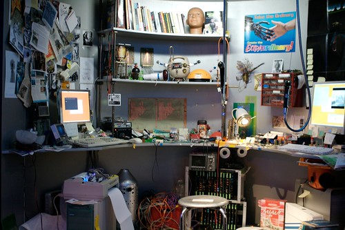
POPSCI has an article about the "history of the teardown" and what happens on websites such as ifixit.com/. (A robot tinkerer's desk at the design museum in Zürich)

The article describes the important of this kind of activity to understand how things work, child-like memories of bricolage and to generate a "culture of repair". But this is not the thing that attracted my attention, I was more curious about how companies react to this:

"A culture of repair fanatics would be rough on the tech manufacturers who rely on pumping out marginally changed gear, year after year, but would have a pretty astounding effect everywhere else. (...) The tech companies themselves aren't helping. "The manufacturers are more hostile now," says Wiens. "The Apple II came with complete schematics," but newer Apple products boast proprietary and hard-to-find screws, unlabeled components, batteries that Apple says must be replaced by the company and not the user, and no user documentation whatsoever. Apple is typically held as the worst or at least the most obvious example of this kind of repair-unfriendliness. (...) The iPhone 4, a few years later, features screws that were created by Apple expressly for this purpose. These weird, five-lobed, flower-shaped Torx screws have no practical advantage over, say, a Philips—except to keep tinkerers out. That didn't stop iFixit, of course: "We actually had to make a screwdriver—had to file a flat-head screwdriver down to fit [the Apple screw]," says Wiens (...) In Apple's case, it's probably a combination of secrecy and simple greed, but even some of the "good" companies, like Dell and HP, bury their manuals deep in their sites, difficult to find for many consumers."

Why do I blog this? This is a good example of a sort of "arm race", or a co-evolution between products and tinkerers (who need to design new tools to tear down products).

This also echoes a conversation that I had last week with some representatives of a domestic appliances company at Robolift. The notion of tinkering/repurposing/opening products is both seen as a challenge and an opportunity. But companies do not necessarily know if they should go against this. I wonder about what can be possible and what can be done with the right target group of people.

Keyboard hack #3

Another interesting keyboard adaptation that I ran across in one my course. This designer is working on a large graphic and needs to drag and drop lots of visual primitives here and there with Illustrator. She found it more convenient to use this quick and dirty solution by using tiny stickers with a visual representation of the graphical elements on each keys.

Why do I blog this? It's always good when you start clustering examples of user repurposing their own technologies. Along with the French-Cyrillic keyboard hack and fixed keyboard mapping, I now have a cluster of modification that show various possibilities.

Design form guide

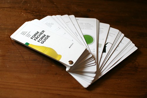
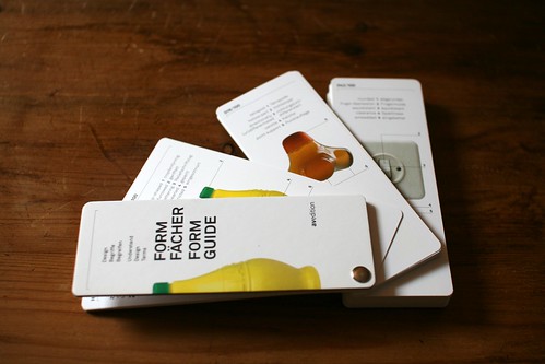
The "Formfächer" (Formguide) is an instrument I stumble across when visiting the design studio emphase.ch two weeks ago:

"The "formguide" explores the potential of language for the description of objects and forms. Using examples, a professional terminology is developed which aids communication about design in practice and education. The versatile vocabulary can be used to describe design solutions more precisely. Hundred products were selected for this purpose and are presented with photography and a brief description of their origin, making the form guide a helpful and informative tool for everyday use."

This publication for designers is the result of a collaborative research project between the Industrial Design Department of the Zurich University of the Arts, the Design collection of the Museum of Design Zurich and the Idea Institute of the Burg Giebichenstein, University of Art and Design Halle, Germany.

Why do I blog this? I quickly became intrigued by this tool because of our current project with Laurent Bolli concerning the classification of video game controllers. What's interesting with this form guide is simply the terminology proposed in there and the way it can be used to sort different artifacts.

Event recap: Lift seminar @ Imaginove about gamification

Last week saw the first of my lift@home series for this year, in partnership with Imaginove, a French cluster made of video-game companies, animated movie studios and web/mobile design firms.

As an echo to the debate at the Game Designer's conference in San Francisco, we chose to talk about gamification, which is defined in the Wikipedia as:

"Gamification is the use of game play mechanics for non-game applications (also known as "funware"), particularly consumer-oriented web and mobile sites, in order to encourage people to adopt the applications. It also strives to encourage users to engage in desired behaviors in connection with the applications. Gamification works by making technology more engaging, and by encouraging desired behaviors, taking advantage of humans' psychological predisposition to engage in gaming. The technique can encourage people to perform chores that they ordinarily consider boring, such as completing surveys, shopping, or reading web sites."

Given the heated debates lately about this topic, the point was to go beyond this buzzword and discuss the implications of using game mechanics for non-game applications.

In my introduction, I drew a parallel between the Serious Games meme and the Gamification meme... to show that there's a long time interest in translating "something" from games to other domains. My point was that this "something" varies over time: game mechanics, game play, game-like visuals. Interestingly, this transfer can be caricatural. At worse, gamification means "add external rewards such as points or badges to your service" and Serious Games sometimes corresponds to "add 3D graphics to your training program and you'll learning how to use this CRM". This is a bit sarcastic but it's unfortunately the case. Concerning gamification, my introduction focused on some of the limits of this approach:

  • Being engaged in a video-game is not just a matter of earning points and rewards, there are different motivational aspects that ranges from learning the interface, discovering the challenges to be completed, the completion of these tasks, the fun of being with others.
  • One should distinguish what's called internal motivation (playing the game itself) and external motivations (being rewarded for the task completed). It's as if proponents of gamification only focused on the second one.
  • Above all, playing a game is fun because of its design, not just because you can get points (what Steffen Walz called "pointification" in his talk at Lift11) and go from one level to another.
  • A gameplay (or a game design pattern) is much more than "earning points" or "collecting artifacts". A game is fun to play because there's a good team of game designers who created it, not just because of basic cooking recipes.

The two other speakers built upon this to demonstrate the limits and opportunities of employing game mechanics. The first one dealt with the importance of this approach for Social Web platforms and the second one showed the potential of game design for urban informatics.

Josselin Perrus

A consultant in User Experience design Josselin started off by showing the drawbacks of external rewards (points, badges). The underlying idea with "gamification" is that designers identify a certain behavior, find a metric that would represent this behavior... and reward the performance of this behavior. In return, this results in participant trying to maximize this metric. Which is very close to performance or sales management with KPI.

Josselin's argument is that this situation is fine in the short term but it doesn't work in the long run because it's not user-centric. For example, the accumulation of badges on Foursquare becomes difficult to understand over time. If you're browsing friends' profile, you see their badges but it's sometimes difficult to get what they mean... because they're only designed as a reward system. A more interesting approach in Social Web design would be to generate rewards as "social indicators": hierarchical cues or categories that are actually relevant for users and which help them to get a perspective on a certain person. Meaningful badges would make users' profile more legible to others.

If indicators became pertinent for others, they would count as intrinsic motivators:

  • As a way to access to a representation about oneself: mirroring your activities, giving you the opportunity to learn about your behavior.
  • Conveying information to others, showing them implicit cues about your behavior.

Philippe Gargov

Philippe followed up on this by questioning how the video-game culture (and video game mechanics per se) can be a facilitator for urban design. He began his speech by showing what he called a triforce of current urban challenges:

  1. City 2.0: the need to integrate citizens in public debates,
  2. Livable city: the importance of favoring more sustainable practices,
  3. Social innovation: the need to facilitate the participation of citizens in the co-conception of public services.

For each of these challenges, Philippe exemplified how certain services anchored their design in game-related elements: 3D platforms employed to engage citizens in discovering how their neighborhood may evolve, the role (and the limits) of visual codes coming from video-games to be more appealing to users, etc. He then focused on two striking examples:

  • Chromorama by Mudlark: a game that shows participants their movements and location as they swipe use their transportation card in the London Tube. The point of such platform is to "connect communities of people who cross paths and routes on a regular basis, and encourages people to make new journeys and use public transport in a different way by exploring new areas and potentially using different modes of public transport".
  • Waze: a social mobile application providing free navigational information based on the live conditions of the road (reported by participants who receive rewards for their input).

Philippe concluded by encouraging game designers in the room to participate to this shift. Their expertise and the solution they put together in their games can resonate with urban services... in a way that is not necessarily as limited as what gamification advocates.

"Field research for design" course 2011

Students are back from vacation and my course about design ethnography at HEAD-Geneva just started. This year the number of students has doubled compared to last year, the diversity is quite good in terms of nationality (Swiss, French, Polish, Russian, Chinese, Brazilian, Dutch) and specialities: I have students with backgrounds in Media/interaction design, others in industrial design, graphic design and architecture. The course aims at giving students a crash course in design ethnography methodologies. It will mostly focus on observation and interviewing techniques, with an emphasis on how to turn field results into design deliverables (topics, personas, activity sequences), insights (user requirements, opportunity maps) and potential solutions (scenarios). The course is divided into lectures and a project conducted by groups of students.

This year the design brief for students project is quite simple:

"Explore how people *********** and design concepts of relevant product/services based on your findings. The solution should somehow be based on disruptive practices, found problems or curious behavior.

*********** =

  • People’s relationship to electricity (in order to design a solution to make people more aware of their energy consumption and drive a change of behavior)
  • How people cook/relationship with recipes (in order to design a solution to help/improve/modify how people prepare meals)
  • How people do physical exercise in an urban context (in order to design a solution to do physical exercise, indoor/outdoor)"

Bloom.io: "Pop-cultural instruments for data expression and exploration"

Bloom.io seems to be an interesting platform and their tag-line is just fantastic.

"Our mission to bring you a new type of visual discovery experience is already underway. We’re building a series of bite-sized applications that bring the richness of game interactions and the design values of motion graphics to the depth and breadth of social network activity, locative tools, and streaming media services.  These new ‘visual instruments’ will help you explore your digital life more fluidly and see patterns and rhythms in the online services you care about. And they’re coming to a tablet, media console, or modern web browser near you!"

Why do I blog this? it seems to be an interesting platform for what Fabien calls "sketching with data. The motivation from Bloom's team is quite relevant too:

""The ways in which people interact with computation are changing swiftly as we move into more casual relationships with our digital services on tablets, big screens, and across social networks. We believe we have some compelling answers about how digital experiences will evolve into these new contexts. Please, follow along with us and explore these playful, dynamic instruments of discovery together."

Screen multiplicity in a Swiss train

Sitting on a Swiss train the other day, I became fascinated by this air pilot playing with his laptop PC and his tablet.

But it became even more fascinating when the guy fired up his iPhone:

Why do I blog this? Fascination towards compulsive usage of technologies. This is definitely an extreme user with peculiar practices, but it was fascinating to see how he combinbed certain sorts of interactions/app usage to certain parameters (screen size, presence of a keyboard, etc.). It was also curious to see how the mobile context (a train with a limited personal space) was not so problematic to accomodate the use of three displays at the same time.

From "Learning from Las Vegas" to design research

During my Christmas vacations, I finally had some time to read "Learning from Las Vegas" by Robert Venturi, Denise Scott Brown and Steven Izenour. Working on a course about field research, I was particularly interested by the way the authors framed the importance of observation in design. Two quotes struck me as important: The first one is:

"Learning from the existing landscape is a way of being revolutionary for an architect. Not the obvious way, which is to tear down Paris and to begin again, as Le Corbusier suggested in the 1920s, but another, more tolerant way; that is to question how we look at things.

There is a perversity in the learning process: We look backward at history and tradition to go forward; we can look downward to go upward. And withholding judgment may be used as a tool to make later judgments more sensitive. There is a way of learning from everything." p.3

I quite enjoyed this one, especially when considering the whole debate about the so-called inability of user research to lead to "disruptive innovations".

The second one is:

"Analysis of one of the architectural variables in isolation from the others is a respectable scientific and humanistic activity, so long as all are resynthesized in design. Analysis of existing American urbanism is a socially desirable activity to the extent that it teaches us architects to be more understanding and less authoritarian in the plans we make for both inner-city renewal and new development." p.6

The implications are important here as well, the idea that design is about synthesis is interesting.

Why do I blog this? Being involved in a week-long workshop about field research for design, I try to find some relevant angles for the students. These two quotes (which of course badly summarizes the whole book by Venturi and Brown) are intriguing and useful for my work. It's also interesting to see what can be translated from architecture to other design domains.