Design

About the history of the computer mouse

An interesting excerpt from "The best laid plans of mice and men: the computer mouse in the history of computing by Paul Atkinson:

"In the case of the adoption of the computer mouse as the preferred selection device, it seems that there are three discrete relevant groups of user that saw the problem being solved, but from different perspectives. The engineers at Xerox and Apple among others were convinced by Card’s use of Fitts’s Law that the mouse was ergonomically an almost optimal device, despite it’s complications from an engineering point of view. Young users, visually oriented users or users unaccustomed to computers found using a mouse in conjunction with a GUI to be a more intuitive way of accessing computer technology, despite the initial wariness of using one. Finally, and perhaps most importantly, the largest relevant social group of user, business users, achieved closure with the computer mouse because of its ability to overcome the need to perform a stereotypically gendered activity. (...) The mouse, then, in a way that none of its designers originally intended, acted to remove the office computer’s association to the typewriter, changing it from what was perceived as a low-status piece of office equipment into a completely new piece of technology, operated in a unique way. The mouse also enabled the different computers targeted at female office workers and male managers to become a single product. I would argue that the mouse played a significant role in the wide-scale adoption of the computer – a computer without preconceived status and gender associations – and in doing so, that it made a substantial contribution to the development of today’s workplace ."

Why do I blog this? it's always intriguing to get back to the history of massively used technologies. More specifically, the paper addresses important lessons about the design choices made by computer mouse designers, the trajectory of its development as well as underlying factors such as gender issues.

"Eye am You"

"Eye am You" (IAMAS Gangu Project, 2009) by Jarashi Suki:

"You am Eye is a toy that reflects the glasses which are in front of their eyes. Captured from the video camera mounted on the front, and locate the face by face recognition system that has the eyes of his face reflecting the display. This bespectacled users can get near the opponent's territory, surprising the people around you can laugh again. The people around you understand how, in the glasses before bringing your own illustrations and cartoon characters, you can enjoy as you like to change the user's eye glasses Masu. People who meet a variety of self-aware that projected itself among the person, is said to grow. Actions are usually performed unconsciously people do, indeed, "visible" are embodied in symbolic form."

Why do I blog this? an interesting project that can be relevant for one my student. A curious communication-disruption.

Fingerprints on touch interface as interaction pattern

An interesting project by Design Language:

"Because the primary input method of the iPad is a single piece of multitouch glass, developers have incredible flexibility to design unique user interfaces. It’s hard to appreciate the variety of UIs though, since turning the screen off removes virtually all evidence of them. To spotlight these differences, I looked at the only fragments that remain from using an app: fingerprints."

Why do I blog this? It's interesting to observe how this quick hack enables to observe touch interface usage patterns very easily. The idea here is to benefit from physical traces to describe the accumulation of interaction over time. It would be fun to add a temporal dimension to this.

Saskia Sassen: Talking back to your intelligent city

Much of what is put under the “smart city” umbrella has actually been around for a decade or more. Bit by bit (or byte by byte), we’ve been retrofitting various city systems and networks with devices that count, measure, record, and connect. (...) The current euphoria, however, centers around a more costly, difficult-to-implement vision. Rather than retrofitting old cities, the buzz today is about building entire smart cities from scratch in a matter of a few years (hence the alternative name “instant city”)
(...)
The first phase of intelligent cities is exciting. (...) The act of installing, experimenting, testing, or discovering—all of this can generate innovations, both practical and those that exist mainly in the minds of weekend scientists. (...) But the ensuing phase is what worries me; it is charged with negative potentials. From experimentation, discovery, and open-source urbanism, we could slide into a managed space where “sensored” becomes “censored.
(...)
The challenge for intelligent cities is to urbanize the technologies they deploy, to make them responsive and available to the people whose lives they affect. Today, the tendency is to make them invisible, hiding them beneath platforms or behind walls—hence putting them in command rather than in dialogue with users. One effect will be to reduce the possibility that intelligent cities can promote open-source urbanism, and that is a pity. It will cut their lives short. They will become obsolete sooner. Urbanizing these intelligent cities would help them live longer because they would be open systems, subject to ongoing changes and innovations. After all, that ability to adapt is how our good old cities have outlived the rise and fall of kingdoms, republics, and corporations.

Why do I blog this? Some interesting elements, to be considered after the series of workshop we had at Lift11 this week (about smart cities and the use of urban data).

Henk Hofstra's Blue Road as a city waterway

Last April, Henk Hofstra created an "urban river" in Drachten, Holland. The Blue Road installation is an example of what mind-blowing urban public art can be.

Featuring 1000 metres of road painted blue and the phrase "Water is Life" written in eight-metre-high letters across it, the Blue Road is reminiscent of the waterway that used to be where the road is now. It's a memorial to nature, but it's also just plain awe-inspiring. There's even a few cool tidbits along the road, like a sinking car.

Sifteo: networked cubes as a game system

Sifteo cubes are a true game system. Each cube is equipped with a full color display, a set of sensing technologies, and wireless communication. During gameplay, the cubes communicate with a nearby computer via the USB wireless link. Manage your games and buy new ones using the Sifteo application installed on your computer. Each cube packs a full color LCD, a 3D motion sensor, wireless communication, a peppy CPU and more. Your computer connects to the cubes via the included Sifteo USB wireless link.

Why do I blog this? this seems to be an intriguing "networked object" platform. I like the idea of creating applications/gameplay based on the interactions between several cubes.

Proximeter: an ambient social navigation instrument (H. Holtzman + J. Kestner)

"Would you know if a dear, but seldom seen, friend happened to be on the same train as you? The proximeter is both an agent that tracks the past and future proximity of one’s social cloud, and an instrument that charts this in an ambient display. By reading existing calendar and social network feeds of others, and abstracting these into a glanceable pattern of paths, we hope to nuture within users a social proprioception and nudge them toward more face-to-face interactions when opportunities arise."

Why do I blog this? although I am not sure about the use case (and how it may lead to some new quirky social behavior), I find interesting FOR ONCE to see a location-awareness device that is not focused on the present/real-time. The idea here is rather to give some information about the near future... and I would find interesting to have this sort of representation only as am ambient display at home: no mobile version, only some simple insights before heading elsewhere.

ThingM Project Feature: Books with Personality

The intent of this project was to create animism in an object, with the use of programmable BlinkM® LEDs. We were interested in books because, as a set of objects, they still had a degree of individuality which we wanted to bring forward. By accentuating the character that the titles already exuded, we were able to develop each personality in unique ways, furthering the books from their common mass–produced ancestry. This experiment came close to becoming a psychoanalysis of an object–exploring themes of ego, vulnerability, intellect, and self-awareness.

Why do I blog this? curious project by Jisu Choi and Matt Kizu (from Art Center) about books and how they can be enriched with "Individuality" features through technology.

Smart Cities: how to move from here to there? | Lift11 workshop

Workshop theme: 

Ubiquitous computing: Augmented Reality, location-based services, internet of things, urban screens, networked objects and robots

Over the past few years, "Smart Cities" have become a prominent topic in tech conferences and press. Apart from the use of this term for marketing purposes, it corresponds to a mix of trends about urbanisation: the use of Information and Communication Technologies to create intelligent responsiveness or optimization at the city level, the coordination of different systems to achieve significant efficiencies and sustainability benefits, or the fact that cities provide "read/write" functionality for its citizens.

The common approach to design Smart Cities is to start by upgrading the infrastructure first and consider the implications afterward. We will take a different path in our workshop and focus on situations that imply already existing and installed technologies (from mobile phones to user-generated content and social networking sites). To follow up on past Lift talks (Nathan Eagle at Lift07, Adam Greenfield at Lift08, Dan Hill, Anne Galloway and Carlo Ratti at Lift09, Fabien Girardin at Lift France 09) and workshops (about urban futures at Lift07 and Lift09), the goal of this session will be to step back and collectively characterize what could be a Smart City. This workshop targets researchers, designers, technology experts interested in developing an alternative approaches to technology driven visions of urban environments.

Co-organizers: Nicolas Nova, Vlad Trifa and Fabien Girardin.

A workshop I'd be organizing at Lift with Vlad and Fabien.

What happens in an interaction design studio

There's an interesting short article by Bill Gaver in the latest issue of ACM interactions. Beyond the focus of the research, I was interested by the description of the approach and the vocabulary employed. Very relevant to see how they define what "design research" can be.

He starts off by stating that their place is "a studio, not a lab": it's an interdisciplinary team (product and interaction design, sociology and HCI) and that they "pursue our research as designers". Speaking about the "design-led" approach, here's the description of how they conduct projects:

"Our designs respond to what we find by picking up on relevant topics and issues, but in a way that involves openness, play, and ambiguity, to allow people to make their own meanings around them. (...) An essential part of our process is to let people try the things we make in their everyday environments over long periods of time—our longest trial so far is over a year—so we can see how they use them, what they find valuable, and what works and what doesn't. (...) Over the course of a project, we tend to concentrate on crafting compelling designs, without distracting ourselves by thinking about the high-level research issues to which they might speak. It's only once our designs are done and field trials are well under way that we start to reflect on what we have learned. Focusing on the particular in this way helps us ensure that our designs work in the specific situations for which they're developed, while remaining confident that in the long run they will produce surprising new insights about technologies, styles of interaction, and the people and settings with whom we work—if we've done a good job in choosing those situations."

Why do I blog this? Collecting material for a project about what is design research. Even brief, the article is interesting as it describes studio life in a very casual way (I'd be curious to read the equivalent from a hardcore science research lab btw). The description Gaver makes is al relevant as it surfaces important aspects of studio life (prerequisites to design maybe): interdisciplinary at first (and then "most of the studio members have picked up other skills along the way"), fluidity of roles, the fact that members contribute to projects according to their interests and abilities.

Primer's explanatory diagram and timelines as a design tool

The blogpost Julian wrote yesterday about Primer reminded of this curious diagram that David Calvo sent me few weeks ago. The diagram is a tentative description of what happens in the movie.

Since the movie is about two engineers who accidentally created a weird apparatus that allows an object or person to travel backward in time, it becomes quite difficult to understand where is who and who is where. The diagram makes it slightly more apparent.

Why do I blog this? Rainy sunday morning thought. Apart from my own fascination for weird timelines, I find this kind of artifact interesting as a design/thinking tool... to think about parallel possibilities, about how an artifact or a situation can have different branches. Taking time as a starting point to think about alternative presents and speculative future is quite common in design as show by James Auger's interesting matrix.

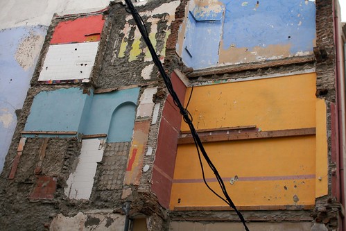
Human reality resides in machines

(Traces of human activity revealed on a building encountered in Malaga, Spain)

An interesting excerpt from Gilbert Simondon's On The Mode Of Existence of Technical Objects:

"He is among the machines that work with him. The presence of man in regard to machines is a perpetual invention. Human reality resides in machines as human actions fixed and crystalized in functioning structures. These structures need to be maintained in the course of their functioning, and their maximum perfection coincides with their maximum openness, that is, with their greatest possible freedom in functioning. Modern calculating machines are not pure automata; they are technical beings which, over and above their automatic adding ability (or decision-making ability, which depends on the working of elementary switches) possess a very great range of circuit- commutations which make it possible to program the working of the machine by limiting its margin of indetermination. It is because of this primitive margin of indetermination that the same machine is able to work out cubic roots or to translate from one language to another a simple text composed of a small number of words and turns of phrase."

Why do I blog this? This reminds me of this quote by Howard Becker: "It makes more sense to see artifact as the frozen remains of collective action, brought to life whenever someones uses them" that Basile pointed me few months ago (which is very close to Madeleine Akrich's notion of script described here).

How to translate Deleuze and Guattari's notion of 'agencement'

One of the key problems of global knowledge concerns the circulation, adoption and adaptation of concepts in translation.  The English word assemblage is gaining currency in the humanities and social sciences as a concept of knowledge, but its uses remain disparate and sometimes imprecise.  Two factors contribute to the situation.  First, the concept is normally understood to be derived from the French word agencement, as used in the works of Gilles Deleuze and Felix Guattari (who, furthermore, do not use the French word assemblage in this way).  Tracing the concept in its philosophical sense back to their texts, one discovers that it cannot easily be understood except in connection with the development of a complex of such concepts.  Agencement implies specific connections with the other concepts.  It is, in fact, the arrangement of these connections that gives the concepts their sense. 

Why do I blog this? attempting to find a proper English word to express what Deleuze and Guattari meant by "agencement"...

Observational comedy, humor and insights in user research

And those who find it particularly funny might be those who’ve actually experienced both claims (booze wreaks havoc in their lives, but they also drink to ease their pain).


In fact much of what we find humorous can reveal our beliefs. Since laughter is typically an unconscious, automatic response it is a useful measure for laying bare individual biases.


This month in the journal Evolution and Human Behavior Robert Lynch of Rutgers University published the first scientific evidence for the conventional folk wisdom: it’s funny because it’s true. But Lynch is not referring to objective truth, rather what we think is true.

Why do I blog this? just thinking about the role of humor and how observational comedy can help to surface interesting insights about culture and human-technical objects relationships.

"A micro-dictionary of gestures"

Why do I blog this? Looking for material for one of my student, I ran across this curious diagram recently and found it interesting. It's curious to see how a comic artist and theorist (Will Eisner) propose a way to describe embodiment in the language of comics. The body postures and gestures are important in comics and they definitely helps to convey meaning in the sequences, as shown by the quote by Eisner: "In comics, body posture and gesture occupy a position of primacy over text. The manner in which these images are employed modifies and defines the intended meaning of the words"

Flux Fields by Critical Mass

Critical Mass is a research agenda currently explored at Obuchi Lab in the University of Tokyo, Global 30 Architecture and Urbanism. The course is dedicated to the research on the emergence of global network society and its effect on architecture, urbanism and design culture. It is an interdisciplinary experimental design research connecting architecture, engineering and computations to theorize and to develop design proposals that negotiate the ever-changing contemporary built environments.

via obuchi-lab.blogspot.com

Why do I blog this? intriguing kind of flux visualization (circulation in a built environment) by Critical Mass.

"Cassette drive for storage: a safari in post-modernity"...

... is a new side-project of mine. It basically consists in the articulation between two sources of insights about the urban environment:

  1. Some pictures I've taken over the years in various territories. The photograph are converted into Black and White using a threshold filter to highlight certain characteristics of the environment: shapes, forms, grids, silhouette, outlines or directions. Given my interest to show stereotypical shapes, the focus of the pictures is certainly connected to my interests, obsessions and gut feeling when undertaking urban safaris. As much as I can, I'll indicated where the pictures have been taken (which is not that difficult if you have an eye for peculiar scenes and buildings).
  2. Quotes from books written in the second part of the 20th Century about cybernetics, architecture, urbanism and design theories. I've bought these books recently at the flea market and in an architecture/design book shop and they seem to come all from the collection of a recently deceased professor from the University of Geneva. The quote I've chosen echoes with my interests and perception about what "matters" in these disciplines. It's definitely a subjective choice and I enjoy the accumulation of such excerpts (as attested by the presence of commented quotes on this blog).

My aim was to select quotes and pictures so that a peculiar kind of relationship emerges out of the juxtaposition. To some extent, this articulation between the two elements could be seen as some vague correlation: sometime there is indeed a cause-and-effect relationship (the quote exemplifies a certain trend that has influenced the architecture of the building represented on the picture), sometimes there isn't. The idea is to show that some notions, paradigms and system thinking either shaped urbanism or provided a certain framework/cultural Zeitgeist which led to the shapes and representations depicted on the B&W pics.

This is a work-in-progress thing. I guess some assemblage are better than others of course. Let's see how things unfold, I'll try to keep this going and select the best juxtapositions in a booklet once I have a certain quantity of material. My perception of this is simply that some patterns and categories will emerge at some point and perhaps a narrative could be constructed at some point.

As usual here, comments are welcome.

The "internet of things": The internet of hype | The Economist

Interesting discussion about the limits of the Internet of Things in The E.:
Is it worth it? Many of the problems that the internet of things is supposed to solve actually have simple, non-technological solutions. Google likes to boast that your smartphone can tell you the ratio of men and women in any given bar. But there is actually a much simpler solution: you can look through the window! Many of the wonders of the internet of things fall into this category. Sensors can tell you when a baby's nappy is full. There is a perfectly reasonable old-fashioned solution to this problem. Sensors can turn the stem of an umbrella to glow blue when it is about to rain. You can always listen to the weather forecast. Mr Kvedar argued that hooking people up to the internet would reduce their need to go to the doctor, because they will be constantly updated about their health. But will elderly people, who are nervous enough about mobile phones, really embrace this high-tech wonderland? It might be better to loosen the grip of professional doctors on medical advice, and allow nurse-practitioners and other para-professionals to monitor people's health. In health care, above all else, technology is a poor substitute for the human touch.

Why do I blog this? this is the excerpt that struck me as interesting in the Economist but the whole article adopts a fresh perspective (especially in this kind of press). I do not necessarily agree with all the arguments here but it's relevant to see how people ponder the IOT.

Fiction - Reality A and Reality B by Haruki Murakami (NYTimes.com)

There has been an especially noteworthy change in the posture of European and American readers. Until now, my novels could be seen in 20th-century terms, that is, to be entering their minds through such doorways as “post-modernism” or “magic realism” or “Orientalism”; but from around the time that people welcomed the new century, they gradually began to remove the framework of such “isms” and accept the worlds of my stories more nearly as-is. I had a strong sense of this shift whenever I visited Europe and America. It seemed to me that people were accepting my stories in toto — stories that are chaotic in many cases, missing logicality at times, and in which the composition of reality has been rearranged. Rather than analyzing the chaos within my stories, they seem to have begun conceiving a new interest in the very task of how best to take them in.

By contrast, general readers in Asian countries never had any need for the doorway of literary theory when they read my fiction. Most Asian people who took it upon themselves to read my works apparently accepted the stories I wrote as relatively “natural” from the outset. First came the acceptance, and then (if necessary) came the analysis. In most cases in the West, however, with some variation, the logical parsing came before the acceptance. Such differences between East and West, however, appear to be fading with the passing years as each influences the other.

In my latest novel, 1Q84, I depict not George Orwell’s near future but the opposite— the near past — of 1984. What if there were a diffe- rent 1984, not the original 1984 we know, but another, transformed 1984? And what if we were suddenly thrown into such a world? There would be, of course, a groping toward a new reality.

via nytimes.com, pointed to me by David Calvo

Why do I blog this? these curious excerpts are interesting IMO both in terms of creative process and speculation. Something to be connected with the design fiction meme.