Design

Confusion in user research

In "Ships in the Night (Part I): Design Without Research?" (ACM interactions, May/june 2009), Steve Portigal addresses the role of user research in design. He points this interesting example of people/companies who mistook how to to carry out research, see this quote from a book he mentioned:

"[T]hey put a design in front of customers and say, “What do you think?” And the customers say, “Well I don’t know; I don’t know if I like this; it’s new; it’s scaring me; it’s too big; it’s too round; it’s too square.” That’s the kind of response you get. People who use this kind of research come back and say to the designers “People think this is too square-you’ve got to make it more round.” Most customers have a hard time articulating their design preferences. You can do far better by watching, listening, and observing."

And here is what Steve says:

"I’m a big fan of “what do you think?” questions because they let the participant respond on their own terms first. But to be effective, there’s much more to consider: What do people tell you first; how do they tell you; what reasons do they give; how can you triangulate that response against other things you’ve learned about them; and how can you help them get to a point where they’re engaged enough in this new idea to give a meaningful response? And of course, we don’t have to take these answers literally and make our design more square or more round; we can see that those responses are trailheads to follow for a deeper understanding of how this new thing is or isn’t making sense to them."

Why do I blog this? This is an interesting problem I often encountered when chatting with people/companies who express some concern/skepticism about user research. The conversation sometimes lead to a similar discussion about "we have done it, we asked people what they wanted and it did not work". There seems to be a confusion between user-centered design and asking people what they want/need.
Windows, shutter and privacy

windows Location-based annotation

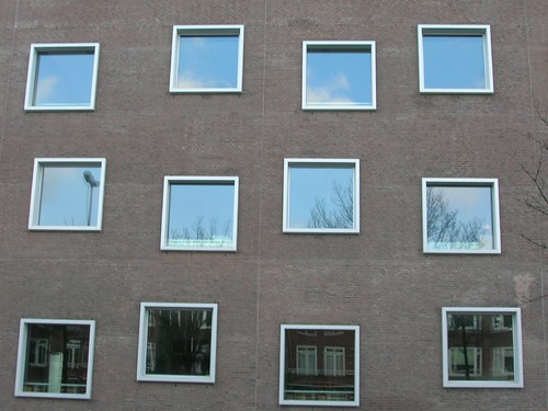
Windows and their relative transparency are an architectural element that I tend to always observe when traveling. Indeed, the presence of shutter and curtain is an interesting material indicator of how people deal with privacy. Some cultures are more likely to leave things open/transparent (as in the first picture above from Utrecht in the Netherlands) than others (the second one has been taken in Zürich, Switzerland). However, the absence of shutters or curtains is not an invitation for passers-by to look at what's happening inside the house. It's a different social norm. Besides, shutter are not just meant to be used for privacy reasons, it's also a good way to regulate indoor temperature (keeping the heat in the winter or a fresh atmosphere in the summer)

During my trip to Portugal last week, a different sort of shutter attracted my attention. Called "meia persianas", it's an interesting middle-ground between the absence and the presence of shutter.

Shutter

From what I was told, this sort of shutter acts as a low-cost air conditioning system (since the house's walls are very thick and retain the heat/cool) AND a good way to protect one's window by letting it open while being sure that no-one can come through the window. Furthermore, it also allows to see without being seen.

Another aspect of this portuguese architecture is also the presence of ropes to dry things above the window. But this is definitely not enabled by the semi-closure. It's just a side-use of the window that I found relevant to document.

Shutters + clothes

So, what is the take-away here? simply that there are different ways architecture embeds privacy issues, practices and norms: from the transparent glass to the sealed window and the half-half solution of the portuguese "meia persianas". This last solution is perhaps the most relevant when it comes to current debates about social software/location-based services privacy issues.

people and electricity

Last semester, I've given a series of lectures at ENSCI (a Paris-based design school) for design students about people's experience of electricity. Just had some time to trim the slides and edit then in english. It's a short version of the presentation I've made about people's representations of electricity as well as intriguing practices I collected during trips, research projects and home visits. This material was used to give students some insights about how human beings related to an abstract (and now mundane) phenomenon such as electricity. Slides under the link below:

Of course most of the presentation is a bit limited without the corresponding talk but it gives an idea of the messages I brought to the table. Moreover, the elements I presented here are only a subset of lots of other phenomena related to electricity that I missed or did not describe for time reasons. For the record, the students' project was about designing "internet of things" artifacts that would make people more conscious of electricity consumption.

Integration of the natural and computational worlds

Signage Freshly updated signage in the woods above Sintra, Portugal. As if the green mousse has just been removed to paint these basic-but-elegant trekking signs.

Signage

These inspiring pictures echoes a lot with a research paper I recently read about how human computer interaction (HCI) had little explored everyday life and enriching experiences in rural, wilderness and other predominantly “natural” places. Entitled "Pursuing genius loci: interaction design and natural places, the paper by Nicola Bidwell and David Browning addresses the integration of the natural and computational worlds.

The pictures above are more precisely connected with one of the principles the authors discussed, there is the idea that "design must simultaneously fade into the background and provoke seeing natural places differently". This is IMO the role of this simple signage painted on rocks: not invasive, easy to understand and just in place. Which of course, leads to the debate of using technological means to support this.

Speech idioms

-) @ Idioms going from the interwebs to the physical, seen on ads in Berlin last october.

Thought about it the other day when I overheard a goof on the streets screaming "lol" (in a french conversation), found it funny to think about the transfer of idioms.

Plus, I am always intrigued by speech bubbles on posters.

Paper clip roles

Paper clip

"A paper clip can be used in all sorts of unintended ways: as a makeshift keyring, as a make-up ustensil, for cleaning fingernails or, bent into the right shape, as a small universal tool. Children link up several clips to make bracelet or necklaces. Older children transform the clips into ammunition which they fire off rubber bands which can also found in an office (...) And last but not least, the paper clip is used to calm nerves, comparable to the hand charms used in Oriental cultures. You can find them lying around, distorted and bent into little balls, after tiring business meetings or important telephone conversations"

"Die Galerie der kleinen Dinge: Kleines Kulturgeschichtliches ABC von A wie Aschenbecher bis Z wie Zündholz" by Heiner Boehncke, Klaus Bergmann, und F. W. Bernstein (1997)

From HCI to UX

Some excerpts from Human Computer Interaction (HCI) by John M. Carroll that I considered relevant for my research:

"To a considerable extent, HCI now aggregates a collection of semi-distinct fields of research and practice in human-centered informatics. (...) HCI has produced a dramatic example of how different epistemologies and paradigms can be reconciled and integrated. (...) There is no unified concept of an HCI professional. In the 1980s, people often contrasts the cognitive science side of HCI with the software tools and user interface side of HCI. The HCI landscape is far more differentiated and complex now. (...) One of the most significant achievements of HCI is its evolving model of the integration of science and practice. Initially this model was articulated as a reciprocal relation between cognitive science and cognitive engineering. Later, it ambitiously incorporated a diverse science foundation (...) Currently, the model is incorporating design practices and research across a broad spectrum. (...) Somewhat ironically, designers were welcomed into the HCI community just in time to help remake it as a design discipline. A large part of this transformation was the creation of design disciplines that did not exist before. For example, user experience design and interaction design were not imported into HCI, but rather were among the first exports from HCI to the design world. Design is currently the facet of HCI in most rapid flux."

Why do I blog this? some interesting historical elements here about the evolution of HCI, although it's clearly partial, mostly focusing on material, communities and conferences from UK/North America and a bit of Scandinavia.

IKEA hardware hacking

IKEA furniture hacking has always been an intriguing topic to me. Thinking that people would use IKEA artifacts and repurpose them to create original and personalized objects is strikingly interesting and important. I was therefore curious to read more about how people would treat this hardware as raw material for creative project in this CHI 2009 paper called "Learning from IKEA Hacking: “Iʼm Not One to Decoupage a Tabletop and Call It a Day" by Daniela Rosner and Jonathan Bean. The article describes the motivations for IKEA hacking and analyses the implication of information technology for DIY practices. Some excerpts I found interesting:

"the actual act of it is pretty satisfying too—the measuring, the cutting… there is definitely an added dimension of satisfaction if there is no template.” Another participant suggested he views the creative work involved with IKEA hacking as distinct from the challenges of his job. “I'm not a ‘real’ builder, I'm a web designer,” he reported. This sense of haptic satisfaction (...) IKEA hacking is partially an appropriation of the cultural meaning of IKEA. One participant said that IKEA had “no style,” explaining when pressed that “there's style but style is lost when too many people buy the same brand,” and others seem to like the ironic idea of using IKEA products in unintended ways. (...) IKEA hackers provide fascinating insights into the quickly shrinking division between the online world of bits and the material world of everyday stuff. We found that people are using ideas based in online culture to transform physical artifacts in three ways. First, we saw the application of metaphors and procedures associated with the online world to the material world: furniture can be “hacked,” the environment can be “programmed.” Second, we saw people using online tools to facilitate manipulations of material artifacts; we saw how DIY culture is moving the workshop from the garage to the web forum. Third, we noted a changing sense of creativity and identity. How can we support new models of collaborative design and design tools that incorporate creative thinking and tinkering? IKEA hacking points to the need for a more critical engagement with DIY culture and further reflection on the impact of online communities on identity and creativity"

Why do I blog this? a fascinating example of bricolage/DIY/tinkering practice that emerges from our contemporary culture.

Success evaluation for radical innovation

Gathering some notes about "successes" and "failures" of innovations to improve my talk about foresight failures, I ran across interesting material in Communicating Technology Visions by Tamara Carleton (Funktioneering Magazine. Vol 1, pp. 13). The paper actually shows how measuring only financial and commercial results for a radical innovation is inadequate and that other aspects should be taken into account. She basically shows how "meeting management’s expected sales, profits, market share, andreturn on investment" only offer a partial view. Some excerpts I found relevant to my research:

"For radical innovations, this default definition presents a thorny issue. There is an assumption that all innovations are predicated on financial results. Many experts today consider the Apple iPod to be a successful example of a highly radical technological innovation, and most would argue that the product was radically innovative from the start. However, if the iPod was measured solely in terms of financial profit based on its first few years on the market, then its proof as a successful innovation is not as strong or convincing. (...) Radical innovations may be truly radical and innovative without necessarily producing monetary gains. There are at least three ways to be considered radically innovative. An innovation could create an entirely new market or product catego- ry, such as the Honda Insight, the first American hybrid vehicle that laid the foundation for other cars like the Toyota Prius to follow. Or an innovation might generate a significantly new customer base but still not produce revenue, such as Napster, the original file-sharing service for music. Or an innovation may introduce a new technological application that is recast as novel or revolutionary in a different market without generating lasting financial returns. This would be the adoption of text messaging in the U.S., years aftewidespread phenomenon in Europe. (...) There is another problem in using the common test of success. Financial information about a radical innovation must be available and unambiguous. (...) Historical analysis will identify radical innovations clearly in terms of success and failure, but investigation of contemporary or budding innovations for the future require different metrics."

Why do I blog this? some good elements here about the definition of "success". Given my interest in "failures", it's important as it helps to symmetrically rethink what is a failure: a commercial failure is not necessarily an innovation failure as described in the example above.

Traces of time and people interaction

Traces of past interactions Several examples of how people's activity and interaction with objects transform their appearance. Stairs in a bookshop (above), a door handle and the floor of the parisian subway are all victims of the passage of time.

Patina

Traces of past interactions

Of course, these traces (or patina) can have an intriguing aesthetic function but they can lead to a specific affordances too: traces that orient action or shape people's interactions with the environment. Social navigation indicators of some sort.

User research data analysis

Two quick links that I still have to digest, think about, mix and adapt about user research and design by Steve Baty: First, Deconstructing Analysis Techniques: different sorts of analysis to apply to user research.

  • "Deconstruction: breaking observations down into component pieces. This is the classical definition of analysis.
  • Manipulation: re-sorting, rearranging and otherwise moving your research data, without fundamentally changing it. This is used both as a preparatory technique - i.e. as a precursor to some other activity - or as a means of exploring the data as an analytic tool in its own right.
  • Transformation: Processing the data to arrive at some new representation of the observations. Unlike manipulation, transformation has the effect of changing the data.
  • Summarization: collating similar observations together and treating them collectively. This is a standard technique in many quantitative analysis methods.
  • Aggregation: closely related to summarization, this technique draws together data from multiple sources. Such collections typically represent a “higher-level” view made up from the underlying individual data sets. Aggregate data is used frequently in quantitative analysis.
  • Generalization: taking specific data from our observations and creating general statements or rules.
  • Abstraction: the process of stripping out the particulars - information that relates to a specific example - so that more general characteristics come to the fore.
  • Synthesis: The process of drawing together concepts, ideas, objects and other qualitative data in new configurations, or to create something entirely new."

Second: Patterns in UX Research: different types of patterns one can find in user research that can be turned into actionable insights:

  • "trends: a trend is the gradual, general progression of data up or down.
  • repetitions: a repetition is a series of values that repeat themselves
  • cycles: a cycle is a regularly recurring series of data.
  • feedback systems: a feedback system is a cycle that gets progressively bigger or smaller because of some influence.
  • clusters: a cluster is a concentration of data or objects in one small area.
  • gaps: a gap is an area in which there is an absence of data.
  • pathways: a pathway is a sequential pattern of data.
  • exponential growth: in exponential growth, there is a rapidly increasing rate of growth.
  • diminishing returns: when there are diminishing returns, there is a gradually decreasing rate of growth.
  • long tails: the Long Tail is a pattern that rises steeply at the start, falls sharply, then levels off over a large range of low values."

Why do I blog this? material to rethink my methodologies. It's too rare to encounter hints, ideas, recommendations about the "analysis" part of user research.

Traffic light in staircases

Red Green stairs Lift09 is over and I only have enough energy to post this intriguing light sign we encountered when visiting the cathedral in Geneva. It's supposed to indicate to visitors when they can go down the stairs (to avoid traffic congestion in the narrow staircases). An interesting example of signage.

Design flop reasons

Cris sent me this highly interesting paper that is spot on my Lift presentation: Why the overwhelming numbers of design flops? by Alice Rawsthorn. The article tries to list the reasons why design goes wrong and misses the point (besides reasons such as budget issues, deadline pressure and lack of talent). The list consists in:

  1. "Designing for other designers (...) ignoring entire consumer categories
  2. Change for change's sake
  3. They made us do it (...) one reason why cellphones are so infuriatingly difficult to use. The market is dominated by the cellular networks, which are understandably anxious to ensure that new phones are compatible with their technology. Unless the manufacturer complies, they refuse to sell the phone.
  4. Innovation for innovation's sake: why invent a new version of something that doesn't need to be improved?
  5. As long as it's green: sustainability is often used to excuse other deficiencies in desig
  6. Design by committee: The more ambitious - and expensive - the project, the more vulnerable its orchestrators seem to feel. That's why such projects end up being subjected to so many people's opinions, that they become as bland as a Hollywood blockbuster with a plot determined by repeated test screenings.
  7. Up, up and away: As corporate life expectancy shortens, ambitious executives have so little time to make their mark in particular roles that they meddle unnecessarily.
  8. But it worked for them/me-tooism, or copy the competition"

Why do I blog this? This is great material as it uncovers an interesting typology of failures with some underlying reasons.

Clive Grinyer on customer experience design

In this insightful blogpost Clive Grinyer, formerly designer a Orange, now at CISCO, reflects on his experience of customer experience design in the mobile industry. Some excerpts I enjoyed:

"In the conventional industrial product development process at that time, my design specification was handed to a mechanical engineer, with specialisms in a greater level of detail of material and process. It was a shock to then realise that the design was treated as merely a guide, where the engineer would take hold of the reigns and steer the object in whatever route made the production easier and more robust. (...) It is only in exceptional circumstances, such as at Apple, where their leadership, investment and strategy embraces those values, that you see the full impact. (...) In the mobile world I saw this repeated through a culture dominated by technology and decisions and assumptions made at every level that impacted badly on the end experience of the user. The situation was worse, in that I was not in the right order of process and "design" had already happened by the time I or my team had anything to do with it. This leads to technology developed without any thought of how it would be used, or 3rd party application providers incapable of customising or improving usability. (...) For the last months I have also struggled to understand what to say about the mobile. It seems so exciting that millions of people can be walking round with so much technology in their pocket but find so little use for it apart from speaking and texting. Open platforms, the promise of Android, ever more capable devices failed to unlock my cynicism in the ability of the mobile to deliver useful applications to normal people. And then the iPhone 3G did it."

His conclusion about "what to do" is basic: Talk about people (look at what people do), Discover the customer journey, Tell stories of how it could be, which are relevant aims in technological companies, and as he points out generally a surprise ("Hardly rocket science but revealing to most people still").

mobile device

Why do I blog this?some good hints here to be re-used in my user experience course. The "talk about people" is a familiar trope to me. I often face the same situation, delivering a speech to technology people in a certain company (e.g. video-game industry, mobile software organization, design students) and I see the fascination towards the material I show them. Most of the time, documenting people's life is of great value to them as they smile and see how things work (or don't work) in a concrete way. However, it's then important to show them how this is valuable for the time being, for what they're achieving. Which is why what Grinyer describes about telling "stories of how it could be" is important. Perhaps I would add as a preliminary step "showing problem, issues, pain points and dreams", as a sort of material to inspire design.

Clothe pegs hack

Wooden clip hack Along with duct tape, clothe pegs are perhaps one the most intriguing tool to modify the purpose of things in order to meet new objectives. The example above, encountered this afternoon in a french bathroom shows a striking example of a thoughtless act: how wooden clips can keep a tube of toothpaste properly squeezed.

Why do I blog this? documenting thoughtless acts is always a pleasure at Pasta and Vinegar.

RFID key mixed with and old key assemblage

RFID key + old school reminder An intriguing mix of the bleeding-edge of recent times (seen at my hotel in Paris yesterday): - this rfid key that you swipe on your door to enter your room - the stability of the past: this old and commong keyring which is so heavy that you would not keep the rfid key in your pocket during a whole day: you must put it back at the hotel desk when you get out (delegation in design).

The flat, sober and white plastic key and the old copper keyring.

The importance of blinking lights

This article in IEEE Spectrum made me think about this earlier post about what stays awake during the night. In the article, Robert W. Lucky describes the importance of blinking lights in hardware. Light

He takes the example of modem boxes which are full of indicator lights and explain that "people want blinking lights" as it shows whether the device is sick or in full swing.

"Often, you have no idea whether or not the gadget is working. When it doesn’t do something you expect it to do, you stare helplessly at the box. “Are you alive in there?” you ask plaintively. (...) Quite often there is no visible activity on my computer screen, but I see the hard-drive light blinking furiously. What is it doing? I wonder. At least the little light tells me that it is alive, though I worry about why it is so busy. At such times I often wish that there were a special key labeled “What are you doing?” I’ve always found the task manager rather useless for this purpose, and no human being could possibly interpret the gibberish that fills your screen following the dreaded “blue screen of death.” (...) Instead of an unintelligible binary dump, my imagined key would give a simple English explanation: “I’m busy at the moment reformatting your hard drive,” it might say"

And the author wonders about new design that does not include any blinking lights. The roar of air-conditioning is then the last sign of life inside the computer.

Why do I blog this? The aesthetic representation of blinking lights aside, these observation are interesting as they uncover people's practices with regards to technology. We have been used to get some concrete signs of activity in our artifacts. Small details like these lights are not so simple as we might think. The nice light ballet you can observe when glancing at your details are all but useless.

Removing the lights also make me think about all these studies about cars that make almost no noise, which are terribly dangerous in cities.

If as a citizen you can no longer fix your own car...

Finally got some time to meet-up and discuss with Rob van Kranenburg yesterday in Amsterdam at Waag. It's been a while that we only briefly exchanged during conferences and I wanted to know more about his work. It also immediately led me to read his recent book about the internet of things.

There is one aspect of his work that I find strikingly important and that is developed in the book: the connection between objects characteristics and people's agency. See these excerpts:

"Just think back a decade or so. Did you not see cars on pavements and guys (mostly) trying to fix them? Where are they now? They are in professional garages as they all run on software. The guys cannot fix that. Now extrapolate this to your home, the streets you walk and drive on, the cities you roam, the offices in which you work. Can you imagine they would one day simply not function? Not open, close, give heat, air…

As citizens will at some point soon no longer be aware of what we have lost in terms of personal agency. We will get very afraid of any kind of action, and probably also the very notion of change, innovation - resisting anything that will look like a drawback, like losing something, losing functionalities, connectivities, the very stuff that they think is what makes us human. (...) If as a citizen you can no longer fix your own car – which is a quite recent phenomenon - because it is software driven, you have lost more then your ability to fix your own car, you have lost the very belief in a situation in which there are no professional garages, no just in time logistics, no independent mechanics, no small initiatives. (...) Any change in the background, in the axioms that make up the environment has tremendous consequences on the level of agency of citizens. They become helpless very soon, as they have no clue how to operate what is ‘running in the background’, let alone fix things if they go wrong. As such, Ambient intelligence presumes a totalizing, anti-democratic logic."

Why do I blog this? these excerpts echoes with lots of various discussions I have lately during a foresight project concerning the future of the internet. The importance of hardware and knowledge about it is a crux issue that seems a bit left aside in the occidental world (as if it was ok to shy away from techniques and infrastructures). There are some consequences of this situation and Rob describes both what they are and how to act in his book.

User experiences deliverables

People interested in design process and deliverable should read "User Experiences Deliverables". The blogpost summarizes a wide array of elements that can be used over the course of a design project. The treasure map (.pdf) offers a good summary.

Why do I blog this? One month ago, I blogged about the different representations of design process as compiled by Hugh Dubberly. The description of design deliverables is also an interesting topic in conjunction with process descriptions. This is both material to rethink my own work process and a good content to discuss in class with students.