Design

Design add-on

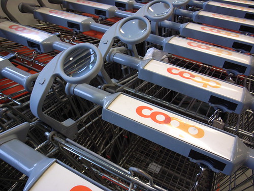
Magnifying glass A magnifying glass added to shopping carts in my grocery store in Geneva. An interesting add-on for shoppers who may need this feature. Will help to perceive some details not easy to see.

It's funny to see that while in some places shopping carts are enhanced with rfid reader, this shop has chosen another design direction to help its consumers.

Just-in-time feedback device

Instant survey As seen on an Air-France counter, a tactile device to get people's feedback. What is interesting here:

  1. On the HCI side: The absence of screen on the device, what is important for the company is only the answers, nothing is really needed to be shown to the person who is pressing the buttons. It's a one-way interface.
  2. On the context side: real-time feedback that can be gained with devices like this, in context. It of course leads to wonder about the best moment to ask people's feedback when traveling: when the interaction occur OR after a while when people had some time to filter out the plus and minuses of their experience. But wait, is life only about +/-?

"in", not "on" the network

It's 2009 and we have to make choices, as proposed by Julian Bleecker in A Manifesto for Networked Objects — Cohabiting with Pigeons, Arphids and Aibos in the Internet of Things few years ago:

"we'll have to begin choosing our prepositions with care — we are now in an era of pervasive networks and are thus more properly "in", not "on" the network. Careful choice of prepositions that help us orient matters deeply, and it helps think more clearly about not only the stakes of cohabiting with Things within the networked world, but also for thinking about how to design experiences for this very different mode of occupancy"

Why do I blog this? writing a chapter this morning about blogjects, I am digging stuff from relevant reports about the topic. This quote struck me as highly relevant for the new year.

I am often fascinated by the use of prepositions to refer to artefacts and services. The Internet is certainly an intriguing context to observe how people refer to accessing/going on/surfing on the network. Besides, are you on Facebook or "in" Facebook?

Interface and process

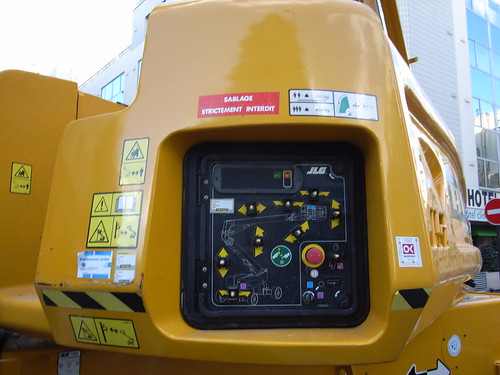
Complex interface A superb example of interface that maps the process and the buttons to be employed. Although the affordance is complex (a button used to move parts), the signage is relevant to understand the possibilities.

Design-Science relationships

In Designerly Ways of Knowing: Design Discipline versus Design Science, Nigel Cross interestingly discusses the epistemological concerns of design research. Using his own typology he tries to differentiate the design-science relationships: (a) scientific design, (b) design science, and (c) a science of design. Some excerpts I found relevant:

"Scientific design refers to modern, industrialized design—as distinct from pre-industrial, craft-oriented design-based on scientific knowledge but utilizing a mix of both intuitive and nonintuitive design methods. (...) a desire to produce works of art and design based on objectivity and rationality, that is, on the values of science. (...) Design science addresses the problem of determining and categorizing all regular phenomena of the systems to be designed, and of the design process. Design science also is concerned with deriving from the applied knowledge of the natural sciences appropriate information in a form suitable for the designer’s use.” This definition extends beyond “scientific design,” in including systematic knowledge of design process and methodology, as well as the scientific/technological underpinnings of the design of artifacts. (...) the science of design refers to that body of work which attempts to improve our understanding of design through “scientific” (i.e., systematic, reliable) methods of investigation. And let us be clear that a “science of design” is not the same as a “design science.” "

Another interesting topic addressed in this paper is the critique of the positivist doctrine implied by the scientific design vector, referring to the following claim by Donald Schön:

" He criticized Simon’s view of a “science of design” for being based on approaches to solving well-formed problems, whereas professional practice throughout design and technology and elsewhere has to face and deal with “messy, problematic situations.” Schön proposed, instead, to search for “an epistemology of practice implicit in the artistic, intuitive processes which some practitioners do bring to situations of uncertainty, instability, uniqueness, and value conflict,” and which he characterized as “reflective practice."

Why do I blog this? exploring the design field, I find it relevant to look at this sort of discussion as it clarifies lots of ambiguities. Working with people having both a "scientific approach" an designers, it's easy to see the gaps and the underlying elements described above. Beyond the "design thinking" meme, it's also good to see some academic references tackling the problem of design epistemology.

Historical analysis as a design tool

In "Historical Analysis: Using the Past to Design the Future", Wyche and her colleagues shows how history can be valuable for ubiquitous computing research; namely, that it can employed to provided insight and methodologies in the same vein as anthropology or philosophy. They point out in what respect historical analysis is relevant:

  • sheds new light on recurring cultural themes embedded in domestic technology, and by extension, ‘smart homes.’ Questioning these themes has the potential to lead designers to rethink assumptions about domestic technology use. For example, rather than using “ease of use” as a guiding principle, elders described difficult, yet enjoyable aspects of housework that technology removed
  • exploring the past helps us understand who we are today and where we are going. For ubiquitous computing, historical awareness can deepen designers’ understanding of the context they are designing for.
  • history can spur designers’ imaginations by revealing the contingency of the present situation, rendering it less obvious and inevitable
  • using history to defamiliarize the present supports designers in envisioning future domestic life less constrained by present-day cultural assumptions embedded in technology
  • Like ethnography, history forces designers to become more aware of their preconceptions about a topic. Because of its ability to defamiliarize the present, history can be a powerful recourse for inspiring innovative computational devices and systems."

They apply this approach to domestic technology use with some interesting techniques such as scrapbooking or the the use of personal histories of technology use (asking people to remember the first time they use a certain technology).

iPhone numeric keypad organizations

123456789

Topic addressed during lunch with Etienne Mineur in a nice italian restaurant.

789456123

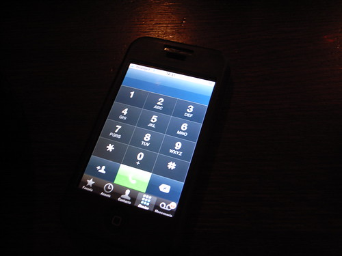
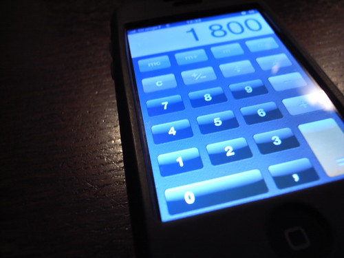
Or... the intriguing settings of the numeric keypads on the iPhone.

Yes "keypads" is plural because there are two layouts:

  • The dial layout: "1 2 3" in the lower segment.
  • The calculator layout: "1 2 3" in the upper segment.

Why two layouts? For a reason I explained here already: this basic interface evolved from two different culture, which are the calculators culture (started with Felt and Tarrant’s Comptometer) and the telephone keypad.

Why do I blog this? What we have here is a tremendously interesting example of an interface clash between two design cultures. It's highly intriguing to see that it has not been made more cohesive. Perhaps both layouts are so sticky that it would be weird to unify them? Who's ready to change that?

Representing design processes

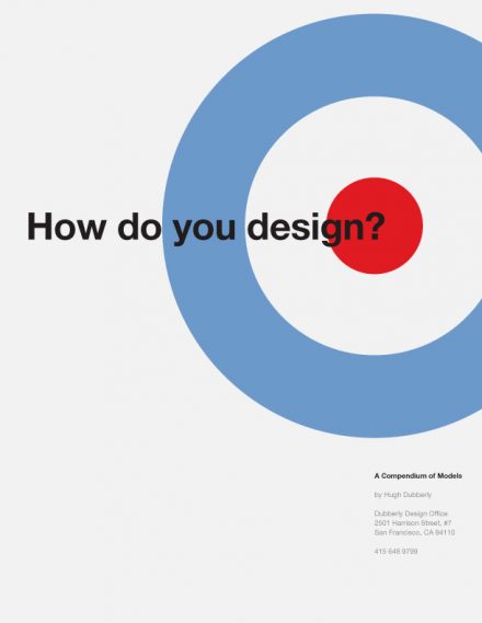
Don't think I posted it here but this initiative about mapping and analyzing design process is of tremendous value. Hugh Dubberly collected "over one-hundred descriptions of design and development processes, from architecture, industrial design, mechanical engineering, quality management, and software development". All this material is a great way to understand how people design and how they describe what they do. The process are often presented in a "designerly" way, mostly with graphics and process representations.

Why do I blog this? material for teaching as well as my interest towards representing designers' process. A must read.

Mobilisable at Arts Déco in Paris

Mobilisable Finally managed to get some time to write down my notes from the conference I attended last week in Paris. Called "Mobilisable" and organized at the Ecole Nationale Supérieure des Arts Décoratifs, the conference was both a scientific and art event about focused on mobility and the hybridization of technologies, environments, objects and people. The whole point of the event was to highlight and illustrate the current mutations at stake in interaction design, new media art and new mapping forms.

The first session was about relational cartographies, maps and mobilities.

Boris Beaude started off by describing the problems to visualize mobility on maps. Some of them are due to the inherent characteristics of maps:

  1. Mobility implies time, a diachronic dimension; so it's difficult to represent this on a map.
  2. Maps generally represents aggregates of people, not individuals
  3. Maps impose an euclidian metric, everything is laid down on a plan so it's difficult to represent different layers.

This is why most of the map depict means of transport, instead of mobilities. In addition, geographers like Boris are experimenting a shift in map design: they try to represent the "space of individuals". He showed results from a project called Scalab in which they asked people to describe their own mobility and map the results on graphics. This type of visualizations allows to show different set of practices. He also talked about projects such as Real Time Rome or Facebook Palantir to show how this sort of visualizations of maps is a evolution of mobilities, that spatial practices are different and that art is inteing as it manages to uncover new forms of representations beyond what geographers are building.

Then Philippe Vasset talked about an interesting book he just wrote about holes in maps: the white spaces you can find on maps where nothing is represented. He explored different white spaces in Paris area, documenting what sort of stuff you can find there.

(Map produced by Bureau d'Etude about the crisis in Argentina)

And finally, Bureau d'Etudes showed their different projects and the underlying rationale or process to design them. Their objective is to represent the world and its components with a subjective approach using visualizations tools and abstract maps. They discussed how this kind of representations have an important critical component. They basically focus on creating informational maps whose purpose is to visually represent different facets of contemporary capitalism: corporations, industrial and financial or influential groups.

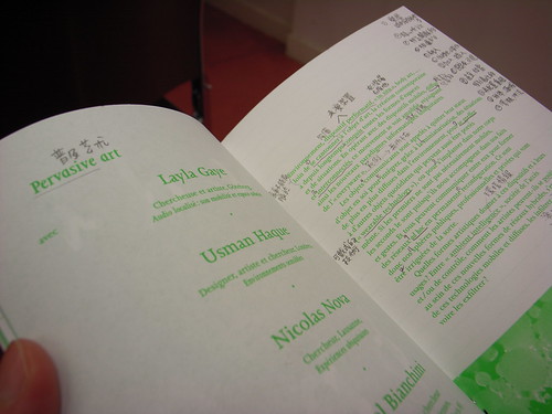
Mobilisable (The conference leaflet annotated by my chinese neighbor)

The next session was about "pervasive art", i.e. how artists and designers envision the internet of things as well as ubiquitous computing. Lalya Gaye, Usman Haque and myself discussed the role of these practitioners in the field.

As a first speaker, I showed why and how designers and new media artists are paving the way for the near future. After a quick introduction of ubiquitous computing and a description of the current challenges, the other part of the talk was a rerun of my why art/design is meaningful to HCI research.

The second speaker, Lalya Gaye gave a great presentation about audio projects in urban environment. What was highly inspiring was that she grounded the discussion about these projects (hers as well as some made by others) in a very relevant design rationale:

  • The iPhone is a presented as the optimal mobility object but she thinks it's not the case. Not simply because the text input sucks to send messages in less than 10 seconds but rather because there are other possibilities which interest her better. Using the city as an interface is such approach
  • The second reason is more aesthetical: urban space, beyond its surface, provides lots of potential affordances that can be creative. For instance, an handlebar can be use by skateboarders, a surface can be filled with stickers, staircases can be employed for parkour, etc. Mundane objects can indeed be seen as having other characteristics: handrails in stairs can be perceived as a way to generate music according to a certain pattern.
  • Daily actions, such as mobility, can be turned (or doubled) into new signfications.

She presented various audio projects built on these principles and concluded with this intriguing question: "what if the augmentation of objects and activities through this process may change the initial meaning of these? Do we get rid of the original object's signification?".

Finally, Usman Haque gave a great a talk (in french!) about his projects to show four key ideas:

  • Traditionally, people think architecture is about hard material (walls, ceilings) but for Usman, it's what remains: between walls, smell, temperature, social relationships, things that help the perception of space, etc.
  • Technology versus instruments: people generally thinks technology is an object but it's a system of relations to "do sth". He said that "nobody takes a frog and say 'this biology is great'". He prefers the notion of instruments.
  • User versus Participant: users imply that there are designers and passive users... which is why he prefers the notion of participants.
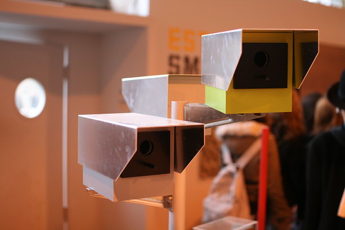
  • Publis space versus commons: now that space is filled with surveillance technologies, where are the boundaries between private and public space?

Why do I blog this my notes from this insightful sessions. Good material from interesting speakers. Some good things to sleep on and re-inject in current projects.

Thanks Samuel Bianchini for the invitation.

6th Design Bienniale in Saint Etienne

Design Biennale This week, I finally took some time to attend the Design Biennale in Saint Etienne, France. In this post, I tried to gather my thoughts about what I've learned there. Before starting off, I should perhaps point out that I am not that familiar with such events, having perhaps a different take on design per se. In my discovery of design as a domain, I tried to sketch down my impression here.
Cité du design

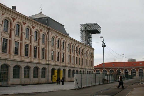
My first comment simply goes to the biennale setting. I am often struck and very intrigued by the environment where design and art exhibit are located: the place itself and its history is sometimes more intriguing to me than what's exhibited. This is why I was really mesmerized by the place where the Biennale happens. It's basically a huge and old manufacture, the former Manufrance and L'Arsenal buildings. Simply put, it's where both consumer goods (and weapons) use to be produced till the 1970s in France. Huge industrial buildings with weird lights, alleys and concrete stonewall. You can even encounter some remnants from the past, in the form of old signage or dirty windows. What's at stake here is that this building (which is going to become the french "Cité du design") bears lots of meaning in terms of the french industrial history. It thus gives a certain framing, at least for me, to the whole exhibit.
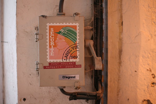
IMG_3658

Now, regarding the exhibit itself, I did not have time to have a look at everything since the whole event is quite big. My general impression is that it was sort of messy with a lot of different sub-exhibits. Down the road, it was sometimes a bit confusing but I guess it's what happen when you have different curators who want to bring forward different perspectives. No problem with that. There are of course lots of colorful and weirdly shaped objects that I don't know what to think: cushions, weird chairs and tables, futuristic objects with ugly fluo-colors and stuff... this is an aspect of "design" that I don't really understand (not to mention the personification of the people who produces these artefacts). What's weird here is that in french, the word "design" is now commonly used as an adjective to refer to stylish-and-snub objects bought (or loved) by some folks. Certain parts of the exhibit may have been targeted to this crowd, familiar with the whole literature about colorful and expensive crap, but it was less present than what I feared beforehand.

Another general impression was also bound to the french system of museums and exhibits: I went there on a week day and it was crowded... with kids. It's indeed very common in France for schools to organize visit for their pupils and most of the museums rely on this audience. Of course kids are so-so with long exhibit but I found interesting that they can approach the field like this, with teachers and design students giving them some information about the context and what the artefacts mean. Don't know whether it may shape their design culture but still.
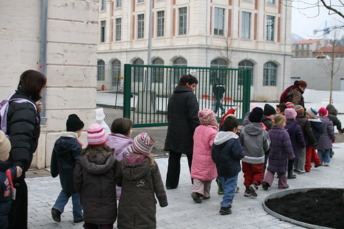
kids at the design biennale

Among the large variety of I was particularly interested by three places/sub-exhibits: EcoLab, the "Demain c'est aujourd'hui" ("Tomorrow is today") and Jean-Louis Fréchin carte blanche by Via. Let me try to nail down the implications of these.
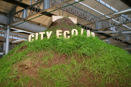
Ecolab

In "Fabrique 5000", The City Eco lab, orchestrated by John Thackara, was a huge and fascinating temporary "event about city-regions and design that includes permaculture, mushrooms, spin-farming, fritzing, open money, peak protein, alternative trade networks, dry toilets, sustainable urban drainage, alternate reality games, watershed planning, seed banks, de-motorisation, and VeloWalas".

What was important here, especially at a design biennial, is simply the idea that it's not about products (be they green or not) but about people and practices. Creating a more sustainable way of life is indeed not just about turning anything into green stuff but certainly changing people's habits and practices. Therefore, the important issue at stake for design lies in the role of designers (and artists): what is left when innovation should be less about adding new products to the stack of artifacts we have? Eco Lab answers this by showing real-life solutions that have been envisioned. It was all about low-energy food storage solution, recycling practices, new forms of mobilities, new economic models, local trading schemes, community supported agriculture, urban gardening, the re-connection of cities with their natural resources and of course (we're in France) a great canteen that only served products sourced within a 80km radius.

I have to admit that although I support this approach, I have never approached these issues in my work (perhaps because I haven't found any context to do so) but it seems highly motivating. Perhaps the sort of stuff that I am doing (studying how people do things) may be valuable for this sort of approach: documenting habits, uncovering practices and weak signals, people's daily bricolage, etc. and turn them into insights about sustainable behavior that should be amplified or act as inspiration for designers. City Eco Lab also interestingly proposed real-time activities (lots of kids!) and discussions. It was certainly one of the liveliest event in the whole biennial. Finally, it was tremendously inspiring to see this thing and envision some possibilities of sorta "real time/living lab" where solution can be explored, and not necessarily with technologies. I liked this a-technological approach which highlight the fact that innovation can also be social (with process and collaboration between people and existing artifacts).
IMG_3682

The next event I looked at carefully was the "Demain c'est aujourd'hui" ("Tomorrow is today". Described as an "industrial prospective exhibition", it presented a selection of objects, prototypes, videos and mock-ups about the near future. The whole set sort of exemplified how design can be used a tool in foresight and strategy. Although I was not convinced by some projects (perhaps because I've seen them elsewhere), some were intriguing and could be described as good landmarks. What was kinda weird there, was this fascination with the "electronification" of everything. "The intelligent pillarbox" was the sort of stereotype for that matter.
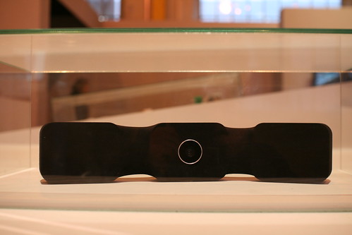
Wablog

That said, one of the most intriguing one was certainly the Wablog (see above) by Jean-Louis Fréchin and Uros Petrevski. This device allows to turn yourself in an avatar using gestural interactions to get and show presence-awareness. You can also leave "traces" on different platforms such as twitter, facebook, flickr and blogs as well as being aware of connections/comments by others on the very platforms. Very low-tech and minimal, designed with arduino and processing, it's an intriguing piece of object.

This leads me to the other work of Jean-Louis and Uros, that they presented in a separate exhibit that was called "Interface(s)" enabled by VIA.
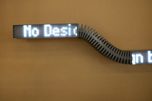
IMG_3674

It's a set of objects called "objets relationnels" that explore how the objects we know at home (light, wallpaper, shelves) can become interfaces. The point is that computation is present but not necessarily visible, as it's dissolved in the device. It's also about mixing ancient and modern material. Technology is not important per se, it's sits here only to create relationships between objects and people or between people/the environment.

Five objects were presented:

  • Waaz: a stereo set in the form of a shelf which enables audio diffusion and archiving digital music files. Interacting with it consist in dropping an audio CD or vinyl on top of the shelf to launch or stop the music. It simply used the objet as the mode of interaction.
  • Wasnake: a snake-like display in the form of shelves with colored LEDs and optical fibres that fill blocks periodically along the shelf. SMS and RSS feeds can scroll across the length of each displays.
  • Wapix: chronopictographic digital photo frames that can connect with each others through a wireless link and images can pass from one display to another. The high quality indeed reminds of the ektachrome.
  • Wanetlight: luminous suspension composed of 25 blown glass candles that form a 3D matrix of light controllable with a Nintendo Wiimote.
  • Wadoor Up: a door-screen with a low resolution electro-luminescent surface composed of EL pixel modules. Each lil bulb can be piloted individually, allowing users to write information messages or draw patterns.

All of them are clever instantiations of ubiquitous computing where computing vanished and is smoothly integrated to the object fabric. Interesting integration of technologies in objects. The proximity of these different interfaces in the same room makes the experience very coherent and gives a certain flavor of a possible "near near future". It was actually more relevant to me than the "demain c'est aujourd'hui" exhibit with this nearfuturistic sense.
About nokia open studio

The recent "Nokia Open Studio: Engaging Communities" published by Younghee Jung and Jan Chipchase is worth to read for various reasons. The obvious one is to know more about open studio/innovation and how they conducted research along this line. Their case study shows how the purpose is not to generate ideas of services but instead, to "generate inspirational and cross-referential material about the role of future technologies in participant’s lives by giving residents the opportunity to articulate their needs and aspirations, and present these in the context of their everyday life". Another reason to read it carefully is more general and concerns the underlying issues regarding UX research in a company such as Nokia (an issue I already described here). Some snippets from the document:

"The decision of what to research is decided on an approximately 6-12 month’s basis with some themes drawn from corporate strategy, guided by a consumer insights team that highlights trends of interest, and based on team member’s instinct of what will have the most impact within the corporation. The style of research could even be described as migratory in the sense that the team is drawn to where the resources - research topics of interest, and the means to carry out that research are richest. A major challenge of any kind of corporate field research is finding the right balance between field work and maintaining relevance within the corporate structure, which can involve anything from the face to face sharing of the results to hands on application of what was learned into the design process. The challenge boils down to: how to efficiently and meaningfully gather credible and interesting data, within a relatively short period of time in the field (which for us equates to about two weeks) from a research location anywhere on the planet?"

Why do I blog this some interesting material about the link between UX and design... some interesting reflections that can be useful to rethink my presentation about how field research can inform design.

The document is an interesting use case that shows the different issues related to this sort of approach.

Persuasive design

Two intriguing examples of persuasive design encountered at ENSCI in Paris: Incentive

The first one, next to the stairs, is an invitation to use the staircase as opposed to the elevator so "harden your butt".

Incentive

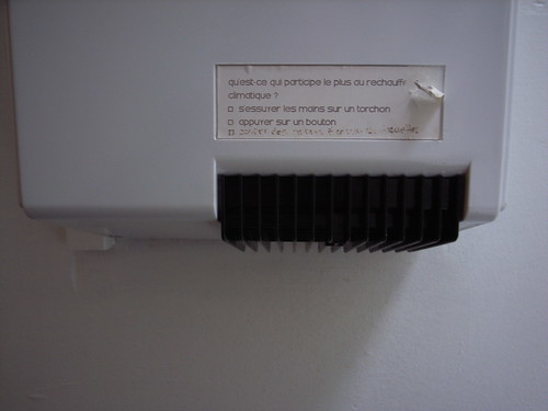
The second is a sticker that someone have put on the toilet hand dryer. It says "What's the largest contributor to global warming?" with two answers: "Dry one's hand with a tissue?" and "Press a button?".

Subtle cueing to invite for behavioral changes.

Exquisite mobile

An intriguing design process discussed this afternoon at the MobiKUI workshop: Paul Coulton introduced this basic way to think about mobile sensor-based applications based on the exquisite corpse model: you take 3 dices, throw them and it gives you the design brief: design an application that use the technology (1) in the area (2) for target (3). Paul called it "exquisite mobile".

Why do I blog this? found interesting this method to set yourself design constraints for creating something. Of course the categories can be questioned and modified but it helps to narrow down the application you want to create and can lead to other types of users. We employed it in the afternoon workshop and I expect it to lead people to scenarios different than the stereotypical geotagging or "where's my buddy" proposals.

How design adds to foresight

The relationship between design and foresight has been a recurring interest in the last few years. It interestingly draws some questions such as "can design help futures research?", "can we define foresight as long-range design?", etc. This is why I found interesting the interview of Nathan Shedroff by Nik Baerten from Pantopicon. An excerpt I found relevant regarding to the aforementioned issue:

"Nik Baerten: The fields of foresight, visioning, scenario planning etc. are not unknown to you. You have dealt with future scenarios a few times as well. Could you tell us something about your own experiences? How did you feel design could add to foresight? Furthermore, now as a chair of the design strategy programme, do you see also value in foresight/scenario thinking etc. for design?

Nathan Shedroff: Scenario Planning is an incredible tool (...) However, it can be tricky in business because, often, executives “get” the new vision but they’re still left with no way to implement it and alternate scenarios are often purposefully provocative extremes. Taking these visions and weaving them back into present strategy is often too confusing or difficult for managers and leaders to do. Design thinking and processes can be important contributors to the scenario-creating process but just as helpful for this implementation phase. In fact, alternate scenarios that build environments and artifacts can really help executives “see” how these scenarios might affect their business. Design processes bring a culture of brainstorming, critique, prototyping, and testing to the product and service development process. (...) Artifacts from the future that relate directly to an organization’s business can help support courage and commitment to innovation since the tangible attributes of prototypes helps leaders “see” examples of offerings "

Why do I blog this? Reminds me of Raphael's blogpost about the making of a view on the future where he explains how a Nokia Design team worked on making tangible and meaningful the Nokia Category Vision with design & experience concepts for an internal strategy forum. Looking more closely at the underlying design process makes Shedroff's point more clear:

"We started to observe people, not objects or technology. We observed and documented needs & wants, moods & modes, behaviors, social ties, lifestyles (...) spent hours distilling internal and external trend forecast reports, digging and hand-picking ideas from past vision projects, gathering inspiration, and interviewing experts and stakeholders company-wide. (...) Then we discussed. A lot. The often small, and sometimes big moments of everyday life. We built and illustrated moments we believed were the essence of connecting, showing off, working, and exploring. All these moments were consolidated into structured scenarios and storyboards. (...) Then we designed in parallel products, colours & materials, and UIs while continuing scripting and storyboarding the four stories. (...) ideas and designs were shared, evolved and incorporated instantly. (...) Then we went into an iteration and assessment cycle while keeping an eye on the looming deadline. What are we trying to communicate again!? Are the designs telling the right stories? How can we sharpen the message?"

Some great examples here from Nokia about how the design process supports foresight.

Also, when preparing my talk for Design Engaged about failed futures, I often encountered the issue of design and/or foresight: the failures I mentioned could be thought as failed forecasts (e.g. the future is not about a certain endpoint/idea) or failed design (e.g. the future is not about a certain instantiation of an endpoint). One can see products as instantiation of endpoints, which is actually what Chris Heathcote commented on last week. Shedroff's arguments above adds up to the discussion by framing another relationship, or dimension, between design and foresight than the one I discuss in my DE2008 talk.

The sociality of the play setting

In People, places, and play: player experience in a socio-spatial context, De Kort and Ijsselsteijn (Computers in Entertainment (CIE), 6(2), April/June 2008) discuss the "situatedness" of digital gaming. That is to say, the socio-spatial contingencies of the player experience. Of interest here is the exploration of how co-players or the audience, as well as the spatial context can shape the player experience:

"This social context cannot be described by the presence of others alone. It also encompasses the player’s ability to monitor other players’ actions, performance and emotions. It includes the other's role in this setting – acting or observing, competing, co-operating, or co-acting. And it comprises their opportunities for verbal and non-verbal communication. Together, the social affordances and the objective characteristics of the game and play context that contain them define the 'sociality' of the play setting. (...) The presence of others, or social presence, is seen here as a continuous dimension (as opposed to a dichotomous one) that varies based on the level of perceptual access to the real or virtual others, their communicative realism, and a shared behavioural engagement. "

Why do I blog this? I've always been intrigued by the role of audience/bystanders/co-located people in gaming situations, and of course of they influence the game experience. One of the topic I find intriguing is how game design can benefit from this and explicitly create interactions that would take advantage of the complexity of the social setting.

"Designed by an engineer"

The city of Lausanne is very proud to have the first swiss subway system (opening very soon). After two years of constructions, some new urban elements are appearing and it's funny to see the pride of the persons who took care of that. See for example this stunning sticker that is pervasive around the new subway entrance: "Designed by an engineer"

It basically says "Conceived/designed by an engineer", I wonder about the background decisions that led to this sticker campaign and find it utterly fascinating. Also what will be people's reaction? Does that make you more confident before taking that elevator?

Of course, I am always thinking how OTHER stickers (such as "Designed by a crocodile wrangler" or "Built by a chicken sexer") would do.

Explore and produce provocative designs for automated journeys

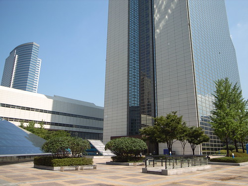
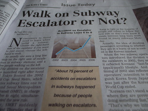
Buildings Issues in Korea

If you're (still) around Seoul, which I am not, there is this awesomely intriguing "action-packed" workshop next week called Automated Journeys (as part of the Ubicomp 2008 conference):

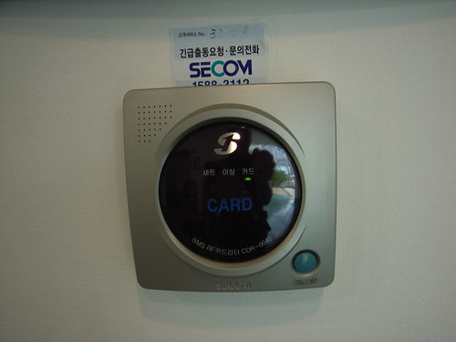
"Computing technology now pervades those moments of our day when we move through our cities. Mobile phones, music players, vending machines, contact-less payment systems and RFID-enabled turnstiles are de rigueur on our daily journeys. This workshop aims to examine these augmented journeys, to reflect on the public, semi-public and private technologies available to us in them, and to speculate on what innovations might be to come. Taking as our starting point cities such as Seoul, we aim to take seriously the developments in mobile technology as well as the advancements in autonomous machinery and how these mesh with our urban journeys.

Through collaborative fieldwork, group discussion and a hands-on design brainstorming session, the workshop's empirical focus will be directed towards producing 4 envisagements that either speculate and/or critically reflect on technological futures."

Why do I blog this? interest in automatic city + active workshop with participants engagement + already attended another workshop organized by this team. Seoul's a perfect place to investigate such a topic (on par with Rotterdam).