Design

"Kill switch"

An IEEE Spectrum article recently tackled the notion of "kill switch":

"According to a U.S. defense contractor who spoke on condition of anonymity, a “European chip maker” recently built into its microprocessors a kill switch that could be accessed remotely (...) If in the future the equipment fell into hostile hands, “the French wanted a way to disable that circuit,” he said. Spectrum could not confirm this account independently. (...) So what's the best way to kill a chip? No one agrees on the most likely scenario, and in fact, there seem to be as many potential avenues of attack as there are people working on the problem. But the threats most often mentioned fall into two categories: a kill switch or a backdoor. (...) A kill switch is any manipulation of the chip's software or hardware that would cause the chip to die outright (...) But other experts counter that such ideas ignore economic realities. "

Why do I blog this? well, nothing in mind in particular, it's just that the notion of "kill switch" is intriguing from a design/ux POV. What does that mean for designs? What does that mean for users? Are there any kill switch in consumer electronics? It also reminds me of secret levels/cheatcodes/hacks in videogames or hidden graphics in Disney movie.

Vocabulary of public transport ticket validation

Touch, Punch and Touch The vocabulary of interaction in this sequence of devices aimed at validating public transport cards in France: "validate here", "punch your ticket", "leave your card here". It's interesting to nice that only the "touch interface" explicitly tell people where to touch the card ("here"), whereas the "punch" interface (in french "compostage") does not have to specify where the interaction happen. Designers assume that if there's going to be something punched (a ticket) it can only be in the grey slit. it's also because people taking french trains have a long tradition of "punching" their tickets, as a sort of standard.

The shape and size of the boxes themselves is also interesting. People who know the context will remark that the one that look very cheap (on the right) is the city transport one, the second smaller box (on the left) is for regional card and the yellow box in the middle is the national system.

The design and fading of pinball games

Last week, the NYT had an intriguing story about pinball machines, or - more specifically - the survivor of the pinball industry. Some excerpts I found interesting below: About how it went downhill ("a painful fading") that may be "turned around":

"“There are a lot of things I look at and scratch my head,” said Tim Arnold, who ran an arcade during a heyday of pinball in the 1970s and recently opened The Pinball Hall of Fame, a nonprofit museum in a Las Vegas strip mall. “Why are people playing games on their cellphones while they write e-mail? I don’t get it.”

“The thing that’s killing pinball,” Mr. Arnold added, “is not that people don’t like it. It’s that there’s nowhere to play it.” (...) Corner shops, pubs, arcades and bowling alleys stopped stocking pinball machines. A younger audience turned to video games. Men of a certain age, said Mr. Arnold, who is 52, became the reliable audience. (...) the pinball buyer is shifting. In the United States, Mr. Stern said, half of his new machines, which cost about $5,000 and are bought through distributors, now go directly into people’s homes and not a corner arcade "

About the design process per se:

"Some workers are required to spend 15 minutes a day in the “game room” playing the latest models or risk the wrath of Mr. Stern. “You work at a pinball company,” he explained, grumpily, “you’re going to play a lot of pinball.” (On a clipboard here, the professionals must jot their critiques, which, on a recent day, included “flipper feels soft” and “stupid display.”)

And in a testing laboratory devoted to the physics of all of this, silver balls bounce around alone in cases for hours to record how well certain kickers and flippers and bumpers hold up."

Why do I blog this? cultural interest in how certain things work and then fade away for diverse reasons that are interesting to observe. Some lessons can be drawn here about innovation, especially about the role of contexts (or the absence of context of play).

The phone diversity issue in ubicomp

If one take cell phones as the prominent ubiquitous computing platform, an important problem is the one of the platform diversity. Greenhalgh and colleagues tackles this issue in their Ubicomp 2007 paper called "Addressing mobile phone diversity in Ubicomp experience development". Phones vary enormously in their capabilities and designers face a trade-off between capability and availability: " between what can be done and the fraction of potential participants’ phones that can do this" Comparing four cell phones platform (SMS, WAP/Web, and J2ME, Python and native applications), the authors interestingly propose "four development strategies for addressing mobile phone diversity: prioritise support for server development (including web integration), migrate functionality between server(s) and handset(s), support flexible communication options, and use a loosely coupled (data-driven and component-based) software approach".

Why do I blog this? documenting reasons of failures for certain projects in the field of consumer electronics.

Greenhalgh, C., Benford, S., Drozd, A., Flintham, M., Hampshire, A., Opperman, L., Smith, K. and Von Tycowicz, C., 2007. Addressing mobile phone diversity in Ubicomp experience development. In: UbiComp 2007. 9th International Conference on Ubiquitous Computing, Innsbruck, Austria, 16-19 September 2007. pp. 447-464

"Keeping aging systems on their feet"

The inevitable aging and depletion of components of a design object is an often overlooked topic that is addressed in this IEEE Spectrum article. Some excerpts I found relevant:

" At the very least, the quest for an obsolete part can escalate into an unexpected, budget-busting expense. Electronics obsolescence—also known as DMSMS, for diminishing manufacturing sources and material shortages—is a huge problem for designers who build systems that must last longer than the next cycle of technology. (...) The crux is that semiconductor manufacturers mainly answer the needs of the consumer electronics industry, whose products are rarely supported for more than four years. Dell lists notebook computer models in its catalog for about 18 months. This dynamic hurts designers with long lead times on products with even longer field lives, introducing materials, components, and processes that are incompatible with older ones. (...) The systems hit hardest by obsolescence are the ones that must perform nearly flawlessly. Technologies for mass transit, medicine, the military, air-traffic control, and power-grid management, to name a few, require long design and testing cycles, so they cannot go into operation soon after they are conceived."

Hence the existence of "company that provides obsolescence-related resources" such as Qinetiq Technology Extension Corp and the need to develop "tools to forecast and resolve obsolescence problems":

"To deal with that growing pile of unavailable supplies, engineers in charge of long-lasting systems must basically predict the future—they must learn to plan well in advance, and more carefully than ever before, for the day their equipment will start to fail. (...) Such companies as i2 Technologies, Qinetiq, Total Parts Plus, and PartMiner have produced commercial tools that forecast obsolescence by modeling a part's life cycle. To derive a forecast, the services weigh a product's technical attributes—for example, minimum feature size, logic family, number of gates, type of substrate, and type of process—to rank parts by their stages of maturity, from introduction through growth, maturity, decline, phase out, and obsolescence. (...) However, predicting when parts will become unavailable is still not enough information on which to build a business plan. "

Why do I blog this? curiosity towards this intriguing and overlooked problem.

How GPS alter navigation/orientation

In-Car GPS Navigation: Engagement with and Disengagement from the Environment by Leshed, Velden, Rieger, Kot, & Sengers is a paper presented at CHI 2008 that deals with the relationship between GPS car navigation and how people interpret their environment or navigate through it. What's interesting here is that they avoid technological determinism (technology as the external causation of change) and the traditional lament/pessimisn about technologies influence on social change. Using an ethnographically-informed study with GPS users, the authors show that GPS disengages people from their surrounding environment, but also has the potential to open up novel ways to engage with it". The issues of environmental engagement and disengagement are the following:

  • Pre-navigation/Route Choice: "“Finding” the destination is thus modified from a relative spatial activity to correctly keying in the address"
  • Route Following: GPS eliminate the attention to objects in the paths, some people less blindly than others.
  • Orientation in Unfamiliar Areas: " the GPS disconnects the drivers from the external environment, as they no longer need to find out where they are in order to avoid getting lost or for getting oriented when already lost. This issue is intensified when the GPS automatically and quietly recalculates a new route when its directions are not followed unintentionally (e.g. because of a mistake) or intentionally (e.g. because of road constructions and detours): the practice of re-orienting and consciously re-routing oneself is not necessary anymore. However, some informants reported that they do like to know where they are
  • Orientation in familiar areas: people do not want to have oral instructions, sometimes disagree with paths, use the gps "just for fun" or use it mark place they know.

  • When driving: social Interactions around the GPS: with: "interaction with other passengers in the car has altered given in-car GPS units. With vocal directions from the GPS unit, a passenger who serves as a navigator in the car is no longer in need, and so the driver/navigator roles are modified"
  • When driving, the GPS is often treated as an "active agent", socially speaking: naming the device, talking to him.
  • When driving, the interaction with the external environment and locals is also altered. For instance, the digital representation is not accurate enough so people have to look outside and see if their POI is here or it can allow to discover new elements (rivers or parks) on the way. And interaction with other people are less needed (to ask a direction).

Based on these results, the author provides some "high-level guidance rather than feature-centered design" ideas:

  • "GPS instructions could refer to landmarks in aiding navigation.
  • Highlight the ambiguity of GPS data (...) to minimize risks associated with over-trusting an automated device.
  • Extend context-aware capabilities: distinctive usage of the GPS in familiar areas
  • Support the car as a social place: Instead of secluding the passenger seated near the driver (...) we can engage them in the interaction with the GPS unit."

Why do I blog this? great paper from lots of criteria (theoretical justification, nice exemplification of techno-social recombination, design implications). Moreover, the design implications are close to what we found in another location-based context: in the CatchBob experiment, while studying how WiFi positioning is employed by players (I'm currently writing a paper with Fabien about it). That paper is also interesting at it contradicts what that "location, location, location" article in the last Economist report state (the fact that we will never be lost or be more immersed in the physical world.

Leshed, G., Velden, T., Rieger, O., Kot, B., & Sengers, P. (2008). In-car GPS navigation: Engagement with and disengagement from the environment. Best Paper Award. To appear in Proceedings of CHI 2008, Florence, Italy.

Blizzard's design process and the role of failures

11 innovation lessons from creators of World of Warcraft by Colin Stewart is a very interesting discussion. I don't agree with all of them but some are important. That one struck me as relevant:

"6. THE IMPORTANCE OF FREQUENT FAILURES “One of the mantras that a large software development company uses is ‘Fail Often, Fail Fast,’ ” Wartenberg said. “As Alan Mullaly said when he led Boeing Commercial Aircraft, ‘We celebrate mistakes; bring them into the open, because we can’t help fix what we don’t know about.’ ” To show Blizzard’s devotion to this principle, CEO Morhaime and other executives listed the titles of canceled games Blizzard had worked on: Nomad, Raiko, Warcraft Adventures, Games People Play, Crixa, Shattered Nations, Pax Imperia, and Denizen. “We don’t have a 100 percent hit rate. We just cancel all the ones that aren’t going well,” Morhaime said. “Failure begets success,” intellectual property attorney St. George said. “Many successful companies and CEOs have noted that their best successes have come from failures. The lessons learned from failures will provide the stepping stones for the next innovation.”"

Why do I blog this? gathering notes about failures for a personal project. It's also interesting to see that game companies are only reaching the stage where they figure out the lessons described in that paper ("GO BACK TO THE DRAWING BOARD", "MAKE CONTINUAL IMPROVEMENTS").

Skateboarding readings of space

The other day I mentioned this short article I wrote in JCDecaux trend report. It was about how skateboarders "read" space, make decision about where they do skateboard or to hang out with peers. In a sense, it's about "social navigation" and what sort of "footprints in the snow" matter for skateboarders. I dug up some examples from my city ventures below. Choosing a skateboard spot according to the physical aspect of the place

For instance, in Niteroi (Brasil), that curved sidewalk is definitely an invitation to skate it: skateboarding spot

This bench in Zürich (Switzerland) is also an obvious point of interest (from the physical point of view) but the presence of wax also attests that OTHERS are using it as a spot. The place can also be more than a physical spot as the presence of wax indicates it marking by a community. It reveals the appropriation by a click of skateboarders (and the likelihood to find them here on saturday afternoon) Waxed area for sk8

Skatespot approval or how places are validated for certain activities

This "thumb-up" stickers found in front the of the University of Geneva indicates the approval of the spot by a community of skater (in that case a local shop/community):

Skatespot approval

Skateboard map

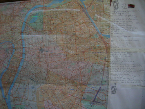
The usual paper map, for example in Lyon (France) found in a shop called Wallstreet, that depicts interesting spots to do skateboarding:

Lyon skateboarding spot map

And of course, there is an on-line/participatory version, named freeyourspot, see the example of London (which not really reveal about skateboarding potential there):

Why do I blog this? of course one could use lots of other examples but I find skateboarders a very interesting target group to study spatial behavior, and how they use various techniques (from wax to participatory websites or cell phones). In this post, I tried to update some examples of how skateboarders read/navigate in space.

I find them really interesting examples IMHO of what some would refer to as "situated technologies".

Henry Petroski about design, failures and compromises

Among my readings during Easter was this "Small Things Considered: Why There Is No Perfect Design" by Henry Petroski. The whole book is about design as a compromise in response to constraints, illustrated by stories concerning automobile cup holders, duct tape, WD-40, paper cups/bags and the devices to make them, the invention of single-lever faucets, the redesign of vegetable peelers and printers. It reads a bit like a Stephen Jay-Gould book in the sense that it's highly descriptive with lots of details. Some chapters are a bit less insightful than others (the one about buying a house was a bit less interesting). And Petroski is an engineer, which gives him a certain perspective of the world. The conclusion was certainly the part that interested me most, about silos/disciplines:

"Designing and building a piece of technology is more than an application of science. In fact, relying on science alone would make it virtually impossible to design even a modest bridge. What science would be applied? The laws of mechanics tell us that forces must balance if the bridge is to stand. But what forces, and stand how? Unless inventors and engineers, designers all, can first visualize some specific kind of bridge in their mind's eye, they have nothing to which to apply the laws of science. The creation of a bridge or any other artifact requires, before anything else something imagined. Whether or not science can be applied to that mental construct is a matter of availability. It there is a body of scientific knowledge that can be applied, then it would be foolish not to exploit it. (...) In fact, "Science finds - Industry Applies - Man Conforms" will never be more than a catchy motto. The reality is "People Design - Industry Makes - Science Describes." It is the creative urge that drives the human endeavor of design, which leads to inventions, gadgets, machines, structures, systems, theories, technologies, and sciences. Both science and technology are themselves artifacts of human thought and effort."

And the last bit about failures:

"Simply put, all technology is imperfect as its creators, and we can expect that it will always be. As we can, by practice and discipline, improve our own behavior, so we can, by experience and process improve the behavior of our creations. (...) As this book has suggested, there are countless examples of technology's imperfections and limitations, from the simplest of the most complex of made things. By understanding their flaws and the limitations of the design process that created them, we can better appreciate why they are and must be imperfect. All things designed and made have to conform to constraints, have had to involve choice among competing constraints, and thus have had to involve compromise among the choices. By understanding this about the nature of design, we can better negotiate the variety of stairways that we encounter, no matter how idiosyncratic or metaphorical, taking us from one level of technology to another."

Why do I blog this? Being currently interested in "failure, possibly for a book/short piece, I am gathering sources like this. What did I learn here? all the evidences gathered in this book are meant to illustrate that "design failures" are not caused by human errors but are a side-effect of the need to make compromise between needs and constraints.

Design process at Apple

An interesting write-up of the contribution by Michael Lopp (senior engineering manager at Apple) at SXSW2008 describes some aspects of Apple design process (by Helen Walters):

"Pixel Perfect Mockups: “it removes all ambiguity.” That might add time up front, but it removes the need to correct mistakes later on.

Apple designers come up with 10 entirely different mock ups of any new feature (...) and give themselves room to design without restriction. Later they whittle that number to three, spend more months on those three and then finally end up with one strong decision.

Paired Design Meetings: Every week, the teams have two meetings. One in which to brainstorm, to forget about constraints and think freely. (...) Then they also hold a production meeting, an entirely separate but equally regular meeting which is the other's antithesis. Here, the designers and engineers are required to nail everything down, to work out how this crazy idea might actually work. This process and organization continues throughout the development of any app.

senior manager outlining what they wanted from any new application: "I want WYSIWYG... I want it to support major browsers... I want it to reflect the spirit of the company." Or, as Lopp put it: "I want a pony!" (...) The solution, he described, is to take the best ideas from the paired design meetings and present those to leadership, who might just decide that some of those ideas are, in fact, their longed-for ponies. In this way, the ponies morph into deliverables. And the C-suite, who are quite reasonable in wanting to know what designers are up to, and absolutely entitled to want to have a say in what's going on, are involved and included. And that helps to ensure that there are no nasty mistakes down the line."

Why do I blog this? curiosity towards organizational/design process per se, especially at Apple. It's generally rare to see this things disclosed.

Dirtiness of touch interface

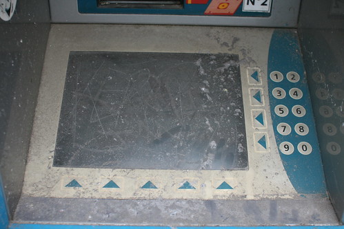
Dirty touch interface How touch interface can age... and get dirty over time. Seen in Paris yesterday, it's actually an old video rental booth down the street of the 11th arrondissement.

Why do I blog this? just find intriguing the role of aging (and dust!) in the design of interfaces (and then: interactions). Sometimes other services need to be put in place (like new kind of maintenance... that would clean the interface or keep it usable).

Tools for writers, design considerations

Funny piece in the NYT by Rachel Donadio about recent tools used by novel writers:

"Powers wrote in an e-mail message — or rather, dictated, since he uses the voice recognition software built into the Tablet PC operating system to compose everything, including his novels. (...) Powers has turned to a program rather ominously called Mindjet MindManager, which creates vast, sprawling outlines resembling family trees. (...) Powers created a visual outline for each character. It included material on his or her “life history, personality traits, physical characteristics, verbal tics, professional and educational background, choices and actions, attitudes and relations to the other characters,” he said. “As the material grew, I created topical sub-branches and sub-sub-branches (...) Vikram Chandra had similar results with Microsoft Project, (...) the program (which he says he first heard about from an Israeli crime novelist) helped Chandra keep track of the nearly three dozen characters across 900 pages — “not just people by themselves, but people in relation to time and place,” he wrote in an e-mail message. Since the novel uses flashbacks to cut between different plot lines — a narrative structure Chandra likens to a mandala, a series of concentric circles used as an Eastern meditation device — “it was really useful ... to be able to see the events arranged on a timeline.” (...) He is also a devotee of the Logitech io2 pen, which uploads handwritten notes from special paper and then converts them into searchable text (...) Excel spreadsheets helped Marisha Pessl structure her novel “Special Topics in Calamity Physics,” (...) Pessl made spreadsheets for each chapter and character. “Because I was plotting a mystery, I wanted to be very sure as to what clues I would plant.” It also helped her see who was doing what when. “With a first-person narrator it was really important,” she said. The novel’s protagonist, Blue, “has such a blinkered view of the world, and as the author you have to have a godlike perspective.” (...) Some novelists even admit to using screenwriting software (...) The program “prompts you step by step to answer a lot of questions,"

Why do I blgo this? what is interesting here is the discussion of the design process (it's not industrial or interaction design but still). For instance, the vocabulary about the process + how/what tools for what, how tool shape the design process are of considerable interest. And for naive people, as the conclusion says, "these computer programs may offer helpful frameworks, but they can’t substitute for talent and imagination.

Design as choice

Encountered yesterday in Venice Beach:Keyboard

Why do I blog this? design is about choice, why have some letters been chosen on that keypad? why others have been discarded? perhaps there aren't anything that starts with "I" or "Y" in the choices proposed.

Another example about design choices: why there aren't any cut/copy and paste on the iphone?

Etech 2008: Fictional futures

"Fictional futures" by Matt Webb. Matt discussed his favorite concepts from science fiction because he likes to take the ideas in the science fiction and take them back to the everyday, inspire product design. To him, scifi is good to identify things that falls into the same metaphor species as design: "I don't make a distinction between scifi and reality". So, some examples he described:

  1. One favorite is moving cities: kim stanley robinson's "meanwhile the city slid over us..." + archigram's walking city + cedric price (the aviary at London Zoo). What does that mean? what would that be to live in a moving city? How would that change our conditions?
  2. another is the moon: Italo Calvino's cosmicomics: story of a sort-of second moon (Cruithne). Why this is interesting? think about what would it be like to live on a city like on the second moon? What would the everyday be like on that planet that have a 385 orbit?
  3. show lots of pictures of stars... that inspire him to design lightcone "a constantly updating list of all the stars that have been enveloped by your own personal lightcone". You can subscribe to your own lightcone.
  4. Still about stars, Lacerta is in Greg Egan’s book Diaspora. Impressive descriptions that helps the thing to be more true (and more believable to him than Gibon's descriptions in Neuromancer). What is the lesson here? It means that features outside of the main story are necessary for believability and for people to accept the narrative into their lives. It inspired him that design.
  5. How low-level physics affect spatial patterns (in Greg Egan's Diaspora): separation of output and input, what you can grasp/reach versus what you can see and touch. In Second Life, your character is your output but you can move your viewpoint... which is weird, you can't do that in physical reality. SL is a world where you can move a camera separated from the body. That's an interesting design issue.
  6. Slow species: creatures that live over a huge period of time (orion nebula) as seen in Olaf Stapledon’s book, Star Maker or in Diaspora by Greg Egan. Implications for design: what would it mean to think at a speed where it takes thousands of years just for a signal to pass from one side of your mind to the other? What about slow communication?
  7. Shows lots of examples of network and closed systems: Birthday of the World (by Ursula Le Guin), people who spend 6th generation to reach a star: they live in a close system, what does that mean? contained space, they’ve no idea what shoes are—their world is carpeted. There’s no disease, no concept of going outside. The novel is about what religion does arise out of this? this is important because our planet needs to be thought as a closed system. Would Discovery, Le Guin’s generation ship, feel like Catalhoyuk, an old sumerian city that has NO STREETS (to get to your house, you had to climb up on top of the city). The web had no street at the beginning: no search engine, etc.

AK-47: criteria of good design?

Read in Good

"The problem is that “good design” didn’t look much beyond the object itself. An AK-47 rifle, for example, makes use of sound and appropriate materials and it demonstrates other criteria of good design, such as solid workmanship, efficiency, and suitability of purpose—the gun was designed so that nothing, from sand to ice, could get in and prevent it from firing. Plus, its robust and “honest” appearance is pleasing. For many, the AK-47 is a classic in the annals of good design (it also happens to be most popular firearm in the world). But the question then is: good for what and for whom?"

People who wants more details can also read the Wikipedia entry about the comparison between the AK-47 and the M16:

"The M16 and the AK-47 design, capabilities, and role on the battlefield were reflections of the different experience and doctrine of the United States and the Soviet Union. (...) The AK-47 was the result of Soviet combat experience during. Studies of battlefield reports showed most combat occurred within 300 meters, and the winner was usually the side with the most firepower. (...) The M16, on the other hand, was influenced by the U.S. Army's preference for an accurate semi-automatic weapon. Although the U.S. Army’s studies into World War II combat accounts came up with very similar results to that of the Soviets', the Army maintained its traditional views and preferred highly accurate weapons."

Why do I blog this? interesting issues regarding controversial objects and the role of "theory"/doctrine in designing an object. It makes me think that machine guns from the french army have "ultima ratio" carved on them (which means "last resort").

Queues and interaction design

Donald Norman's column about the analogy between "queues and interaction design" was very thoughtful:

"What is a buffer? It is a holding space between two systems, sometimes in space, sometimes in time, allowing the objects or information from one system to await the next system. (...) We can see buffers in operation almost everywhere. For example, when I walk into a dining room and see the food waiting to be dispersed to the guests, these are inventories of food, buffers. Even when eating from a plate heaped with food, the food not yet in the mouth is inventory, a buffer that makes it easy to select from the preferred orderings at the eater’s own pace. (...) Interaction design is about interfaces, which means it is about synchronizing the events of different systems, about memories, buffers, queues and waiting rooms. Waiting is an unavoidable component of interfaces, an unavoidable part of life."

Why do I blog this? just found the analogy intriguing.

Metro pass surfaces

To access the underground:(Violet) Touch interaction

(Violet) Touch interaction

To recharge your card/pass: (Violet) Touch interactions

(Seen in Paris last week)

Why do I blog this? I just wanted to point the size and color of the contact area (coherence and homogeneity). This big violet circle is intriguing and as you can see on the second picture there is a sort of "tail" maybe to facilitate the passing of the card/pass when moving. The tail allow the user not to stop to validate his/her card.

Two design approaches: Disney Theme Park and LEGO

Not really a pattern, but I ran across two articles about design process this morning. The first one (found here) is about the design of a new ride (Toy Story Mania) at Disney theme parks:

"BUILDING elaborate models is among the first formal steps in creating a Disney attraction. Engineers, paying attention to scale and sight lines, want to find out how a planned addition would affect the existing park. Models are built on large tables equipped with wheels. The company keeps room-size models of entire parks, and engineers will eventually wheel the new model into that area to see how it looks. (...) To give birth to Toy Story Mania, Mr. Rafferty and Mr. Coltrin went to work turning drawings of the ride into foam models, toiling in the same 1950s-era building in suburban Los Angeles where Walt Disney himself once tinkered. Tweaks started to happen. The team added turrets to the top of the ride for a more dramatic flair. (...) Upstairs, designers entered blueprints for the ride into a computer program. This would allow them to start building and refining the entire project (...) “It is much easier and less expensive to do this before the concrete has been poured,” he added. “As rides become more complicated, your ability to tweak in the field gets harder and much more expensive.”

Across the street, in a cold, unmarked garage, Ms. Allen helped to conduct “play tests” on rudimentary versions of the ride. More than 400 people of all ages — all had signed strict nondisclosure agreements — sat on a plywood vehicle set up in front of a projection screen and played various versions of the games. Disney workers studied their reactions and interviewed them afterward.

And this interview of Bjarne P. Tveskov, the classic LEGO Space Designer addresses interesting topics related to design:

"BBG: Where did the ideas for the models come from? Did someone from LEGO say "Bjarne, we need a big space ship for the Blacktron line" or did you come up with the ship so they decided to produce it?

Bjarne: Well, normally there was a brief to create a new space ship or vehicle or base at a specific price point. Maybe the model were to replace an existing set or maybe there would be some other requirements. But there would always be a fixed "brick-budget" one had to stay within. That was often the hardest part; If the model was over budget, one had to simplify and sometimes strip all the little cool extras of the models. Each brick has an internal price, and there was a whole department that did nothing but calculate the prices of all the prototype models we designed. Often 20-30 different models would be built, and only one would be selected for production. Then the models went through a committee of super-experienced model-designers to make sure stability and buildability was optimal.

I remember that one of the toughest ones to slim down to the right price was the Blacktron Alienator (6876). It had to be rebuilt and re- calculated several times before the brick-count was low enough. But it's still also one my favorite sets out of the 20+ LEGO Space models I designed back in the day from 1986 to 1990."

Why do I blog this? two interesting accounts of design process in less known fields, some curious elements to be thought of. For example, the description of the test approach in the theme park scenario would be a curious topic to discuss with urban planners. Are there some transferable approaches? Would a public transport company benefit from this?

Recursive affordances

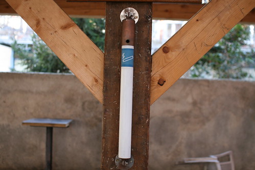
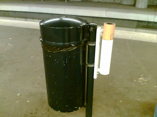
These two ash-tray found in Geneva and Lausanne are two impressive examples of an object affordances: Cigarette ash-tray

Double affordance

Why do I blog this? This is utterly curious from a design perspective. the artifacts designed to received trashed objects looks like the object itself. A sort of recursive affordance to some extent. What does that mean? It's actually not that recursive and the second example if maybe more self-explanatory since the two different garbages are next to each other. Besides, the first one has a little hole that only allow to receive small things like cigarettes.