Design

Steve Portigal on scanning/meme-broking

There is a great interview of Steve Portigal in influx. Some excerpts I found relevant:

"A great design strategist (...) someone who has had a few different professional identities and gets excited by the spaces where disciplines, schools of thought, and methods overlap. They are curious and easily intrigued: they like to observe what's going on around them and they're good at listening to people. And they know how to use all this data to synthesize new patterns and communicate them clearly to a range of audiences. Charlie Stross, in the sci-fi book "Accelerando", describes the profession of a "meme broker" and the intense amount of content they have to assimilate every day in order to do this. Bruce Sterling calls this activity "scanning“ looking at all the sources one can and constantly asking what does this mean for my clients. Being able to work through all those data sources and pull out the implications is crucial for design strategy. (...) The best research brings to life the imperfect and messy stories of real people and presents generative frameworks that lead the way forward for new designs, products, services, features, communications, or whatever is needed."

Why do I blog this? some good insights here that rings a bell with personal thoughts, especially concerning the messiness of reality and the need to uncover quirks, peculiars situations, extreme users as well as exceptions.

Design process at Experientia

Read the english translation of an interesting article about Experientia from “The Marker. The description of their design work process, by Jan-Christoph Zoels is interesting:

"“We spend a lot of time thinking about future trends, about the enjoyment of the user, about his current AND future needs, about the obstacles to usability and how design can eliminate those. Usually, designers focus on their process of creation. We get out inspiration from the issues the end-user faces.”

We produce a prototype relatively quickly, to allow us to test and assess ideas, and to check on potential profitability. We’re very fast and interactive. This is unique in this market.”

Usually, the process of design starts with a thousand ideas drained and ends with the one product on the market. R&D departments or academia narrow down the one thousand ideas into a hundred business opportunities. Traditionally, they also eventually reduce them to five that then get developed and tested before one is put on the market. We believe that if you can prototype these ideas quickly and cheaply and test them with potential consumers, it will be much easier to make a decision on how to best move forward. Our added value is that we offer 60%-80% certainty that the final product will indeed sell, because it is already based on experience with the consumers.”"

The articles goes on with examples of their current projects (and insights they rely on for their projects in mobile services for instance). Why do I blog this? pure curiosity towards others' process.

Surrounded by objects whose workings are a total mystery

In "Why Toys Shouldn't Work "Like Magic": Children's Technology and the Values of Construction and Control ", Mark Gross and Michael Eisenberg describes the tension between "ease of use" and user empowerment" that is at stake in kids artifact design. Starting from an interesting quote from physicist and science writerJeremy Bernstein, they how the design of toys (and the incorporation of technology in objects) raises the same set of issue. Here's the quote from Bernstein that I quite like:

"Most of us, myself included, are increasingly surrounded by objects that we use daily but whose workings are a total mystery to us. This thought struck me forcibly about a year ago. One day, for reasons I can no longer reconstruct, I was looking around my apartment when it suddenly occurred to me that it was full of objects I did not understand. A brief catalogue included my color television set, a battery-operated alarm watch, an electronic chess-playing machine, and a curious fountain pen that tells the time. Here I am, I thought, a scientist surrounded by domestic artifacts whose workings I don't understand.

The whole discussion, exemplified by toy project is about how technology seems like magic when we do not understand how it works. The authors then argue for intelligibility of use.

Why do I blog this? this discussion is quite common in design as it deals with issues such as transparency and glass/black box model of technologies.

Mark D. Gross, Michael Eisenberg, "Why Toys Shouldn't Work "Like Magic": Children's Technology and the Values of Construction and Control," digitel, pp. 25-32, The First IEEE International Workshop on Digital Game and Intelligent Toy Enhanced Learning (DIGITEL'07), 2007

Notes on "Hertzian Tales by Anthony Dunne

Reading "Hertzian Tales by Anthony Dunne was quite interesting as it echoed with some other readings/feelings/discussions. Although the book is maybe more suited to a designer audience (format/references), it's a must read for people involved in HCI or innovation/foresight. Some excerpts I found relevant to my work:

"... the Human Factors community who have developed a view of the electronic object, derived from computer science and cognitive psychology, that is extremely influential in the computer industry, for example Donald Norman's The Psychology of Everyday Things. A serious problem with the Human Factors approach though, in relation to this project is its uncritical acceptance of (...) the ideological legitimation of technology: "All problems whether of nature, human nature, or culture are seen as 'technical' problems capable of rational solution through the accumulation of objective knowledge, in the form of neutral or value-free observations and correlations..." (B. Waites) (...) The result, as the computer industry merges with other industries, is that the optimisation of the psychological fit between people and electronic technology, for which the industry strives, is spreading beyond the work environment to areas such as the home which have so far acted as a counterpoint to the harsh functionality of the workplace. When used in the home to mediate social relations, the conceptual models of efficient communication embodied in office equipment leave little room for the nuances and quirks on which communication outside the workplace relies so heavily. (...) design is always ideological. User-friendlyness helps conceal this fact. The values and ideas about life embodied in designed objects are not natural, objective or fixed, but man-made, artificial, and muteable (...) Current design approaches aim to optimize the experience of using an object, with the effect of constraining our experience to the prosaic (...) Although transparency might improve efficiency and performance, it limits the potential richness of our engagement with the emerging electronic environment and encourages unthinking assimilation of the ideologies embedded in electronic objects""

And this is from 1999, it definitely rings a bell as every discussion I have about entertainment, city of the future, mobile communication are often hijacked by people who want "city inhabitant to be effective" or "home cooking system to rely on maximum reliability and allow to communicate information in real time". So where does this research about the "post-optimal object" can be achieved? The conclusion offers a good summary:

"one result of this research is a toolbox of concepts and ideas for developing and communicating design proposals that explore fundamental issues about how we live amongst electronic objects. The most important elements of this approach are: going beyond optimisation to explore critical and aesthetic roles for electronic products; using estrangements to open the space between people and electronic products to discussion and criticism; designing alternative functions to draw attention to legal, cultural and social rules; exploiting the unique narrative possibilities offered by electronic products; raising awareness of the electromagnetic qualities of our environment; and developing forms of engagement that avoid being didactic and utopian"

Why do I blog this? Lots of interesting material there, especially the vocabulary ("user-unfriendlyness", "inhuman factors", "post-optimal object"), the richness of example and the aims. Certainly food for thoughts about critical design that I need to integrate in my work and connect to foresight research.

Weather stations, weathervanes, cuckoo-clocks and ubiquitous computing

In a tiny street of Bern, Switzerland, I stumbled across that machine yesterday: Walled Weather station

Why do I blog this? As it says in german, it's a "weather station" with time, temperature, pression, etc. Beyond the interface that I find amazingly retro-like, I find intriguing to have this sort of device on the street. It's actually an example of an ubiquitous computing device (so to say) that would make explicit invisible/implicit phenomena (such as temperature) to city dwellers. That machine is actually translating information about the state of the world to passers-by.

Of course, weather station comes from a long tradition (especially in Switzerland), with analog devices such as thermometers or manometers. Perhaps the oldest analog device would be the weathervane. I was thinking about this a sort of metaphor of information-pull device. Which is obviously opposed to information-push device (to which the ultimate stereotype would be the swiss cuckoo-clock as Frederic Kaplan stated in a talk I attended last week).

It's only two metaphors for how information can flow from source to "users": (a) Information Pull, where a user takes (or is given) the initiative to get it, (b) Information Push, where a supplier takes (or is given) the initiative to deliver it. It might be a bit limitative, what are the options in between? What can we learn from weathervane or cuckoo clock behavior? Is there any manual about designing cuckoo clock or weathervane?

Nintendo DS and ebooks

Some random facts about how ebooks might be relevant for the Nintendo DS: According to this press release:

"Darren Reid, author of the best selling Fantasy/Science Fictionfusion novel The Lord of Darkness and Shadow: The Chronicles of the Shadow Book One, today announces the release of a free ebooklibrary for Nintendo Wii, DS and Sony PS3. The free ebook librarycontains a collection of short stories, novels and novellas whichhave been optimized for use with the browsers in the Nintendo Wii and DS. "

An homebrew comic reader on the Nintendo DS by Francis Bonnin. It also seems that a french company is heading into that direction.

Notes from the person who described it:

"Actually reading the comic on my DS was a pleasent experience. With all of the display options, I had little-to-no trouble finding one that suited me. Everything worked as advertised, and I was enjoying an issue of The Books of Magic on my DS in no time. As expected, there’s a loss in “the experience,” due to the 256×192 resolution. Using anything that wasn’t the Dual Screen mode did not show enough of the page for me. Despite the limited screen space, text was legible, and the images appeared just as nicely as on the original pages."

Further away, Toshiba released an interesting DS-like e-book, using the same affordance:

Why do I blog this? gathering some thoughts about the topic for a client project (not really a research project). As shown in this blogpost, some projects about using the DS as a way to convey textual content are starting off.

Some limits to have ebooks on the Nintendo DS: - how to get the content: since Nintendo is less an less happy with homebrew developments/flash cards, what should be the best medium to convey texts? cartridges? download through the Internets/wifi? - screen size and resolution are peculiar, what sort of content would be appropriate? - the DS has incredible wifi capabilities (mostly in terms of practices and how people gather to play together), what would that mean for ebook applications? There might be great opportunities to design innovative applications based on ebook reading/educational applications. - Same with annotation capabilities with the pen - ...

"design" at the WEF in Davos

The IHT reports on a discussion about design at the WEF last week in Davos. It lists some of the themes of interest there:

"Alice Rawsthorn: designers will devote more time and energy to the underprivileged majority, the 90 percent of the world's population who can't afford basic products and services. (...) Another theme was dematerialization. Rather than creating new things, designers will also strive to make existing products disappear, often by integrating them into digital devices (...) guiltless consumption. At a time when none of us can ignore the environmental and ethical consequences of the things we buy, an essential element of "good design" is feeling free from guilt about how they were designed, made, sold and will eventually be disposed of.

Paola Antonelli: 3D printing, the extraordinarily precise rapid manufacturing processes now being developed by companies like Materialise in Belgium. (...) yearning for privacy - or Existenzmaximum, as she calls it - will be an increasingly important issue for designers in the future. (...) the potential for design to translate advances in science and technology into things we need or want. Recent developments in bioengineering and the cognitive sciences have tremendous potential, but need to be applied intelligently

Hilary Cottam: "design as a political force - the ways in which a design approach has real power to address the big social issues of our time." She advocated using design to encourage people to change their behavior. (...) to develop new ways of tackling social problems through mass collaboration (...) the role of design in policy making, arguing that designers are better equipped than politicians to understand the ambiguities and contradictions of daily life.

John Maeda: the moral responsibility of designers. He stressed the importance of transparency in design, and of extending the participatory "open source" development process now popular in software design to other sector (...) simplicity, and its importance at a time when our lives are increasingly complicated, often unnecessarily so (...) the importance of appreciating the beauty of the everyday objects and places that are often taken for granted.

Why do I blog this some interesting trends and insight spotted there, although very general. It sorts of show where the emphasis is located in this crowd (no one mentioned critical design?).

Unconventional solution to a conventional problem

Just discovered this new "jugadu" term reading this article:

"'jugad'-street slang for the distinctly Indian ability to find a way around the system. And in this case, as ironies go, the origin of the word that has come to define the can-do attitude of an entire country lies in a makeshift vehicle popular in rural India.

Literally, 'jugad' is the colloquial name for water pump sets and a wooden cart miraculously assembled by any local carpenter into a mode of transportation that runs on diesel fuel. The vehicles are not recognised as 'cars' by the official transport authorities and so escape paying road tax. They are said to manage 40 km per hour and cost about Rs 40,000 to manufacture. No wonder then that 'jugadu' - a word that may have once had the hint of vice - has today come to be the ultimate compliment for the ingenuity of the ordinary Indian.

Basically, the word means finding an unconventional solution to a conventional problem. Whether it is using washing machines to churn butter, spreading out stacks of rice and hay on highways for some natural threshing by passing tracks, drawing electricity from overhead wires or magically converting the rim of a cycle wheel into a homespun dish antenna, it's all about never taking no for an answer."

Why do I blog this? yet another exemplification of people's creativity that has profound design implications. I also find intriguing the sounds of that term, especially when you think about this other practice called "chindogu".

Seamful design and cell phone reception bars

Different approaches have been developed under the "seamful design" term. Chalmers, McColl and Bell indeed proposes to reveal seams and technology limites to empower users. In a paper from Eurowearable in 2005, they give an example: "By revealing such seams, users can better understand when and where to use digital resources such as network connectivity—and when not to—as they go about their work and use our systems in their ways". A common example is the one of cell phone reception bars that allows people to adjust their behavior (one bar = SMS, 3-4 bars = voice communication, 1-2 bars = assumptions that the communication quality would be bad).

Reception bars

But what does those reception bars actually mean? I cannot remember how I ran across this Metafilter discussion about "this topic. Some excerpts:

"They don't mean much of anything, it turns out.

I don't know what they're displaying for GSM, but probably what they're displaying is the signal strength. For CDMA (which is what I know about) that's what they display, but in CDMA the signal strength is highly deceptive because it doesn't inform you of what the noise floor is.

The technical term is "EC/I0" (pronounced "ee-see-over-eye-naught") and it refers to the amount of the signal which is usable. In CDMA you can have strong signal (4 bars) and lousy EC/I0 and not be able to carry a call, and you can have low signal (zero bars) and excellent EC/I0 and carry a call fine. (...) Even worse... there is no industry standard for what "one bar" or "two bars" means. None. Everyone just sort of sets some thresholds, and even from the same manufacturer it can change from phone model to phone model. (...) The GSM standard does not specify the meaning of the signal bars on your handset (correctly known as the "signal quality estimate"). Each manufacturer uses their own formula to work out how many bars you see. This varies not only between phone makers, but also between models, and between firmware versions of the same model. In short, you can't compare phones using signal bars. You *can* - to a limited extent - compare the signal strength in different locations using the same phone, but even that isn't reliable."

Why do I blog this? this is an interesting example of how seamful design is hard to put in place. However, it would be intriguing to have behavioral adjustments (such as the one we often see with reception bars) even with reception bars that do not mean anything. As if the design itself was more important that the meaning of the information represented.

The interface transition of common artifacts

Recently read L'Age du Plip by Bruno Jacomy, a french book about stories concerning the evolution of techniques. The book haven't been translated in english but there are some interesting aspects I wanted to report here. Using different examples of techniques, the author describes different rules of technical innovations The first example is about the "plip", the remote keyless system to access automobiles. One of these device, invented by Paul Lipschutz received the name "plip". Jacomy finds interesting to describe "the fact that there is a mutual coexistence in drivers' pockets, of 2 distinct objects with the same function" (to open up doors and start off the engine). According to him, it shows that we're in a transitory phase with: the physical key made of metal with weird shapes and the "plip", that small box full of electronics. He also take two other examples a different transitory phase from sailing ships to steam ships (with a co-existence of both steam engines and sails) or the use of crank to start engines in old cars. In these cases, it took 50 years for the innovation (steam instead of sail, removal of the crank) to be fully deployed.

The second case study he observes is the difference between cook handles depending on their use of gas or electricity. To be started gas handles need to be turned counter-clockwise (to the left) and electric handles do not have standards, and generally need to be turned clockwise (to the right). The author shows that this is caused by the two different "cultures" behind the design of such instruments. Gas are fluids, and as every other liquids, one open handles by turning it to the left whereas electricity comes from a different culture in which things has been derived from devices employed to take measures (such as voltmeter). The modifications of voltage for example was measured by a small increase that would go clockwise (because of the resemblance of the measuring device and a clock). Then, when people had to design electrical appliances, they figured out that it would be better if an increase was translated by a clockwise movement. Things get complicated when the interface that evolved from two different culture can be found in the same cooking device (gas and electricity). Jacomy uses this as a second law in which he shows that the confluence between two techniques will have three phases: the two ignore themselves, then they coexist, then one win over the other.

We're in the midst of such a situation with the examples below: a telephone, a computer keyboard and... a lovely-but-dusty minitel.

phone numeric keypad Minitel numeric keypad

This has been caused by two different technical cultures: calculators (started with Felt and Tarrant's Comptometer) and telephone keypad. The minitel is the most interesting because it's a sort-of computer designed with the phone interface culture. The author also mentions how ATM use both interface.

Why do I blog this? few notes and thoughts about that book (which have more to offer!). I find interesting this timescale dimension that also give some interesting elements to consider in terms of foresight issues and the evolution of artifacts. Moreover, the notion of "design culture" who set standards is also important, especially when things start to mix because of the convergence between manufactures objects. Surely material and food for thoughts for a near future laboratory pamphlet.

Sensor-based interaction in TGV toilets

Ergonomics Toilet ergonomics is always intriguing as attested by this picture taken from the french TGV. Using the tap water and the hand dryer require to pass your hands close to a sensors, as indicated by the 2 stickers. However: - the depiction in red of radiowave detection is perhaps clear enough for someone used to live with sensor-based device all over the place but not for everybody. - the exact location of the sensor is wrongly depicted as it is not necessarily on the left of the tap/dryer.

Why do I blog this? As we already discussed here, the representation of sensor-based interactions is always more complex than expected by the engineers who designed them. Next time, you're in such train try to spot if the tap has been used (see traces of water).

Tangible and gaming in Aix

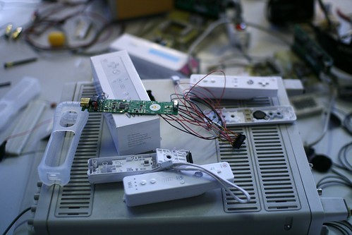
Currently in Aix-en-Provence, at the School of Art where I've given a talk yesterday about tangible interfaces (a rerun from my GDC2007 presentation). The talk was part of a workshop called "Workshop Wiimote Hacking. The whole thing was about how to hack the Nintendo Wiimote and turn it into a tool that artists can employ. Students are involved in the process of adding new sensors as well as defining new sorts of usage. Thanks France Cadet for the invitation and Douglas for having taken time to discuss. Wiimote hacking

The discussion after the presentation revolved around: - How the wiimote might have the potential to become a sort of standard in the living room as the controller. I personally don't predict anything about this. However from current observations of practices, I do think that the Wii is much more than video game device and play an interesting role of multimedia platform in the living room (with photos, usage of personalized mii). In addition, the presence of very focused applications such as wii questions turns it into a platform where facebook-like small application can be played by the family. - Why the game design ideas we have so far on the Wii are so conservative... which turned into why the video game industry is so conservative or how the whole economic system is so controlled by the marketing crowd that it's difficult to go beyond usage of the wiimote as sword/steering-wheel/magic wand. This is a sort of over-statement but it's actually close to the reality. - How this work about tangible interfaces relate to my other work about mobile and pervasive gaming? we discussed the notion of granularity and how complex the game system is when the dimensions reach the city level. Much more than just gesturing in one's own living room, using the city as a game field is complex for lots of reasons (technical, infrastructural, difficulty to have a continuous experience), etc.

Fortunately, there was also an exhibit about games as medium for artists to create and tweak digital worlds. Called gamerz02, there was a bunch of very curious projects.

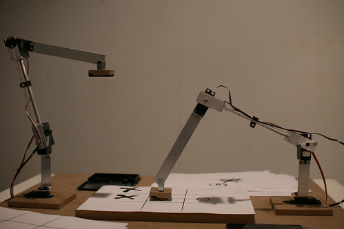
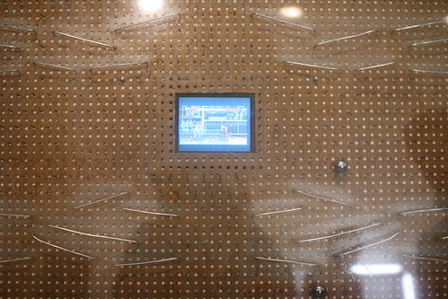
The one that attracted my attention was Patch&KO (Antonin Fourneau and Manuel Braun): instead of using a joystick people can play Street Fighter 2 using a pachinko interface. In a sense, the player's ability to control the character is disrupted by the semi-random movement of the metal balls. As the designers state, the player has to accept a loss of control. Slightly related was this Tictactoe played by robotic arms I blogged about the other day. In this case, what was explored was that the Tic Tac Toe is a curious game in which the only way to win is to rely on the opponent's fatigue and loose of sight in the game. In the context of two mechanical arms played by a computer, the surest way to win is to avoid playing. Finally, I was also interested by Tchouri by Pascal Silondi, a sort of knife-based interface much more intriguing than always-seen magic wands. Some of the pieces there were maybe slightly easy-going and naive but the whole things made sense and I found find fruitful to make game designers more aware of such work, perhaps some ideas about a workshop/seminar.

Tic Tac Toe with mechanical arms

Patch&KO

Beyond visualizing electromagnetic fields

One of the most interesting projects I've seen lately is "the bubbles of radio" by Ingeborg Marie Dehs Thomas. Perhaps it's because I've always been intrigued by visualizing electromagnetic fields as shown by the work of Dunne+Rabby in "Hertzian Tales. As Timo describes on the Touch weblog:

"Using inspiration from richly illustrated books on botany, zoology and natural history, Ingeborg arrived at the concept of an encyclopeadia of radio waves that contains a selection of fictional radio ‘species’. Armed with a well researched and advanced knowledge of the use, application and technicalities of each radio technology she created fictional visualisations of the ways in which radio waves inhabit space. These are creative expressions based as much on personal creativity as on technical or scientific data like range and signal strength. Six contemporary radio technologies were visualised: Bluetooth, DMB, GSM, RFID, Wifi and Zigbee. (...) These visualisations are not intended to be technically accurate or to offer actionable information. Instead they provide a playful cue to reflect and consider radio as something tangible and physical to be experienced by other senses, not just through a screen."

The visualizations are available as a poster here (.pdf) and slides from the final presentation of the projects are there. The book they published seems to be a must have: it's a ‘fake’ encyclopedia of electromagnetic fields, with a main focus on wireless communication.

So why is that important to visualize these elements? As she describes in her report:

"There are many opportunities for where and what these patterns can be applied to. (...) They could be printed on fabric, for clothes and accessories, from handbags, umbrellas, to coats, linings and even underwear. They could be applied to domestic objects that are used near electromagnetic fields; apron for the microwave, cloth for the TV or telephone table, curtains for the windows facing the neares mobile communication antenna, to mention a few."

Why do I blog this? personal interest towards the topic. Although the press captured that project as "artist work to visualize bluetooth and wifi", I am pretty sure there is really more to draw out of this work. For example, I would be curious to see how people are aware of these airwaves and how they have a representation of them: how do we represent ourselves the airwaves of cell-phones or microwave-oven. And maybe in a second phase to use this a material to talk with people about the existence and the shape of electromagnetic fields (it would require a less barbarian vocabulary though).

Their usefulness is indeed tough to describe (it's more an intuition) but my impression is that making such things visual is an important first step before discussing them (as we human being are very visual-oriented).

Aging for manufactured objects

In the NYT piece "The Afterlife of Cellphones", Jon Mooallem yesterday wrote about what happened to cell phones after they're discarded. Most of the article deals with methods for recycling and e-waste but the end of it address interesting design concerns of electronic/manufactured objects as it stress how "our affection for many high-tech objects is tied exclusively to their newness. Some excerpts I found pertinent:

"There is no heaven for cellphones. Wherever they go, it seems that something, somewhere, to some extent always ends up being damaged or depleted

“The mobile phone occupies a kind of glossy, scratch-free world,” he says. Whereas a pair of jeans gains character over time, a phone does no such thing. “As soon you purchase it, you can only watch it migrating further away from what it is you want — a glossy, scratch- free object.” You might leave the plastic film over the display for a few days, just so you can take it off later and “give yourself a second honeymoon with the phone,” he says. But ultimately everything that first attracted you to it only deteriorates. You start looking at it differently. “It’s made of some kind of sparkle-finished polymer and it’s got some decent curves on it, but so what? The intimacy comes more from the fact that, within that hand-held piece of plastic, exists your whole world” — your friends’ phone numbers, your digital pictures, your music — and that stuff can be easily transferred to a new one. So you “fall out of love” with the phone, Chapman says."

Why do I blog this? pure personal interest in this discussion about the rush-for-new-objects as well as the role of age on objects. I am personally skeptical about this phenomenon, in the long run.

Playing PONG against a fish

The idea of "new interaction partners" that we develop at the near future laboratory more and more echoes with projects here and there. For instance, Florent Deloison has an intriguing project about playing PONG with a fish (in french). The system is based on mormyrophone, a device designed by biology researcher Christian Graff, able to detect and translate as image and sounds the electric discharges produced by a fish.

This was part of workshop at the Art School in Aix en Provence, France. Other students developed projects about allowing the fish to send e-mails or using the fish as THE interface.

Why do I blog this? reviewing some animal-based interactions that have I seen popping up lately is always refreshing. Although this looks a bit weird and pointless, I believe there is a great deal to explore in this "new interaction partner" vector.

Protecting one's electricity

Different ways to protect one's source of electricity: Well covered in a french train: Protected source of electricity

With duct tape at the airport in Brussels: Locked electricity

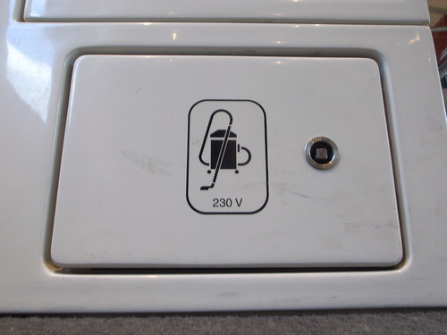
Why do I blog this? in a time where we have our pockets full of mobile devices that require electricity, it's always an issue to find a power plug. This is even more important when you hang out in Marc Augé's "non-places". Most of time, it's in these areas that owners of the infrastructures are trying to design different ways to prevent you from accessing it. Even when there are still plugs for vacuum cleaners or christmas trees, there are always some possibilities to show you that you're not welcome to steal a bit of volts.

Automation, light and door sensors

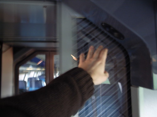
Last week I had two interesting encounters with gestural interactions. The first one was in the super-fancy double decker train that goes from Geneva to ZanktGallen/Zurich. In that train, there is a sensor to open up the doors between wagons. People, if they're slow or if they don't know that there's a sensor generally walk in, wait a bit and then come in as the door opens up when the sensor detect the presence of a body. But usually, commuters know that they can wave their hand next to the sensor as I did here (very weirdly with the left hand): Wave the arm to open the door

In other trains, the sensor is situated on the floor. Standing next to this door during the whole trip to Zürich was a fantastic opportunity to observe the range of behavior in that kind of situation. I did not count or ran precise analysis but I tried to categorize these behavior in a sort of ludicrous way: - old people clueless about the sensor presence but slow enough to see the door opened when they approach it - people who knows that there's a sensor, so they wait and go through the door - commuters well-versed into swiss train sensors who wave their arm - people in the rush who almost run and bump into the door because the sensor did not have time to detect the body - commuters who know how the sensor works, wave the arm and fail to open it (for some reason... because technology sucks), so step back and try again 1 or 2 times. A variant is when you have people then looking at the sensor, sometimes talking to it. - one person even try to open the door manually but he failed because there is no clear handle (nor affordance) to do so. He the looked at me and sighted.

Quite an interesting list and I am sure there can be other curious use case as I haven't seen kids or people with loads of luggage. The underlying variables here are the following: the location of the sensor, its visibility and affordance to the user as well as the delay between body detection and opening of the door. It was obvious that all of them were problematic.

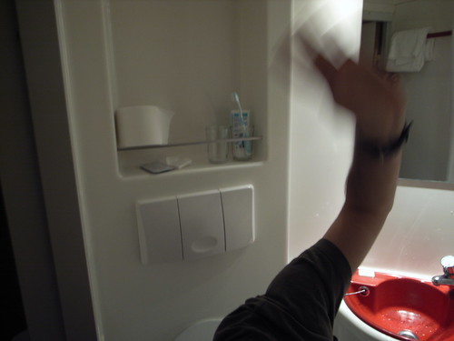
The second encounter was in Brussels, in an hotel loo, there was a sensor that detect a body presence to switch on/off the light. What happened inevitably is that the light went off and I found myself waving my arms here and there... eventually above my head... because I did not know where was the sensor. What happens? Who tuned the sensor? How did they tune that bloody sensor? Did they run user studies about how people spend time in bathrooms? In any case, what happened is that they created a sort of norm in that building, that tell people how long they must or must not stay there. The whole experience then becomes weird although I can adapt and find funny to wave my arm around.

Automatic light

Why do I blog this? there are two interesting aspects here: the mix of gestural sensing and automation. All of this is based on the assumption that the best way to interact with technology is to make things more naturals, more physical by removing any transducers between people and artifacts. No buttons, no switches to open doors or switch lights on. In a sense there is still an interface, that is gestural but as it is no self-revealing, people have troubles knowing what to do. And you have, on top of that, the clumsy automation issue: automation indeed create new operational complexities as shown by Wood.

On that topic, see also Fabien's experience as well as Fabio Sergio's story. Clive Grinyer has good thoughts about it too.

"Design matters"

Was in Grenoble yesterday, attending an event called "Design Matters organized by the big nanotechnology operation they have there as well as several other partners. The gig was about design in the context of industrial innovation: "Is it possible to see designs as fundamental processes developed by a multi-partner, multi-disciplinary innovation hub which will allow us to combine the essential elements of research, analysis, conception, creation and production to develop highly valuable technological products?". Speakers ranged from philosopher (Bernard Stiegler), UX specialist (Adam Greenfield), design (the director of a french design school, Federico Casalegno and a designer from Alcatel) and design/branding (SEB). Some of the elements I found interesting are summarized below. Minatec
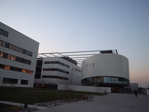
Bernard Stiegler gave an inspiring talk about the evolution of techniques (externalization as described by Lerhoi-Gourhan) that lead to technosciences. He showed how the role of design evolved over time and how we reached a situation in which people/structures who build/design technologies are separated from users, now called "consumers". He pointed how today there's a "desire crisis", a sort of exhaustion of desire in which the individual is disaffected. His claim is the techniques used to create "consumer behavior" amount to the destruction of psychic and collective individuation. According to him, technoscience developments became opaque and distabilize biological, physiological and geographical systems. For the individual, it's a loss of intelligibility in the system as well as a loss of participation. He then advocated for more open and distributed design process in which people can participate. To some extent, Stiegler justifies bottom-up innovation by a psychological impetus necessary for our society to go beyond today's desire exhaustion.

Federico Casalegno presented the eLense project and the Landmark interactive bus stop (in which my colleagues Enrico Costanza and Mirja Leinss participated). Federico showed their design approach at the MIT Mobile Experience Lab, exemplifying today's design methods there.

Attending Adam's "Everyware" talk for the 4 of 5th time is always interesting. Especially to see how things eveolved over time. For example, I was struck by his new slides about "what does it suggest that the same presentation was illustrated last year with prototypes is now exemplified with existing products". His addition of Deleuze work (see Postscript on the Societies of Control) is also strikingly relevant. It was important also to see what Stiegler had to say about Adam's work, as he pointed our the importance of going beyond resistance (which reminds of "nostalgia is for suckers" that Adam threw at LIFT Korea) to participate and invent.

After this very high level discussion, a former designer at Alcatel described the role of a prudct designer according to him. Although what he presented was very conventional to me, it was interesting to see the designers' stance in these big french operations. He claimed how design was blurry, intangible and "difficult to measure" in this context, showing example of meetings in which the person with the vaccum cleaner in the corridor is asked if she preferred "product A" or "product B" or how the CEO needs to get back the products at home and ask his wife about it. I quote that example because I was kind of astonished by the gender assumptions there, as if I had been swamped background in time. I also found curious the sort of design he presented as he never mentioned "critical design" or less mechanistic and utilitarian approach.

Finally, the manager of branding at SEB described the relationship between branding and product design. What was very inspiring there was his description of the failures of some products who wanted to jump in a certain bandwagon (like... designing ironing devices in an "apple-like" way with translucid material), forgotting to match the brand of the product. He also describes some of their process based on "affordance test" of pans, coffee-machine and toasters: how they ask 100 persons (who are presented the product) to use it, how they would hold it, use X and Y functionalities. In a sense, what he described what very close to usability testing in which people begins to explore freely the usage of a physical artifact.

Why do I blog this? although a bit loosely coupled at first, the program was very interesting in the sense that it showed the sort of messiness of approaches and perspectives, especially in the context of France. Good meetings there as well.

No WiFi!

Seen in Grenoble today: No Wifi

"no wifi"... as if it was important to indicate that this area is not covered? It's not the case here, if you read the lines under that sign. Sometimes, 802.11b cannot be employed... some context prevent people from making it available and sometimes it's even worse: you're required to deactivate your wifi-enabled devices!

Also, think about the fact that I've seen this sign in France, and there were not french translation at all around it.

Bottom-up innovation and velo'v

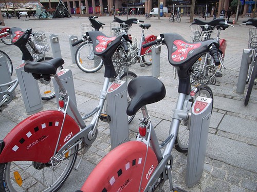
In this post, I mentioned this bike rental service called velo'v in Lyon (Paris has velib, Brussels has cyclocity, etc.). They're managed by JCDecaux and you can read Re*Move for an analysis of this. What is interesting is to observe the side practices around these bikes. Two examples: Look how here the saddle is rotated, which is a trick used by people to show that the bike does not work well (or a part is broken): Velo'v trick

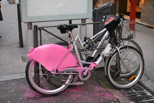
In the second example, a part of the bike has been painted in pink by ACTUP activitists (in paris they covered saddle with pink tissue): Pink velov

Why do I blog this? going through some pictures I've taken recently, look at emerging patterns, observe what that means for urban computing. In these cases, it's the "bottom-up innovation" aspect that I find intriguing and how the infrastructure that has been put in place by JCDecaux is apprehended, the creativity around it and what this means to rethink these artifacts in the city of the near future.

Certainly, material for a talk concerning "bottom-up innovation and urban computing"