Design

Aquarium phone booth

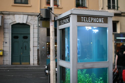
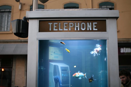
Street encounter in Lyon: a phone booth turned into an aquarium (by Benoit Deseille and Benedetto Bufalino), as part of the Lyon Light Festival: phone booth aquarium

As the designers express it:

"With the advent of the mobile telephone, telephone booths lie unused. We rediscover this glass cage transformed into an aquarium, full of exotically coloured fish; an invitation to escape and travel."

phone booth aquarium

Why do I blog this? an interesting way to explore how artifacts from the 20th century can be turned into other sorts of objects in the city of the near future.

Ethnography as Design Provocation

Going through the EPIC 2007 proceedings, I ran across this interesting paper entitled "Ethnography as Design Provocation" by Jacob Buur and Larisa Sitorus. The paper starts off my explaining how the use of ethnography in technology development has been limited to data collection, which led to isolate the researchers from design (which is R.J. Anderson's point) and a limit to the way practice and technology can evolve together (Paul Dourish's point). The authors advocate for another approach in which ethnography can "provoke new perspectives in a design organisation". They describe this stance through case studies of "design encounters" (i.e. workshops) showing how ethnography could be "shared material", "embodied in design" and a way to frame "user engagement". The conclusion they draw are also interesting:

" Firstly, to engage the potential of ethnography to provoke organisations to rethink their understandings of problems and solutions, the textual form may not be adequate. Neither are insight bullet points, as they submit to the logics of rational argumentation that hardly provokes questioning and engagement. Instead, we find it paramount to develop ways of engaging the organisation in sense-making through the use of visual and physical ethnographic material.

Secondly, the ethnographic theory building, though crucial to design, cannot progress independently of the prevailing conceptions of (work) practices ‘out there’ in the organisations – and these may not become clear to us until we confront the organisation with our material. Better sooner than later.

Thirdly, to move collaboration beyond requirements talk among the design team, organisation and participants, needs well-crafted ethnographic material to frame the encounters to focus on fundamental issues and perceptions."

Why do I blog this? interesting reflections about methodologies, a good follow-up to this other post.

Design as a compromise

Found this paragraph in Bill Buxton's book "Sketching User Experiences":

"People on a design team must be as happy to be wrong as right. If their ideas hold up under strong (but fair) criticism, then great, they can proceed with confidence. If their ideas are rejected with good rationale, then they have learned something. A healthy team is made up of people who have the attitude that it is better to learn something new than to be right."

Why do I blog this? I found quite interesting how this quote shows how design is compromise, it's also something I should add up to the post

Weird personas deck

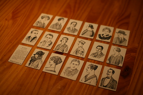
Personas Some weird cards that I use for [absurd] persona discussion. Each of this very nice portrait has on the other side: its name, job and description. Exercise for today: Try to design for "Teddy" an officer of the US navy (and try to spot him on these cards).

6 months in a design lab

It's been 6 months or so that I am working at the Media and Design Lab, a structure led by Jef Huang that sits both in architecture and computer sciences faculties. My motivation to join this lab, as a researcher, was both to work on architecture/urban projects and to learn more about design thinking. My background being mixed up (undergraduate degree in cognitive sciences/psychology, MSc in human-computer interaction in a psychology a faculty, PhD in human-computer interaction in a computer science faculty) I quite like discovering new territories, epistemologies, methodologies and purposes. Therefore, discovering and working with architects and designers (other than game designers with whom I work for 7 years now) is very worthwhile and relevant. Given my interest in "user experience" research (or behavioral studies/psychologie ergonomique/...), it's important to live with people who create, design, build and think technologies or services, especially in domains that I am interested in (urban computing , mobile applications, tangible interfaces, games).

Speaking about projects, the lab is a bit scattered as each of us have his or her own project but there are some common ones that involves everyone and most of the time we're required to give feedback on each others' work (be it about teaching or research). It's especially during those moments that I feel how we can learn the richness of multidisciplinary design work.

(Picture of a lab meeting)

Over time, I tried to take notes of the elements that I found interesting and that seems to be referred to as "design thinking". Coming from more structured research traditions (HCI, psychology and social sciences), it's pertinent for me to see the differences as well as the idiosyncrasies of that group work. Reading this made me think that I should post about it. So here are some of the elements I spotted a interesting [if you're from the design community, you might find that a bit dumb]:

The first thing that is striking when you come from more monolithic-science department is the use of artifacts during the project process. I won't enter into much detail about it (rather read "Sketching User Experiences" by Bill Buxton) but it's important to notice how artifacts such as posters, sketches, drawings, cardboard stuff are not an end but a way to convey and discuss ideas. See for example the huge posters below that we used for a project, it was mostly to discuss the evolution of interface design. Over time, there has been at least 8 iterations of different visualizations, all supporting the arguments. Hence the gathering of artifacts in sourcebook that can be reused afterwards as inspiration. Nokia project #3

The corollary of this is the importance of prototyping and hence the presence of fascinating material all over the place (not that different from computer sciences department though): Material used by colleagues (1)

Of course, this does not mean that the end product/report does not also benefit from this... there is comparison between reports/presentations that I have seen in some academic psychology/HCI contexts and what is in that community.

Another side issue is the importance of the design critique in the process, which is quite surprising you're thrown in the arena, having to criticize architectural projects you have no clue about how to articulate the validity. Over time, you grow and habit and learn what elements can be criticized, especially about how the design process has been achieved, what has been done from the starting point and whether there are flaws in the reasoning/building of the artifact.

Something that keeps surprising me about this is both the "tabula rasa" attitude in which, at the end of the day, the ideas and artifacts are stored somewhere and the next day starts with new ideas. I don't mean here it's a constant attitude but I noticed the tendency of architects to do so (without reinventing the wheel afterwards). This is linked to the design thinking/process that is very different from what scientific research in the sense that it's much more creative and based on defining different vectors, evaluating their pertinence, exploring others in a less incremental way than engineering or scientific research.

In sum, I am happy to see that and how I can adjust my own research to this. Of course, this is just after 6 months there but I really have pleasure to discover all of this and to compare it to other settings. And not only to scientific research, my biggest surprise (in retrospect) is to notice how video game design suffers from the lack of design thinking, how they're definitely closer to the engineering way of thinking (problem/technological solution) and that there is a whole set of things to apply there. This is not astonishing as the work I am doing for certain video game companies for few years is spot on this (user-centered design, ethnography, foresight).

As a side note, what I wrote here mostly emerges from my academic work. Foresight and research work don with Julian at the Near Future Laboratory explores that area in different ways.
Implications for Design: responsibilities and framing

In "Responsibilities and Implications: Further Thoughts on Ethnography and Design continues to elaborate on the use of ethnography in human-computer interaction and the "implications for design" issues he addressed at CHI2006 (see my notes here). In the CHI paper, he argued how the use of ethnographic investigation in HCI is often partial since it underestimated, misstated, or misconstrued the goals and mechanisms of ethnographic investigation. Which is problematic since researchers aims a deriving "implication for design" from these investigations. The DUX paper continues on that topic to show how ethnography is relevant but not in the bullet-point "short term requirements" way some use to think about. As he says, "the valuable material lies elsewhere" or "beyond the laundry list", which is described through 2 case studies about emotion and mobility.

Then what should be these implications for design (voluntarily skipping the examples, see the paper pls)?

"The implications for design, though, are not of the “requirements capture” variety. They set constraints upon design, certainly, but not in terms of operationalizable parameters or specific design space guidance. What they tend to do, in fact, is open up the design space rather than close it down, talking more to the role of design and of technology than to its shape. (...) A second observation about the implications is that they are derived not from the empirical aspects of ethnographic work but from its analytic aspects. That is, the ethnographic engagement is not one that figures people as potential users of technology, and looks to uncover facts about them that might be useful to technologists (or to marketers). Instead, ethnographic engagements with topics, people, and fieldsites are used to understand phenomena of importance to design, and the implications arise out of the analysis of these materials. (...) the theoretical contributions that the studies provide have a considerably longer shelf life, and a relevance that transcends particular technological moments.

Is it a cop-out to say that what these studies provide is a new framing for the questions rather than a specific set of design guidelines? Hardly.

In addition, his discussion about the responsibilities is also important:

"The engagement between ethnography and design must be just that – an engagement. Ethnography and ethnographic results are part of that engagement. (...) I’d argue that it is no more the ethnographer’s responsibility to speak to design within the context of each specific publication than it is the designer’s responsibility to speak likewise to ethnography. Rather, the responsibility for ethnographically grounded design results is a collective one.

Why do I blog this? This is a topic Paul Dourish will address at LIFT08 in Geneva. Beyond that, this article echoes a lot with both reviews I received from academic papers (criticisms towards implications for design that are too broad and not short term requirements) and what can be observed from designers' practices at the Media and Design Lab I joined 6 months ago.

Closer to my own research, I like the way he frames this notion of implication; and indeed ethnography can bring more than sort term recommendations as it can uncover motivations for action, needs and deeper human rationale. In my research about location-awareness, we explored the differences between self-disclosure of one's location and automatic positioning; in this case, the crux issue was not to oppose the two sort of interfaces but rather, to show how each of them was different and had different implications in terms of human motivations (for example, self-disclosure of one's location is linked to communication intentionality).

Dourish, P. 2007. Responsibilities and Implications: Further Thoughts on Ethnography and Design. Proc. ACM Conf. Designing for the User Experience DUX 2007

Design research and social scientists

"Design Research for Social Scientists: Reading Instructions for This Issue by Hummels, Redström & Koskinen is an interesting introduction to the relationships between design research and social sciences. It's actually the introductory paper of a journal issue about that topic. A relevant excerpt:

"what determines what knowledge will be pursued within ‘design research’, is not necessarily what other research disciplines find to be scientific but what knowledge design researchers, design professionals, and perhaps especially design education find important, relevant, and even necessary for the advancement of their practices. (...) ambitions to completely fit within any particular existing framework is likely to be of secondary interest here although there are strong ambitions to build on more general ideas about science and research as to foster a solid knowledge discourse. Within the fairly new field of design science, design researchers are still exploring the boundaries of what science means from a design perspective; for example, some researchers consider their products/ prototypes as being a physical hypothesis and testing them as a hypothesis-generating method. (...) Design researchers do not aim at advancing knowledge in sociology or management science, but utilize well-established theories and practices from those disciplines to advance technological development."

Why do I blog this? coming from social sciences and working with designs led me to similar issues described here. The whole issue seems interesting to learn more about to find a common ground as well as processes that would be relevant for both communities.

Hummels, C., Redström, J. and Koskinen, I. (2007). "Design Research for Social Scientists: Reading Instructions for This Issue. In Hummels, C., Koskinen, I. and Redström, J. (Eds.) Knowledge, Technology & Policy, Special Issue on Design Research, Vol. 20, No. 1, pp. 11-17. Springer.

"Remarkable hope in seams and scars"

As a complement to the discourse about showing the seams (and seamful design), I found these lines by Anne Galloway very relevant:

"seams and scars point to where we have in the past made or become something else—and yet they also remind us that we can do so again in the future. If we treat them not as irregularities to be hidden but as indicators of our abilities to intervene in the world, seams and scars offer us glimpses of how we shape and re-shape ourselves, each other, and the worlds in which we live. (...) I find remarkable hope in seams and scars. But because liminal spaces, like all potentials, are also rather uncertain I find good reason to proceed with care. (...) Who is making the cuts? Who gets left behind? What goes forward? Who does the suturing and sewing? Has there been suffering? Healing? Are the seams ugly? Are the scars beautiful? What can we learn about ourselves and others by attending to the seams and scars our work creates and leaves behind?""

Why do I blog this? "seamful design" or how to reveal the seams/limits of technologies is an interesting proposal in terms of design thinking. However, what it implies is often quite difficult to conceptualize in terms of consequences. The paper provides some elements about it.

Galloway, Anne. (in press) “Seams and Scars, Or How to Locate Accountability in Collaborative Work,” in Uncommon Ground, Cathy Brickwood, David Garcia and Willem-Jan Renger (eds.), Amsterdam: BIS Publishers.

Switch conventions

In Switzerland, the large majority of switches fall into 2 categories: Swiss switchAnother swiss switch

As if there was some sort of CH's designer-in-chief who ruled the existence of switches. It eventually leads to a great homogeneity in their design (compared to the very broad diversity in France for example).

Find it intriguing, and not that bad actually.

Device Art

Reading Device Art: A New Form of Media Art from a Japanese Perspective by Machiko Kusahara this morning in the train was a good way to start the day. The author describes what he intends by "device art", describing how this concept took shape on the basis of an analysis of works by contemporary Japanese media artists such as Toshio Iwai, Nobumichi Tosa (Maywa Denki), and Kazuhiko Hachiya:

"The concept is a logical extension of a change in the notion of art that already started in the early 20th century with art movements such as Dada and Surrealism. More recently, interactive art has redefined forms of art and the role of artists. What we call device art is a form of media art that integrates art and technology as well as design, entertainment, and popular culture. Instead of regarding technology as a mere tool serving the art, as it is commonly seen, we propose a model in which technology is at the core of artworks. (...) As a concept, Device Art is rooted in the analysis of the key role that devices play in certain types of art, that is, artworks involving hardware (a device) specifically designed to realize the artistic concept. The device itself can become the content. Technology is not hidden, its function is visible and easy to understand, while it still brings about a sense of wonder. Well designed interfaces made of the right materials facilitate interaction for users, often in a playful manner. (...) a device could be the "body" of an artwork that offers an artistic experience to its users / participants. In other words, the "resulting" experience cannot be separated from the device specifically designed or chosen to enable this experience. Producing multiple copies of such work and distributing it as a commercial product makes it accessible to a wider audience, provided the piece is designed in such a manner that anyone could use and enjoy it. An artist's concept could become a part of people's lives, rather than being kept in museums and galleries. Why not share art with more people?"

(Picture from the Bitman project by Ryota Kuwakubo)

Why do I blog this? what is important here is the idea that "device art" can be described as "a form of media art that integrates art and technology as well as design, entertainment, and popular culture". This is both a holistic AND a boundary object. It's not very surprising to read this from a japanese author but it's relevant to see the underlying motivations and reasons.

Also think about the contrasting approach with lots of projects we see in Europe or in the US that do take a totally different angle. I am thinking about recent robotic projects seen in Europe that really don't want to remove the existing boundaries.

How to design an alien

In an issue from december 1991 of New Scientist, there is a curious article entitled "How to design an alien". It's definitely not the astrobiological dimension that struck me as relevant, but rather these quotes:

"[inventing new planets] requires building a new world ecology with a detailed evolutionary history so that the plot does not have any obvious contradictions (...) although every detail must be different, there are patterns of general problems, and common solutions to those problems, that would apply to life anywhere in the Universe"

Why do I blog this The "theoretically possible after all" dimension as well as the balance between particular challenges/universal solutions described in Cohen's article is very interesting, as an exemplification of the design process.

Defining "slanty design"

Russell Beale use the term "slanty design" in a short article he wrote for Communications of the ACM recently.

"Slanty design is the term I've given to design that purposely reduces aspects of functionality or usability (...) Slanty design incorporates the broader message, making it difficult for users to do unwanted things, as well as easy to do wanted things. Designers need to design for user non-goals—the things users do not want to do or should not be able to do even if they want to. If usability is about making it easy for users to do what they must do, then we need to have anti-usability as well, making it difficult for them to do the things we may not want them to do. So slanty design reflects two subtly different characteristics: that we need to design for broader goals than individual users may identify, and that we need to incorporate anti-usability, as well as usability, into our systems. (...) Slanty designs result from five key design steps: - Identify user goals; - Identify user non-goals—the things users don't want to be able to do easily (such as deleting all their files); - Identify wider goals being pursued by other stakeholders, including where they conflict with individual goals; - Follow a user-centered design process to create a system with high usability for user goals and high anti-usability for user non-goals; and - Resolve the conflicts between wider issues and individual goals, and where the wider issues win out ensure that the design meets these needs. "

Why do I blog this? I find interesting this notion of "anti-usability" though cueing and preventing people form doing certain interactions.

Beale, R. (2007). Viewpoint: Slanty design, Communications of the ACM, 50 (1), pp. 21-24.

Dassault Systemes 3D modeling initiatives

A very intriguing article in the IHT about how Dassault Systèmes wants to jump on the Web2.0 bandwagon with their new 3Dvia division. They aim at democratizing the usage of 3D so that everybody can use it in its everyday life in a pure "marketing investment" fashion. Their motto is "We have been in the background for 20 years, We want to be visible now. It's our turn":

"With a new division called 3DVia, the company, based in Paris, is targeting ordinary consumers as future clients of its complex three-dimensional modeling software. Visitors to the free 3DVia Web site, which is still in test mode, have designed and "built" chairs, buildings, sailboats, "Star Wars" materials, fantasy characters and numerous other products.

In partnership with Microsoft, Dassault also introduced a free online application two weeks ago that allows users to create 3-D models and put them on the map, sharing them on Microsoft's Virtual Earth and with online communities. (...) Dassault has plans for a "virtual lab" on the Internet that could be rolled out as a service that is paid for by the use. "We believe this is the future," he said, "we want to be the eBay of 3-D. But it's true, we are still working out the business models.""

okay but I am not very sure about this:

"Stephen Lawler, general manager of Virtual Earth at Microsoft, said that teenagers were already intimately familiar with sophisticated 3-D rendering technology from their sometimes-daily exposure to video games. They know what to expect from 3-D computer creations and are comfortable in virtual worlds like Second Life, he said, while people unaccustomed to computerized modeling might need training and exposure."

Besides, playing 3D games do not mean that creating 3D models can be easier. Why do I blog this? Curiosity. In addition, what I am surprise of is the tone of this article that only focused on 3D modeling in a digital environment and did not really tackle something that is more appealing to lots of people (especially kids): rapid manufacturing of 3D models. It's even more surprising hen you consider the Cosmic Modelz system they have which allow kids to print 3D model stuff made with Cosmic Blobs.

The past future of computer games

A P&V reader recently commented on this post by sending me this incredible scans from the "Usborne Guide to Computer and Video Games: How they workd and how to win". The last part of the book is funny in terms of game experience. The predictions are quite on spot with multi-player games, long-distance games and the "ultimate game" (great names!):

But it's definitely the part about "game variations that I found hilarious:

Why do I blog this? this variation part is very interesting, in the sense that it really shows some weird tricks to modify the user experience of games, without any tech breakthrough, rather curious workarounds imagined by writers of that books (or their kids). When I read books about that topic from that last 10 years, I've never really encountered any tweakings like this.

Quick notes on Jan Chipchase's talk

Watching Jan Chipchase's talk at Nokia Connection 2007 (see the podcast here), I tried to take some notes about the sort of questions Jan addresses related to the "material" he and his team collect:- find the lessons about why people are doing x and y? what motivations and apply it to other contexts - does results x and y apply to the consumption of digital content? or tangible media? mobile phone design? - what is the digital equivalent to x and y phenomena? - if you see that people use x and y objects (e.g. straps) what kind of services you can have with X and Y? - challenge people's opinions with baseline data - yield not facts but informed opinions

Why do I blog this? quick notes after listening to a podcast, what inspires me most in Jan's work is precisely how to go beyond the collection of "data" and what sort of questions one can address using them.

Quotes from Pic Nic 2007

Some quotes heard at Pic Nic 2007, in Amsterdam: "At that time, Lisa was the female of Bart" - The Simpsons director.

"Games are about expectations and permissions slips: you give players the fact that everything is permitted" - Katie Salen.

"Lots of picture of the Wii are not picture of games but of players and their hands" - Julian Bleecker.

"How do we prioritize good content over garbage in mobile anotations? A classical question about user-generated content" - Matt Adams.

"The reality around us (...) the repeated module of doom: banks, dunkin donuts, nails, franchises" - Adam Greenfield.

"Play is about fluidity, work is about crystallization - Play as the negative space of work that allows work to continue" - Ben Cerveny.

Roles of ethnography in design

Ethnography and Design? by Andy Crabtree and Tom Rodden is an insightful paper written in 2002 about the practical relationship between ethnography and design. The main problem they describe is how to link details accounts of situated activities (provided by ethnography) to the actual design of computer systems. Beyond "requirements engineering", the authors propose "a broader conception of design work" with three roles for ethnography:

"To identify general researchable topics for design through continued workplace study. (...) To develop abstract design concepts concretely by using workplace studies to sketch out and work up design-solutions. (...) Evaluations may be both summative, where ethnography is employed as a means of conducting a ‘sanity check’ on design, and formative, where prototyping sessions are treated as sites of work amenable to study and findings are used to drive iteration in design (...) To drive the development of novel technologies by evaluating the social application of innovative technological research. "

They also distinguish "product-oriented design" and a "process-oriented view":

""The product-oriented perspective places an emphasis on organizing the design of an end-product rather than on the nature of the production process itself (...) An alternate point of view - the process-oriented view – places emphasis on the role of learning and dialogue between the parties to design throughout the development process employed as a means of conducting a ‘sanity check’ on design, and formative, where prototyping sessions are treated as sites of work amenable to study and findings are.""

Why do I blog this? some good elements here to nurture methodological discussions and to go beyond current use of ethnography in design research.

Crabtree, A., Rodden, T. (2002). Ethnography and design? In Proceedings of the International Workshop on "Interpretive" Approaches to Information Systems and Computing Research. London. pp. 70-74.

George Legrady's talk at LDM

A good talk I will miss this week at the lab: "Aesthetic & Cultural Perspectives Through Data Visualization" by George Legrady on September 12th at EPFL in BC01 at 4:00pm:

"The lecture will trace the intersection of data organization and visualization in a number of the artist's projects such as "Pockets Full of Memories" (Souvenirs plein les poches) inaugurated at the Centre Pompidou, and "Making Visible the Invisible" a public arts commission for the Seattle Central Library, and the Global Collaborative Visual Mapping Archive (GCVMA) cellphone visual archive exhibited this summer at the National Academy of Sciences, Washington, DC. These projects consist of visualizations generated by custom designed software that dynamically organize data."

George Legrady is Professor of Interactive Media at the UCSB. He holds a joint appointment in the Media Arts and Technology Graduate Program, and the Department of Art. His current research addresses data collection, data processing methodologies, and data visualization presented simultaneously in interactive installations and the internet. He is Co-Principal Investigator of the National Science Foundation’s Integrative Graduate Education and Research Traineeship (IGERT) Interactive Digital Multimedia (IDM) Program at UCSB.

It doesn't do "choo-choo" but it's a train

Overheard in the train tonight:"This, is a train, it doesn't do "choo-choo" but it's a train" says a mother to her kid point at the nice IC2000 CFF Double-decker train.

(picture courtesy of railfan europe).

Why do I blog this? It's curious how onomatopoeia, which start becoming names for things can survive after the artifact's behavior becomes utterly different. It's always intriguing when the naming of things goes berserk. The noise, (i.e. one of the physical manifestation) is more important than the appearance and the behavior.

Choo-Choo, now it's a wrong onomatopoeia. Other examples?